Admin Reports
What's on This Page:
About the Admin Reports
Admin Reports are the best place to answer questions such as who is using how much of your license, who are your most engaged and least engaged users, and what is the quality of research happening in your company as measured by Expert Review. These metrics and more are illuminated in the Admin dashboard, consisting of the License Usage Report, the Activity Report, the Content Engagement Report, and the User Engagement Report. You can also use this tab to view your brand’s self-enrollment code.
License Usage Report
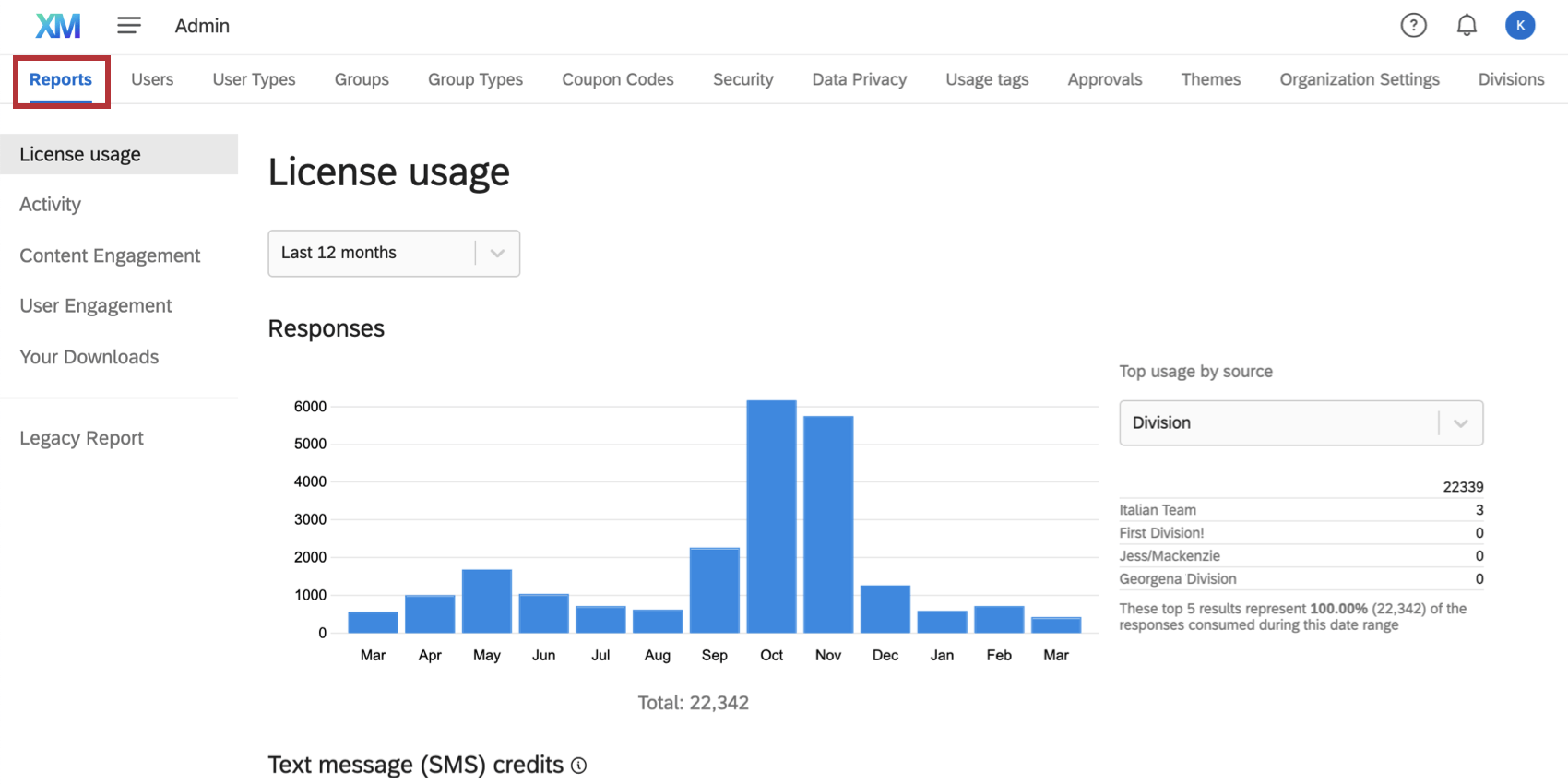
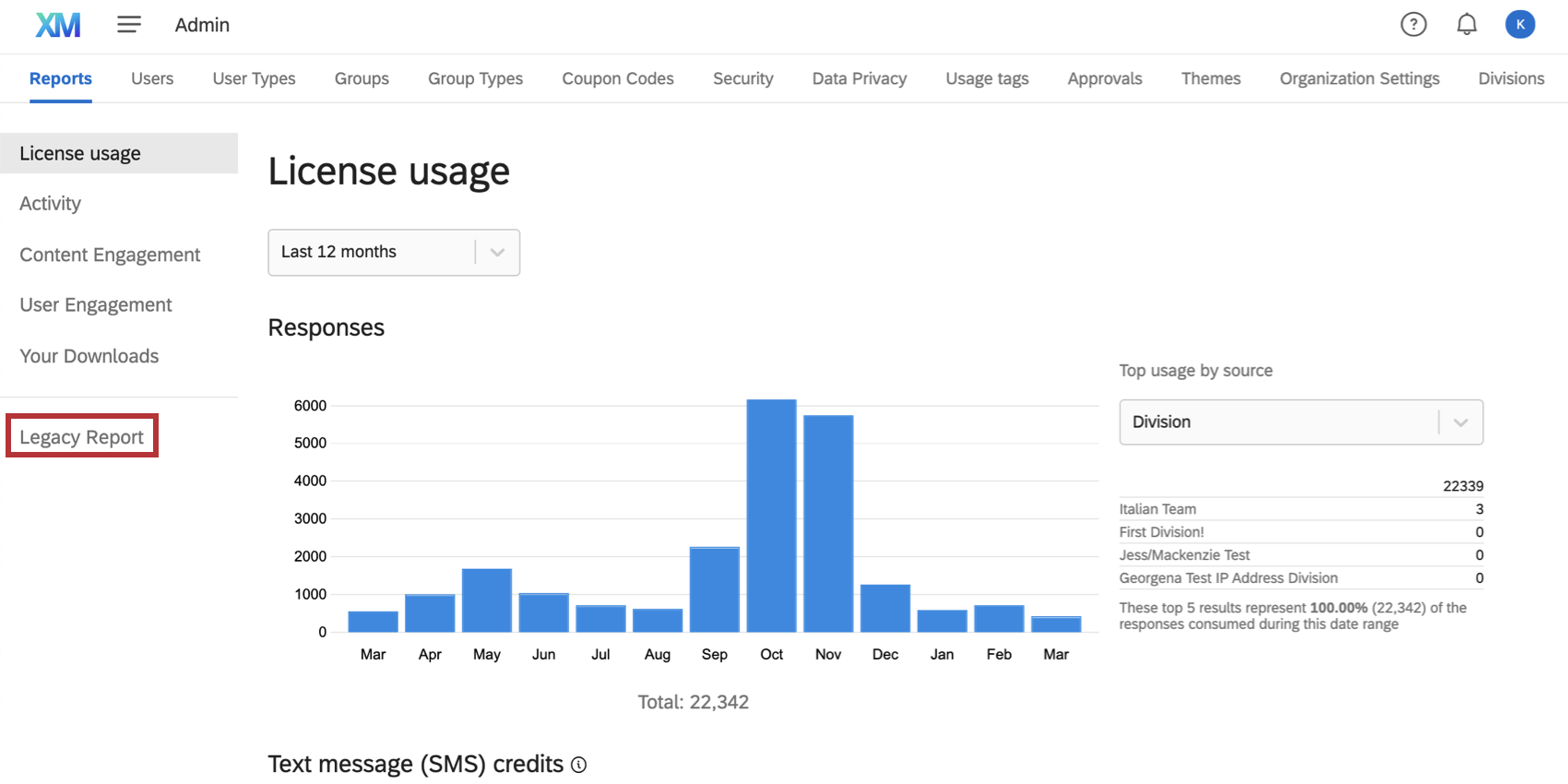
The License Usage Report allows you to view how many responses, SMS credits, and user seats have been used by your license within a given time period. If you’ve set up Usage Tags as a cost management system, you can break out your charts by the tags as well.
Responses Chart
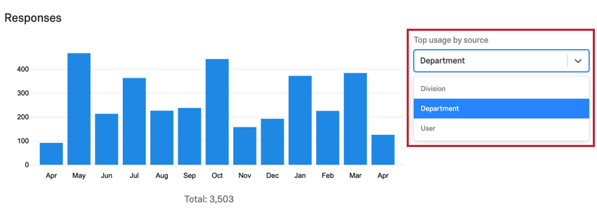
The Responses chart displays how many responses have been collected by the surveys in your license. Click the dropdown menu to the right of the chart to choose what the chart displays. You can break your data out by user, division, or any tags you’ve created.
SMS Credits Chart
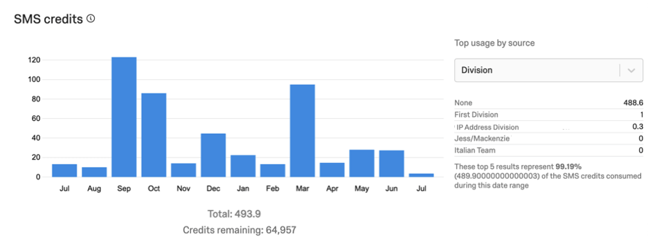
The SMS Credits chart displays how many SMS credits have been consumed in your brand, as well as the remaining SMS credits for the brand. Use the dropdown menu to the right of the chart to choose what the chart displays. You can break your data out by user or division.
New Users Chart
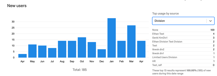
The New Users chart displays how many new user accounts have been created in your license. Use the dropdown menu to the right of the chart to change what the chart displays. You can break out your data by division or any tags you’ve created.
Usage Details Table
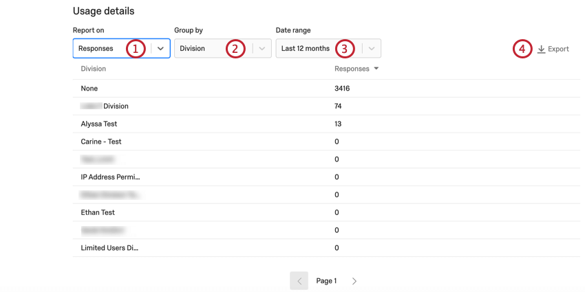
The Usage Details table displays the same information as the charts in your License Usage Report, but in a different format. You can also export the data from this section. The Usage Details table is located at the bottom of the License Usage Report page.
- Use the Report on dropdown to choose what is being reported. You can choose to report on Responses, SMS credits, or Users.
- Use the Group by dropdown menu to break out the data. You can group by Division, User, any tags you’ve created, or choose not to group your data.
- The Date range dropdown menu is used to choose the time frame of the data you want to include in your report. If you are reporting on Users, then this date range will show you users created within that time frame.
- Click the Export button to download a CSV or TSV version of the table.
Qtip: You can export details about all users in your brand by setting filters to:
Report on: Users
Group by: None
Date range: All
Activity Report
The Activity report shows the survey activity within your brand. Here, you can see details of all surveys in your brand including their quality as measured by Expert Review.
Active, Pending, and Inactive Surveys
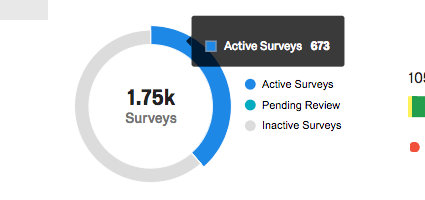
The first graph in the Activity Report provides the total number of surveys in the brand (center of circle). The colors on this pie chart represent how many of these surveys are active, pending review, or inactive. Highlight over a colorful section of the chart to get the exact number of surveys in the brand that have that status.
- Active Surveys: Surveys that can collect survey responses. These surveys are not new, paused, or closed.
- Pending Review: If you have designated that users must have surveys approved before they go live, this status will show how many surveys have been submitted for approval but are not approved and activated yet. Learn more about the permissions needed to set up this process on the Survey Approval Process support page.
- Inactive Surveys: These surveys have been paused or closed.
You can click statuses in the legend to exclude them from the graph, or to reinclude them.
ExpertReview
The ExpertReview breakdown bar helps you check the quality of your brand’s surveys by displaying the scores of surveys that have ExpertReview enabled. You can highlight over the bars of this graph to get the survey count.
To learn more about ExpertReview and how it scores surveys, see the linked support page.
Survey Details
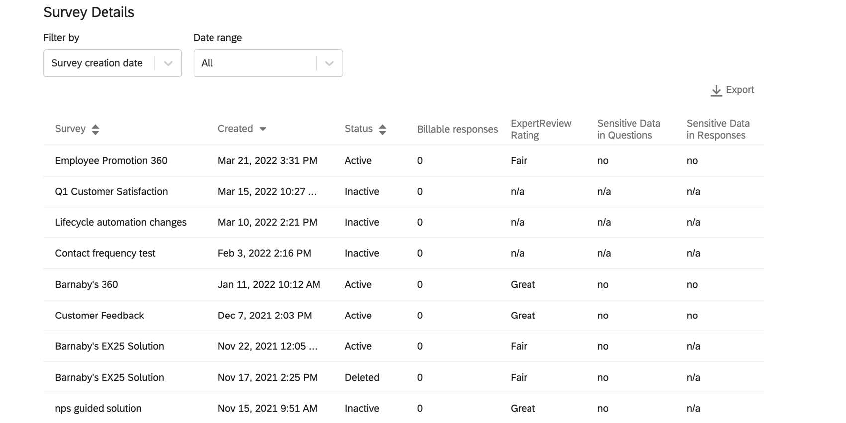
The Survey Details table provides insight into when surveys were created, how many responses they’ve collected, their status, their ExpertReview rating, and whether they contain sensitive data in the questions or responses.
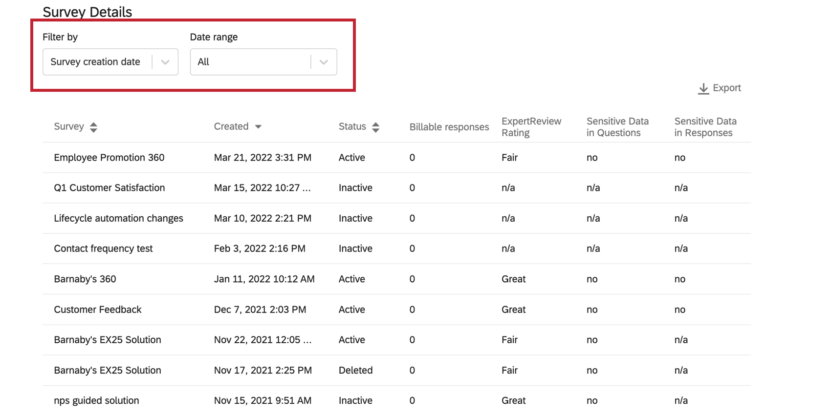
You can filter activity reports by survey creation date range and response date range by using the drop-downs above the table.
The Survey Details report the presence of sensitive data as a Yes or No. To learn more about the specific topics being violated, reach out to the survey owner.
| Yes | No | N/A | |
| Sensitive Data in Questions | Survey contains questions that ask for sensitive data. | Survey does not contain questions that ask for sensitive data. | Sensitive Data evaluation not available for this survey. Surveys created before you turned on Sensitive Data Policy for your brand will have N/A for both columns. |
| Sensitive Data in Responses | Survey responses contain sensitive data. | None of the responses contain sensitive data. | Sensitive Data evaluation not available for this survey. Surveys created before you turned on Sensitive Data Policy for your brand will have N/A for both columns. |
You can click Export to export a CSV or TSV of your Survey Details table. The columns include survey ID, survey name, when it was created, the owner ID, division ID, division name, survey status, responses, owner username, owner user type ID, owner user type name, ExpertReview score, Sensitive Data in Questions, and Sensitive Data in Responses.
Content Engagement
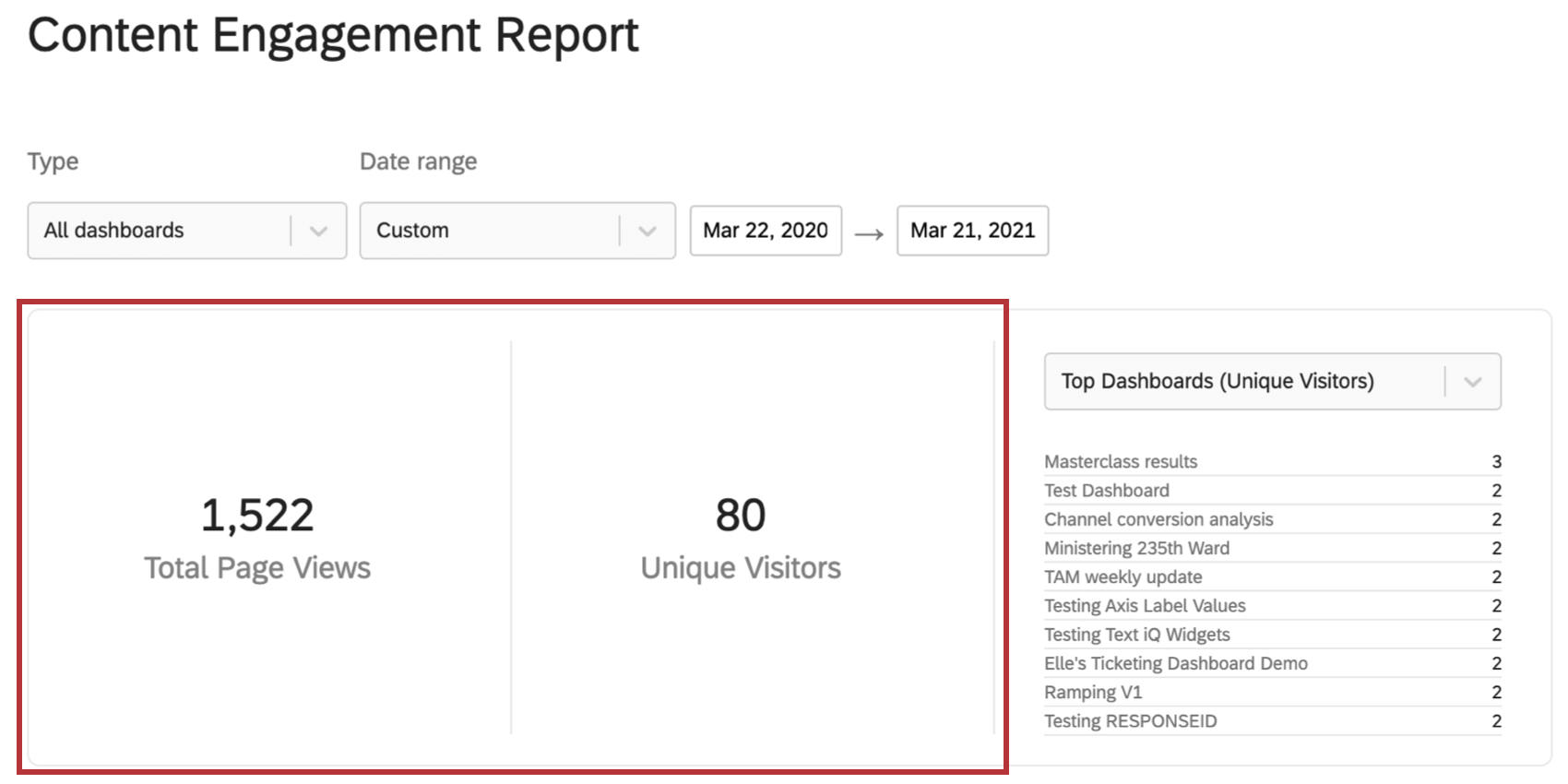
The Content Engagement report is a great way to determine the dashboards your users engage with the most. Here, you can determine top dashboards by timeframe and export data on pageviews and unique visitors.
Type of Dashboards
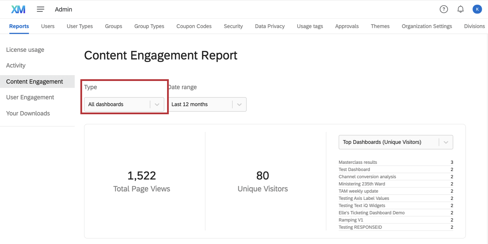
You can choose to view all dashboards in your brand, or specify based on whether they are CX, EX, or BX. Depending on your license and what kinds of projects you have access to, not all of these options may be available.
Date Filter
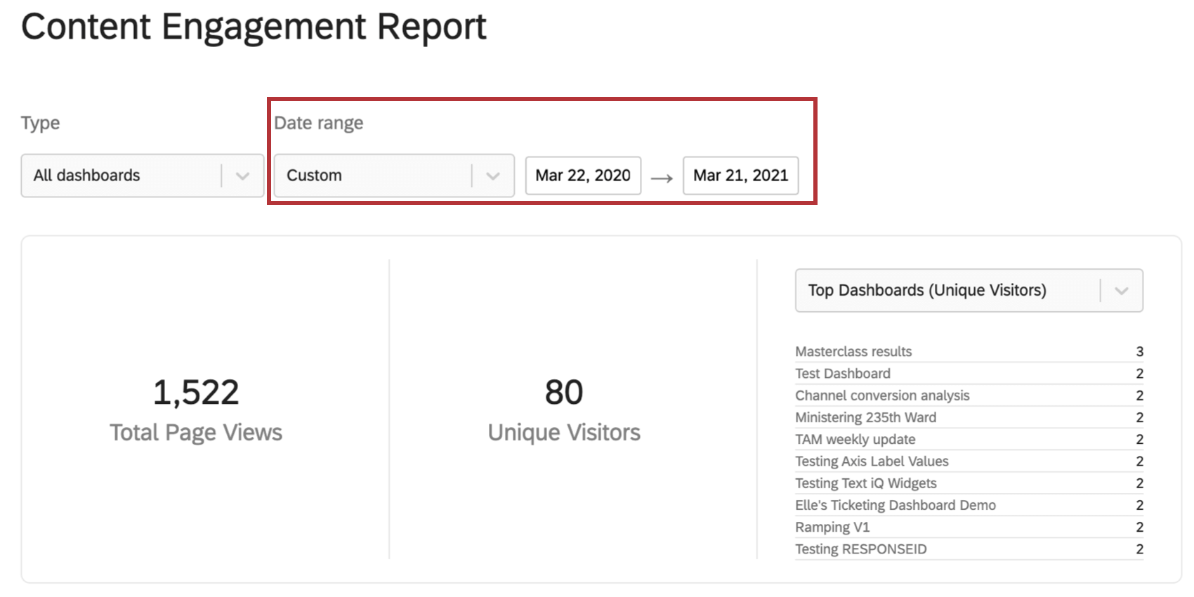
Use the date dropdown to adjust the data displayed on the Content Engagement report. You can choose a preset date, or filter by a custom timeframe. This date filter will adjust all the data in this admin report.
Total Views and Unique Visitors Across Dashboards
To the left of the report are Total Pageviews and Unique Visitors across all dashboards existing in your brand (for the selected timeframe).
- Total Pageviews: Number of individual pageviews. Navigating between pages of a dashboard will increase the pageviews. This metric is generally a higher number than unique visitors, because individuals can visit multiple pages or the same page multiple times.
- Unique Visitors: Individual users in your Qualtrics brand who have viewed the dashboard in the selected timeframe.
Top Dashboards by Total Views or Unique Visitors
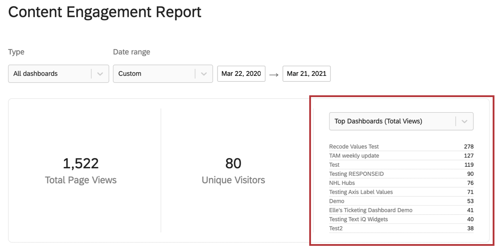
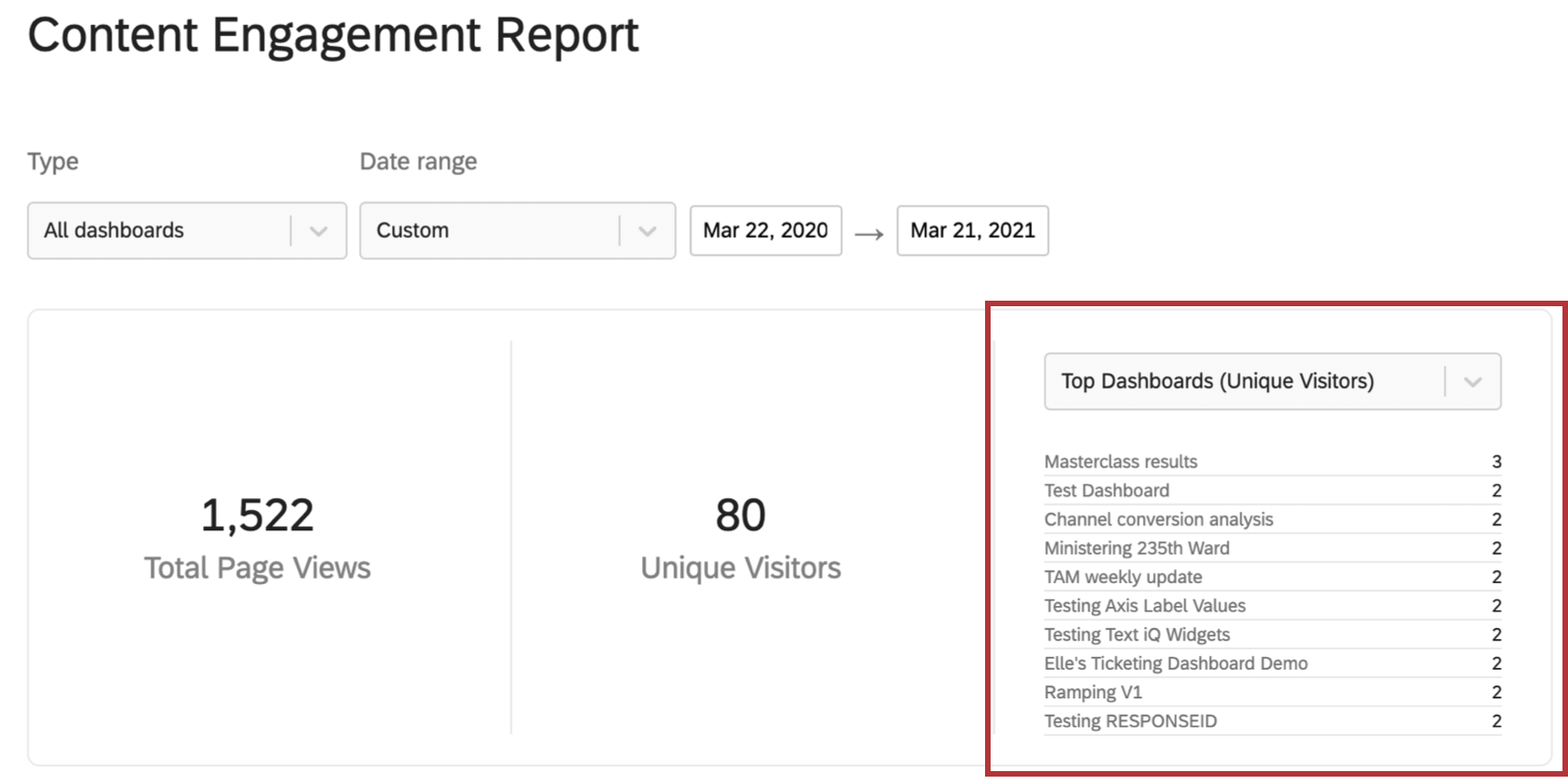
Using the dropdown above the list, you can see the top 10 dashboards in your brand.
- Total Views: See the dashboards that have gained the most pageviews within the chosen timeframe. The exact number of views across all pages of a dashboard will be given for each dashboard.
- Unique Visitors: See the dashboards that have been viewed by the most Qualtrics users within the chosen timeframe. The exact number of unique visitors will be given for each dashboard.
Content Details
The Content Details show unique visitors and pageviews to specific pages of dashboards in your brand (instead of providing this information for the entire dashboard). You can sort the table by pageviews or visitors.
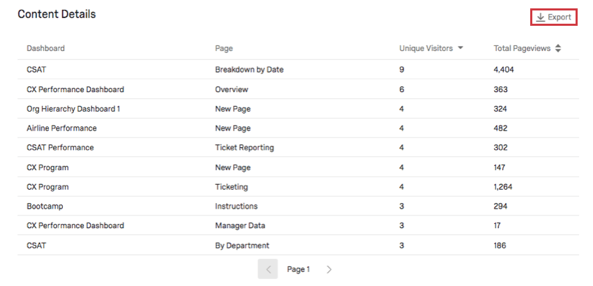
You can download this data to a CSV or TSV by clicking Export. The export includes the Dashboard ID (an internal ID assigned by Qualtrics), the Dashboard’s name, the Page ID (an internal ID assigned by Qualtrics), the page name, total unique visitors, and total pageviews. Each row represents the data for a different dashboard page.
User Engagement
The User Engagement report is a great way to determine which users are most engaged with your Qualtrics license. Here, you will see information on top users and login behavior.
Date Filter
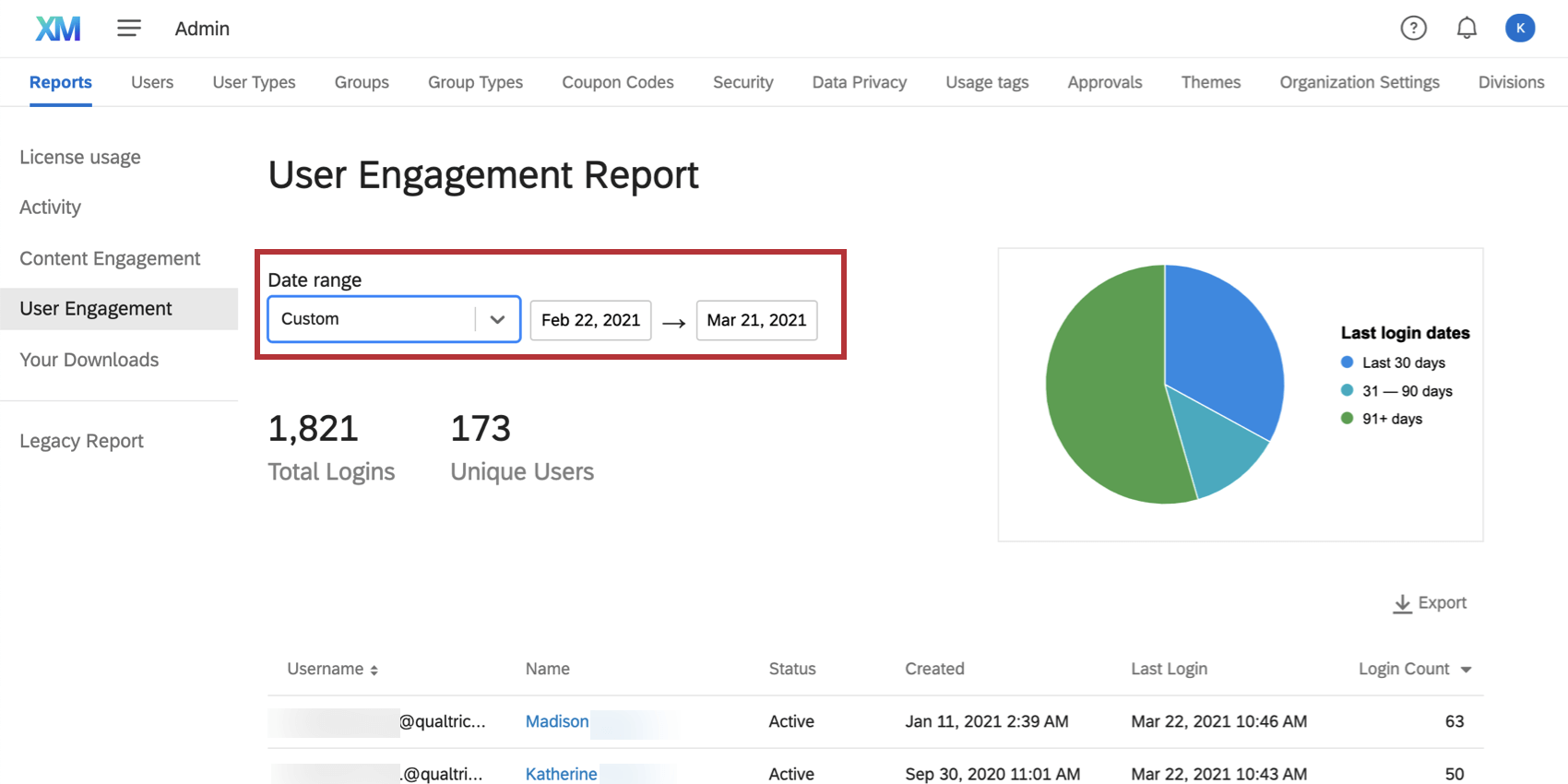
Use the date dropdown to adjust the data displayed on the User Engagement report. You can choose a preset date, or filter by a custom timeframe. This date filter will adjust login and user summary, as well as the data table in this admin report.
Logins
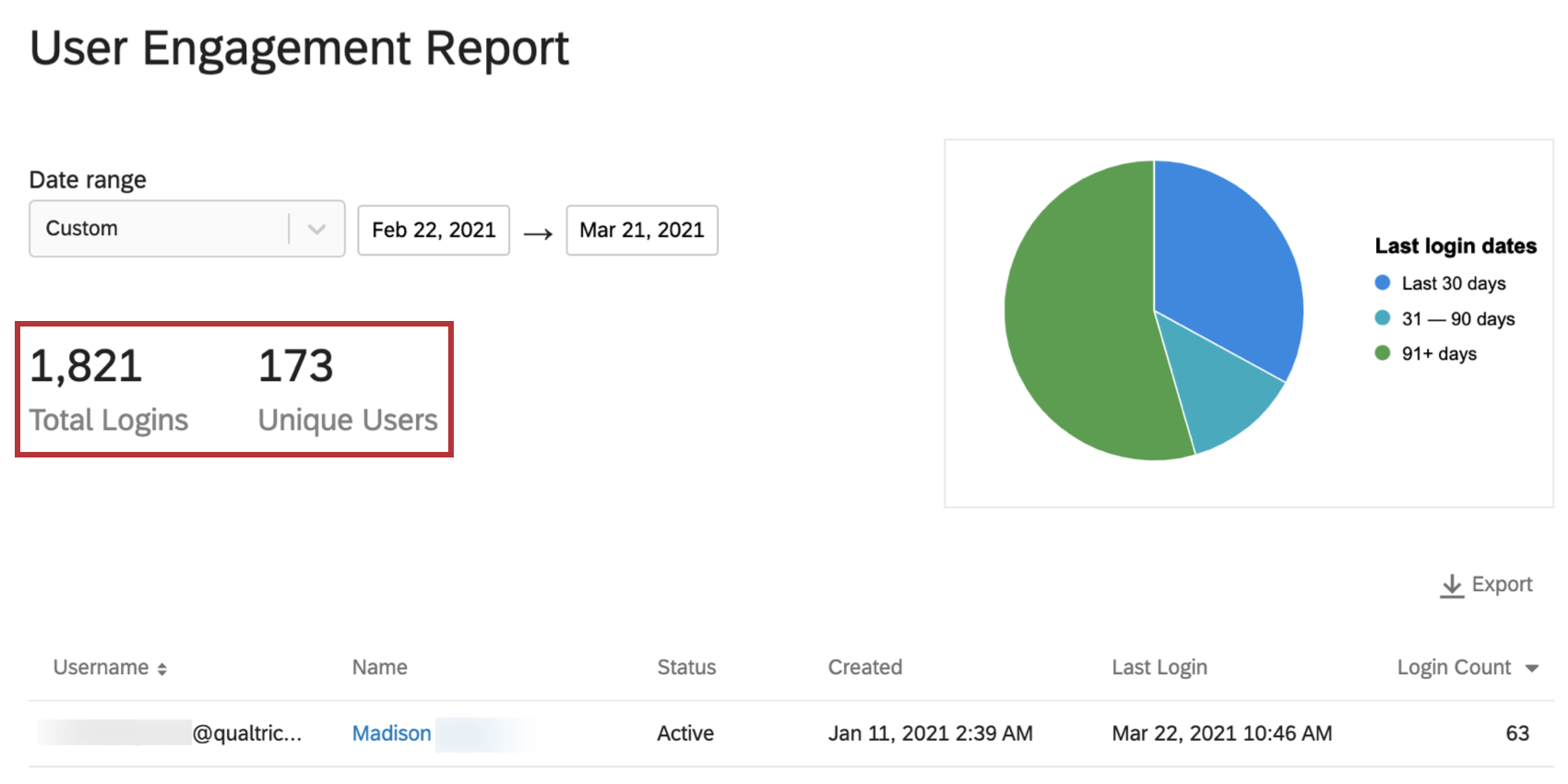
- Total Logins: The number of times users logged into accounts. This includes the same user logging in multiple times, logins to dashboards (both CX and EX), or Brand Administrators proxy-logging into accounts from the Admin page.
- Unique Users: The number of unique users that logged in.
User Details
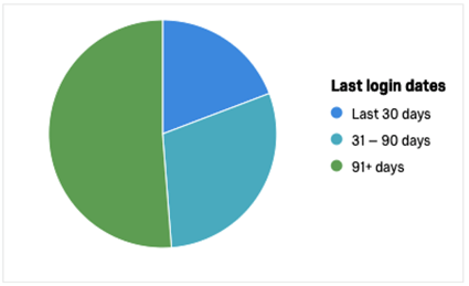
This pie charts shows a breakdown of users who logged in:
- Within the last 30 days (blue)
- 31-90 days ago (teal)
- More than 90 days ago (green)
Hover over a color to get an exact count of users who fit into that category.
Exporting User Details
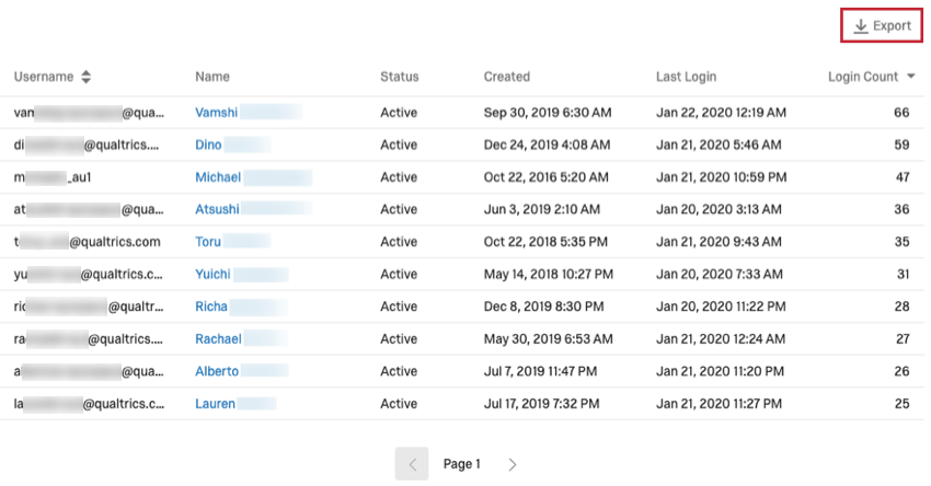
This table shows the usernames, names (which link to the user’s email address), account status, date of account creation, date of last login, and the login count for the filtered users. This table can be sorted by username or login count.
If you export this data, the file will include the user ID (an internal ID assigned by Qualtrics), username, first name, last name, email, account status, when the account was created, when the user last logged in, and how many times they logged in. Like all the data on this report, the export will also match the date filter.
This data can be exported in CSV or TSV format.
Your Downloads
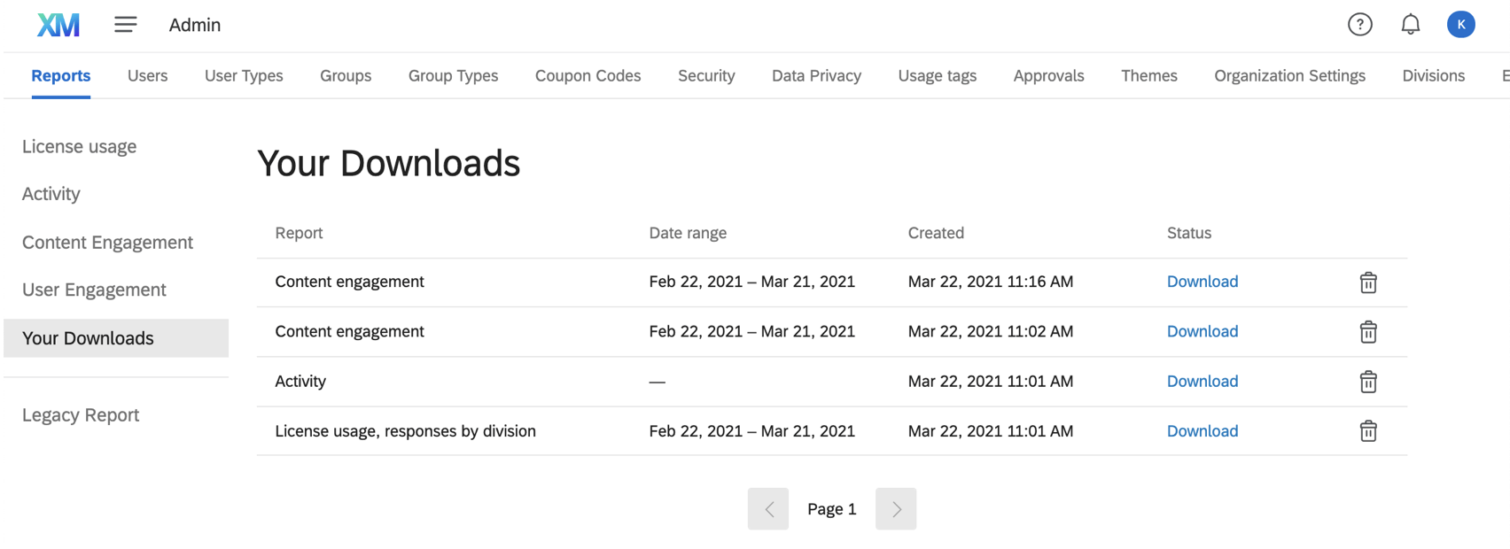
In the Your Downloads section, you can view any files you’ve downloaded from the admin reports. Files will appear here for 30 days.
A list of reports is shown on this page with the report it was downloaded from (e.g., license usage or activity), the dates it was filtered for, the date you requested to download the file, the status, and the ability to delete the file from your download history. Timezones match the one set in your account.
To re-download a file, click Download.
Self-Enrollment Code
The Self-Enrollment Code serves as an extra security measure. For example, if you don’t want to restrict the email domains people can use to sign up with your Qualtrics license, you can choose a Self-Enrollment Code instead. This functions as a code new users have to enter when signing up to complete the account.
The Self-Enrollment Code is randomly generated and displayed at the top of your Admin Report as soon as the permission is turned on for your organization.
Auditable Responses
This section tracks the number of responses collected in your license. This includes any responses collected on the Recorded Responses page, except Preview Data, Test Data, and Imported Responses.
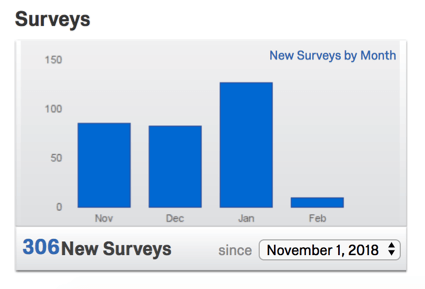
Surveys
This sections counts all the surveys on the license that have a status of new.
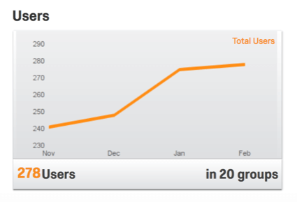
Users
SMS Message Credits
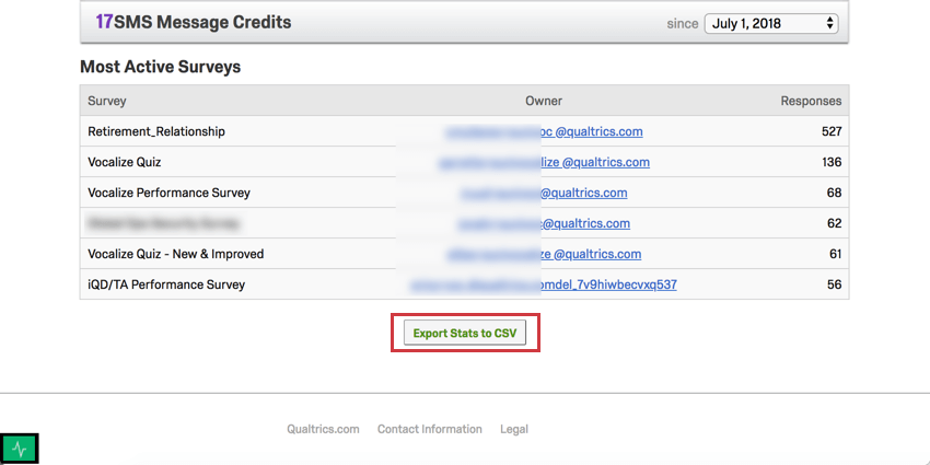
If your license has purchased access to SMS distribution, this section will show you how much of your available credit you’ve used.
Most Active Surveys
This section is a list of surveys sorted from most to least responses received. The survey name and owner will be displayed.
Export Stats to CSV
In addition to these metrics, you have the option to export a detailed spreadsheet of the usage statistics for your organization. This export option is found at the bottom of the page.
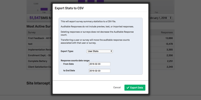
When you export these stats, you will have the option to specify a date range and the type of data you’d like to export.
- User Stats: Statistics for every user in the brand. Includes a column for User ID, username, email, first and last name, the date the user was created, the date their account expires (if such a date was applied), the last time they logged in, user type, user status (enabled, disabled, or not verified), division, number of surveys, auditable responses collected, and “other responses” (previews, tests, etc., which are not auditable).
- Survey Stats: Statistics for every survey in the brand. Includes a column for Survey ID, survey name, survey description (meta description), auditable responses collected in that survey, “other responses” collected in that survey (previews, tests, etc.), survey status, creation date, Owner ID, username of the survey’s owner, first and last name of the survey’s owner, their user type, and their division. Before you export the data, you can choose from a list of columns to sort the data by.
- Survey Stats, Grouped: Export data on auditable vs. “other” (non-auditable) responses. This data can be presented by user (first name, last name, username, or Owner ID), by survey (survey name or Survey ID), or by division.
