
Themes Tab
What's on this page
About the Themes Tab
The Themes tab of the Admin page allows Brand Administrators to create branded dynamic themes for their whole brand to use. With this tool, administrators can create an unlimited number of branded themes, and then restrict who has access to individual themes using permissions. This makes it easier than ever to create beautiful custom themes that comply with your brand’s personal sense of style.

Qtip: Division Administrators do not have access to this theme-building tool.
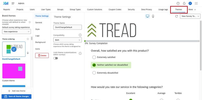
Creating a New Theme
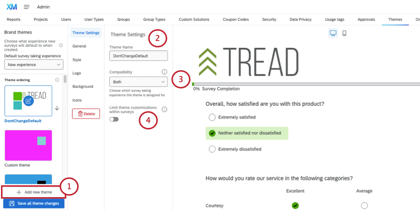
- Both: This theme is compatible in surveys regardless of their survey taking experience type. This is the default compatibility option.
- New experience: This theme is only compatible in surveys with the new survey taking experience enabled.
- Legacy experience: This theme is only compatible in surveys using the legacy survey taking experience.
Qtip: Surveys that currently use a theme that has become incompatible will continue to have access to that theme until the theme is changed in the look & feel editor. Once changes are saved, the incompatible theme will no longer be available for that survey.
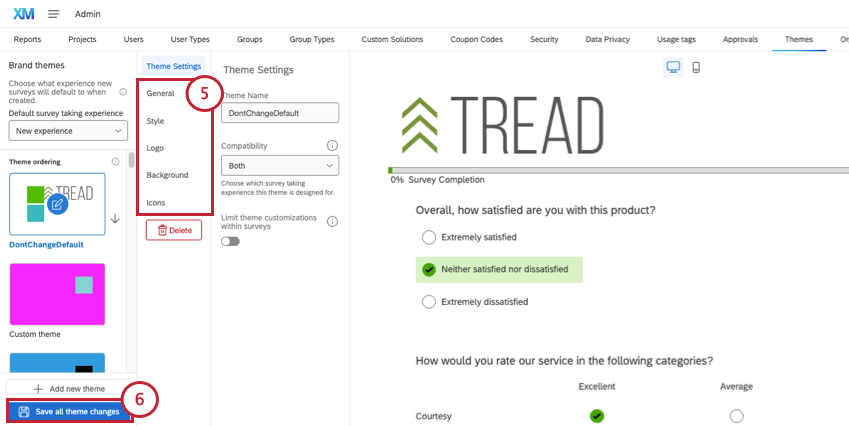
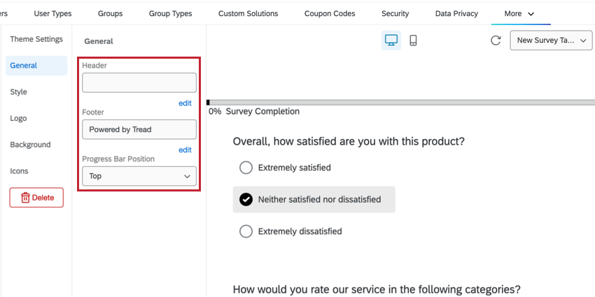
General Settings
This section describes the theme settings available in the General section.
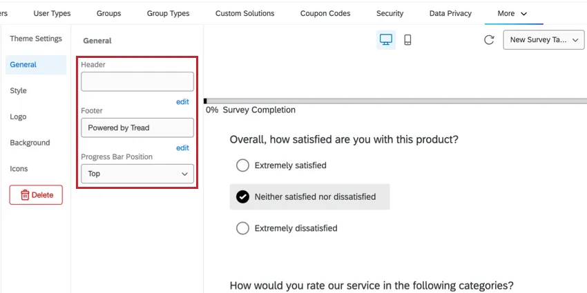
- Header: Enter a header for the theme. Click edit beneath the field to open a rich text editor and add font effects, images, and basic HTML. This setting is optional. Qtip: Instead of adding a logo here, wait until you reach the Logo section.

- Footer: Enter a footer for the theme. Click edit beneath the field to open a rich text editor and add font effects, images, and basic HTML. This setting is optional.
- Progress Bar Position: Determine whether the progress bar should be on the top, the bottom, or whatever the default is for the layout the user selects. Qtip: A layout determines the visual style of questions and buttons in a survey, and is chosen by the survey builder when they customize their look and feel. You can see what your theme looks like using different layouts by using the dropdown in the upper-right.


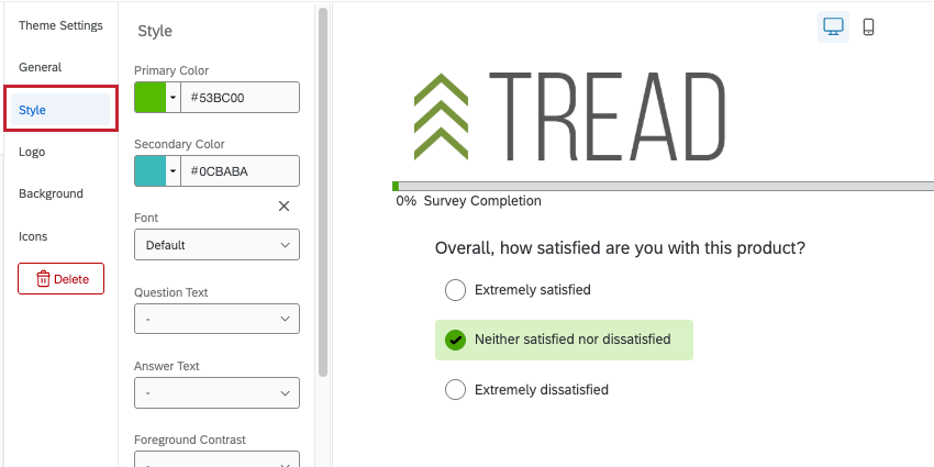
Style Settings
This section describes the theme settings available in the Style section.
Attention: Certain advanced settings, like Custom CSS, could affect a theme’s compatibility. Review these changes to ensure they are correct for the intended survey experience.
- Primary color: Select a primary color. This affects different features based on the selected layout, but is generally the color applied to the selected answers, progress bars, and back / next buttons Attention: In order to have an accessible survey (with a visible focus indicator that is not only indicated by color), you must use the New Survey Taking Experience. See more on Accessible Survey Themes.

- Secondary color: Select a secondary color.
- Font: Choose a font.
- Question Text: Choose the font size of the question text.
- Answer Text: Choose the font size of the answer text.
- Foreground Contrast: Choose the level of contrast between the colors in the foreground (text, buttons, borders, etc.) and the colors in the background.
- Question Spacing: Choose the question spacing.
- Multiple Choice Style: Turn this setting on to show radio buttons for multiple choice questions. This feature is only available in the New Survey Taking Experience.
- NPS Style: Turn this setting on to display buttons vertically for NPS questions taken on mobile surveys. This feature is only available in the New Survey Taking Experience.
- Custom CSS: If desired, add custom CSS. You can click edit to open a larger CSS window to work in Qtip: Custom CSS requires programming knowledge to implement. Qualtrics Support does not offer assistance or consultation on custom coding. You can always try asking our community of dedicated users instead.Qtip: Custom CSS added to a theme in the Admin tab is implemented separately from custom CSS added to a survey in the Look & Feel menu. When you apply a dynamic theme to your survey, you won’t see styles from the Admin themes editor show up, but they are still being applied. This also applies to headers and footers.
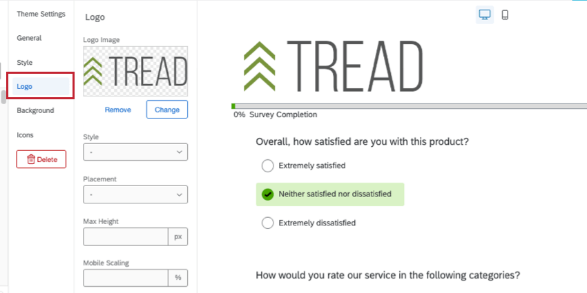
Logo Settings
This section describes the theme settings available in the Logo section.
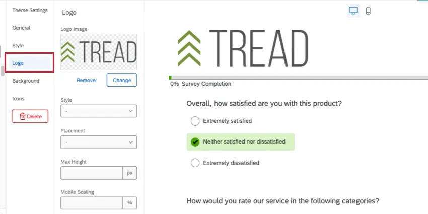
- Logo Image: Upload your logo by clicking on the box. To edit the logo, click Change.
- Style: Determine whether this logo is floating (shows exactly as the image is uploaded), or if it is a banner (adding a block of color behind the image).
- Placement: Choose the placement of the logo.
- Max Height: Choose the max height of the logo.
- Mobile Scaling: Determine how the logo will scale on mobile.
Background Settings
This section describes the theme settings available in the Background section.
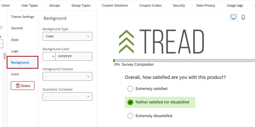
- Background Type: Select if you would like a color or photo as your background.
- Background Color: This option is available if the background type is set to color. Select or enter the hex code for a particular color.
- Background Image: This option is available if the background type is set to photo. Upload a photo to be used in the background. Additional overlay options are available.
- Foreground Contrast: Select the foreground contrast. This can make text more readable or images appear sharper.
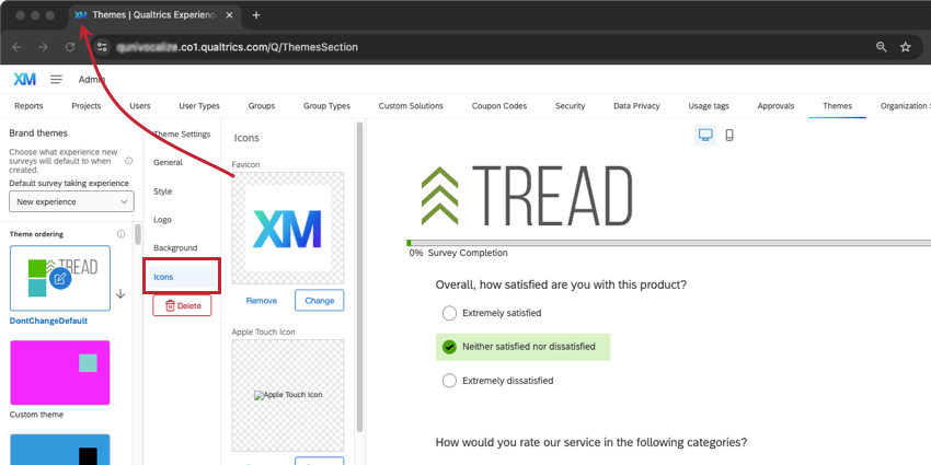
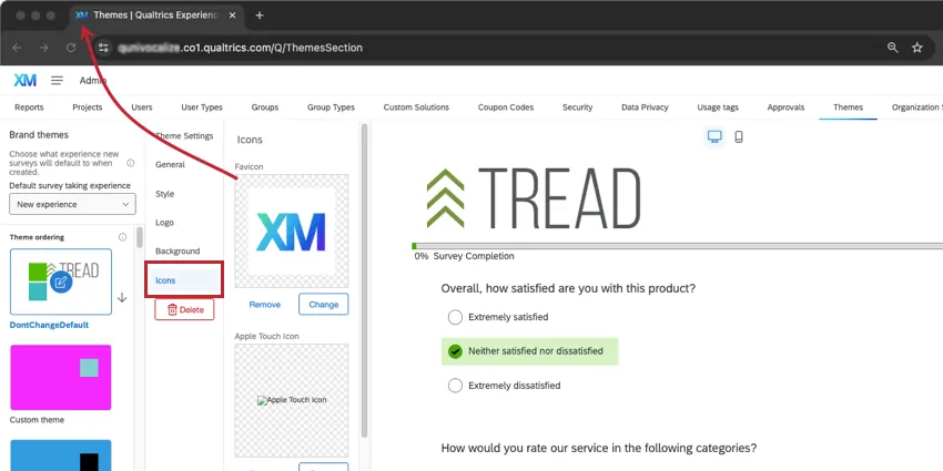
Icons Settings
This section describes the theme settings available in the Icons section.
- Favicon: This is the icon that appears on a tab when the theme is opened. Upload an image by clicking the square.
- Apple Touch Icon: This is the icon that will appear if someone bookmarks a survey with this theme, or adds the survey to their home screen. Upload an image by clicking the square.
- Open Graph Image: This is the icon that will appear when texting the survey’s link on some iPhones and Androids, and when sharing the survey link on social media such as Facebook or Linkedin. Upload an image by clicking the square.
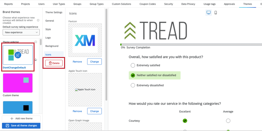
Deleting Themes
You can delete a theme by selecting it from the menu on the left, and then clicking the Delete button on the menu.

Previewing Themes
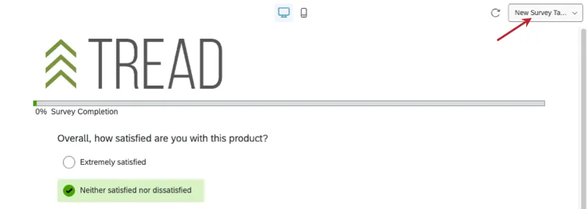
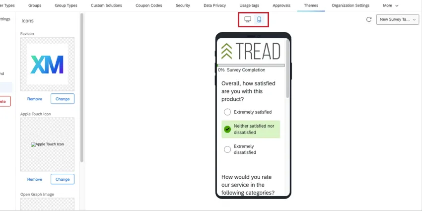
While building a theme, there are a few options to help you understand how the theme will appear when in use.
Using the dropdown in the upper-right, preview the theme with different layouts or the new survey taking experience.
To see the theme on a desktop vs. mobile device, toggle the icons on the top of the preview.
Qtip: If you’d like to see the theme on a specific survey, save the theme and test it using your survey’s look and feel and preview options.
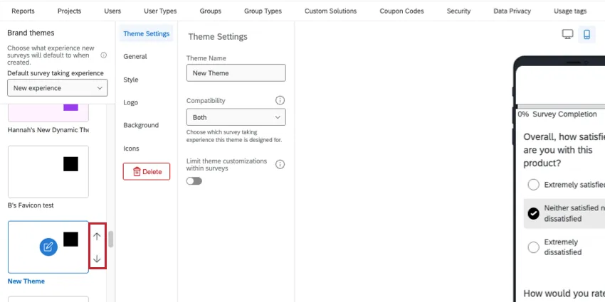
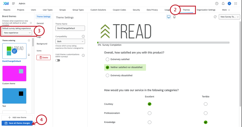
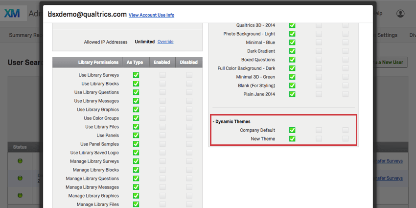
Setting a Default Theme for the Organization
The default dynamic theme used for new projects can be set by adjusting the order of your themes. The first compatible theme in the list is the default theme for any new project created in your Qualtrics organization.
To make a theme the default, click it, then use the arrows to move the theme to the top of the list.
Only new projects are affected when you change the default theme. Existing projects whose themes haven’t been edited will have the previous default theme.
You can use permissions to determine what themes a user, group type, or division has access to. If the organization’s default theme is disabled for someone, that person’s default theme becomes the next compatible theme in the list. There is no other way to set a different default theme for users, groups, or divisions.
Qtip: If your organization has a branded static theme defaulted and you would like to change this to a dynamic theme, contact the Qualtrics Support team.
Setting a Default Survey-Taking Experience
Attention: As of June 30, 2025, many brands are using the new survey taking experience by default, and it will automatically be enabled when creating new surveys.
The new survey taking experience is designed to simplify survey building tools, while also making the resulting survey more mobile-friendly, easy to use, and accessible for your respondents. You can set a default experience that will apply to all new surveys created in your organization.

- New experience: We recommend using the new experience for the most accessible, mobile friendly, and easy-to-use option. Automatically apply the new survey taking experience to all new surveys created in your brand. This setting will not impact existing surveys. Users can still turn off the new experience in individual surveys.
- Legacy experience: Do not apply the new survey taking experience to new surveys created in your brand. Instead, surveys will have layouts that can be adjusted. Qtip: If you’re unsure which to choose, check out our guides to improvements, updates, and features not yet supported by the new experience.
Theme Permissions
Once your theme is saved, you can determine who is allowed to use it by applying permissions on a user, user type, or division level.
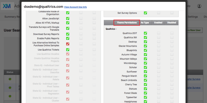
Qtip: If the brand’s default theme is disabled for a user at any level, their surveys will be affected as follows:
- Already existing surveys that use the theme will continue to use the theme unless manually changed.
- Newly created surveys will not have access to the default theme and must use a different available theme.
Applying a Branded Theme
Branded themes are applied just like any of the Qualtrics preset themes, using the Look and feel menu.
Branded themes can be added to just about any project you may have access to, including:
- Survey projects
- XM Solutions
- Engagement
- Lifecycle
- Ad Hoc Employee Research
- Pulse
- 360
- Conjoint
- MaxDiff
Please note that not all of these types of projects are included with every license.
That's great! Thank you for your feedback!
Thank you for your feedback!