How your products look and feel matters
For most brands and businesses, their product’s packaging is typically overlooked. Instead, they opt for the cheapest and fastest packaging solutions, not believing in the power that custom packaging has — both for them and their customers.
But in an age when so many businesses want to differentiate themselves and stand out from the competition, delivering a great product — especially in the B2C space — is just one part of the puzzle. How it looks and feels matters, too.
As more brands and businesses tap into the expectations of the customers and begin to realize how pivotal every element of the customer experience is, they’re taking the time to invest in designing packaging.
No matter how great your product is, if it arrives in low-quality packaging that’s not sustainable nor exciting, you’re losing out on an opportunity to wow your customers.
In this article, we’re going to go through designing product packaging and explain how it can contribute to your brand or business’ success.
What is product packaging?
Product packaging is the way you present your goods and services to the customer.
To most people, ‘product packaging’ implies physical items (e.g. a cardboard box, glass bottle, food packaging packets, bags, wrappings, etc.) that protect items, like a foodstuff or liquids product inside it.
However, product packaging can also mean grouping products and services so that they can be bought as a single unit. This could be to better serve the customer or to target a specific audience, based on what you know about their needs.
For example, a software company might package up a year’s VPN service with virus protection, knowing that their target audience is concerned with privacy and security. The result is a product that’s more compelling and more valuable to the customer.
XM Scientist, Craig Lutz, explains that brands can be “trying to understand what kind of features and functionality should be grouped to produce the most relevant and resonating package. [They’re] not just offering what people will be interested in, but providing the functionality they need to complete the jobs they need to do.”
Let’s talk about how you can make the right packaging design decisions.
How to make the right packaging decisions
Packaging design is a complex field, and the factors involved might depend on the size of your business, the maturity of your market, and whether you’re bringing out a brand-new product or combining your existing offerings in new ways.
Before you begin, think about answering these questions:
Do you know enough about your target audience?
To make the right packaging decisions, it’s crucial to know your target customer well. You need to understand who you are marketing to and what customer needs you will be addressing. This will help you create the best design brief.
Your customer knowledge can make the difference between a brand package that’s greater than the sum of its parts, punching above its weight in terms of appeal and perceived value, and one that simply baffles your customer.
For example, when your customers think about buying a pair of trainers, are they thinking about how they look or how they feel on their feet, or both? Knowing what would be a benefit to your audience will help you decide how to position products and what features to highlight.
You should also make sure your customer knowledge is as up-to-date and comprehensive as possible in preparation for product packaging research. Knowing your prospective customer will be the basis for recruiting your research panel, as the people you survey need to represent your target market.
Packaging design templates
Try out some of our ready-made, free product design templates that offer you a speedy way to connect with your target audience and give you a better basis for making decisions. View the range of templates
What is your budget?
As with any business endeavor, creating amazing packaging solutions requires a solid budget. But how much do you need — and what value does your packaging offer to your customers?
Conjoint analysis can help you weigh up the benefits of possible options to make sure your project is cost-efficient – for example, you can stack up the costs of premium packaging against the value it offers in terms of customer preference and their likelihood of purchase.
What is Conjoint analysis?
Conjoint analysis is a form of statistical analysis that enables you to determine what product features and attributes, services or offerings are important to your target customers, helping optimize your chances for success in that market.
A conjoint analysis example (more on this later) could be a television manufacturer wanting to know if customers value sound over picture quality.
It’s based on the principle that any product can be broken down into a set of attributes that ultimately impact users’ perceived value of that item. This mathematics-based market research method helps to uncover the trade-offs that customers would make by forcing them to select product configurations they prefer. The output is used to model market adoption, competitive analysis, and optimal product packaging.
What is your brand and does it stand out?
You can use conjoint analysis to understand how much of a difference your brand makes to packaging decisions. It’s possible to test branded and non-branded options to determine this. We recommend using the best-practice methods within our Optimum Package Analysis:
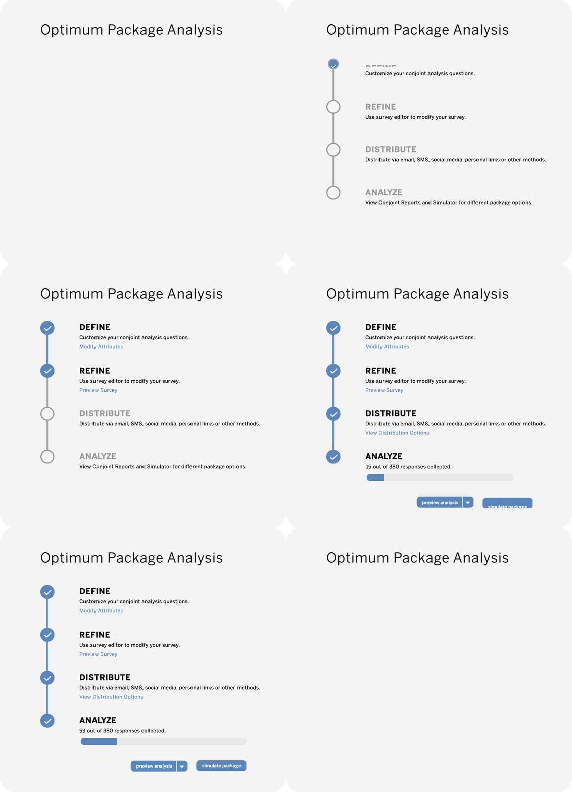
This designs the perfect products and services – from the features to include, to the optimal price point – and looks at the impact of your decisions. For example, you’d use this method to investigate which packaging designs are exactly what the customer wants, by running research to understand their choices:
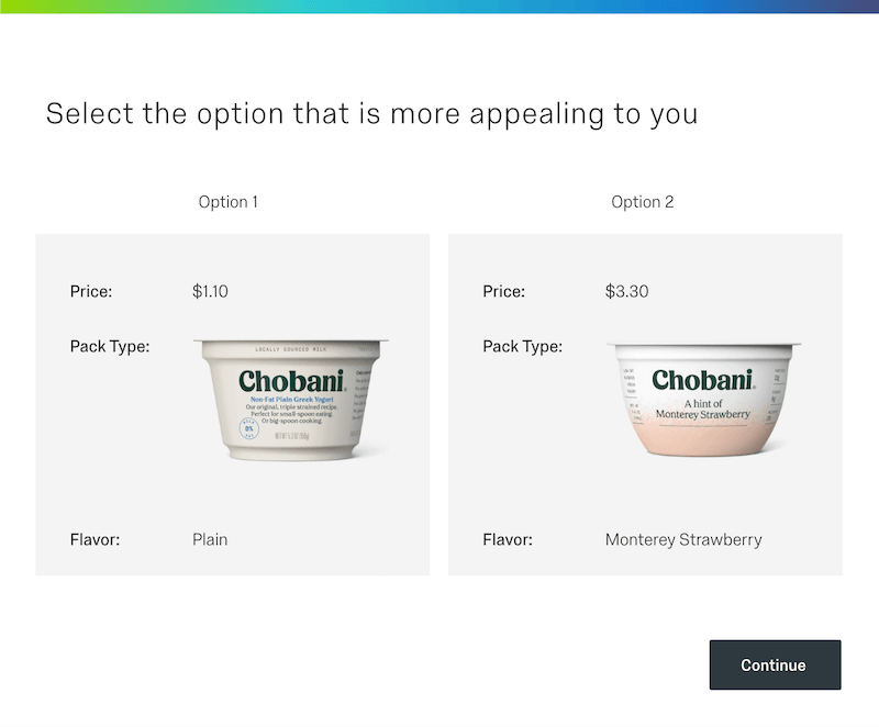
What are the design implications of your product?
Changing up the look and feel of your packaging can be a risk, especially if you haven’t done your due diligence to understand what customers prefer and/or want — but there are ways to do it correctly.
Take the “Share a Coke” campaign by Coca-Cola, for example. Perhaps one of the most successful product redesigns in branding history, this new approach to their package design was instantly recognizable and landed well with customers.
By replacing the title Coca-Cola on one side of the bottle with one of the top 250 names in that particular country (including nicknames and titles), consumers felt an unparalleled connection with the brand.
So whether your product is large or small, made from sustainable materials or needs to be packaged carefully during transport, do your research. Work out what your customers want and ensure they have a clear understanding of what you’re doing and how it differs from the competition. But most importantly of all, make sure they feel involved!
You can also bolster purchases of your products in their new package designs by bundling them with hero products, e.g. other items that customers regularly purchase or are very interested in. Over time, they’ll become more accustomed to your new product packages.
What are your competitors doing with their products?
No product exists in a vacuum. What competitors are doing can affect expectations around price points and functionalities. It can also mean your target customer has some assumed knowledge of your product that could help or hinder you depending on your approach.
What is the sale point for your product?
Is it going to be by the till in your shop, or can it be bought online with a single click? This makes a huge difference to your design priorities – online, you can create eye-catching pictures to advertise your product, while in-store, you may want to consider how much space it takes up and how you showcase it to attract customers.
Learn more about our conjoint analysis tool
Learn moreProduct packaging design process stages
You’ll most likely work with several different designers during this part of the process – a packaging designer, a graphic designer and even other professional designers in-house. You might even enlist an agency for specialist support!
Take stock that you’ll probably need to engage with senior managers, the customer support team, marketing, and brand teams as well, so you may want to get them on board early on.
What’s important to remember as you go through these steps is that the stages provide foundational knowledge of the process, but in reality, the stages can chop and change constantly as your design evolves. There’s no hard and fast process.
Ideation
Consider the following elements as part of your ideas’ creation (ideation) phase – A good packaging design should:
- Call attention to itself: Is your packaging design visible from a distance, but engaging enough to draw attention to it and make people want to get closer to find out more?
- Showcase the brand purpose: Is your brand visible throughout the packaging design in its colours, text font, sleek logos, and label design?
- Awaken emotions: Does the package design make you want to laugh or smile? Or does it get under your skin? If your design packages evoke an emotion, your target customers will connect and be more likely to take notice.
- Be iconic: Does it carry a winning design or a unique design that stays with your target customer or stands out as a first-of-its-kind novel idea?
- Capture and call out benefits: For example, is your product eco-friendly? Does the label design highlight information about the brand? Make sure your benefits are visible to all.
Concept
“The first stage in making a packaging decision is to consider your options. You need to be as open as possible and avoid closing off possible options too early,” says Craig.
“At least initially, you’re thinking of the total space available. You’re brainstorming any and all ideas you’re having for what could potentially be included.”
“It’s important to be really broad with the attributes and functionality you consider because you don’t want to disregard or remove something too quickly.”
“From there you’re going to carry out different exercises to arrive at something a little more actionable. And so you’re going through different exercises.”
Gather information about your:
- Brand colours (RGB, CMYK, Pantone Matching Values or hex codes)
- Brand font types and style guides
- Source files for your logos in various formats (PNG, JPG, and SVG)
Bring all this information together into a design brief that contains the design ideas, which you can distribute and provide feedback on.
Copy assessment
Before you move on, make sure the relevant teams have signed off on all packaging design copy (and associated materials). This includes copy, imagery, packaging design marks (e.g. logos and expiration dates), copyright terms and conditions, and the actual strategy.
Artwork review
Create the artwork for each packaging design or custom packaging design. This can include information on cut lines, a dieline template, printing requirements, and any ancillary design elements. Production artists will create print-ready files you can take forward to printing — most likely using Adobe Illustrator for .ai, .pdf, or .eps files.
Prepress
Prepress is when the design files are readied for printing by reprocessing and preparing the designs with the print machinery. The printers assess the colours used to see if there’s any overlap and test the designs to ensure they’re ready for mass-scale production.
Hardcopy color proof
Your design is checked to see if it keeps closely to the predefined color reference chart so that your brand color palette is preserved to prevent wasted money and reprints.
Printing and press
Your printers will turn your packing design into reality by creating a STEP file that can be used by many printing machines. Press plates are made for each color and the print production is scheduled. You’re ready to print!
Examples of great product packaging and design inspiration
What makes a great packaging design? Here, we’ve collected some ideas that you might want to consider trying out?
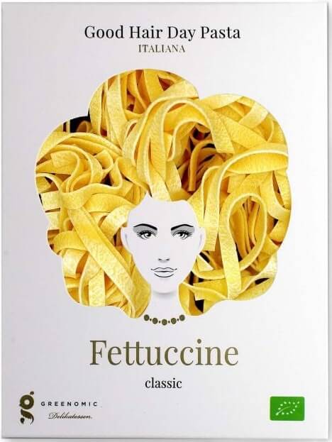
- Make your packaging design innovative? How does it take an idea and give it a new spin? For example, Pasta created really simple packaging that highlighted pasta’s different shapes, and used the see-through cut-outs as a replacement for hair.
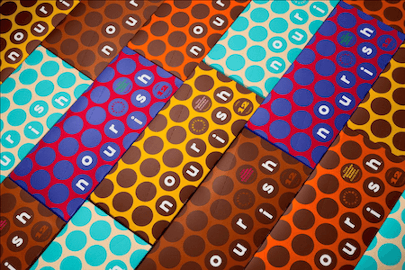
- Can you use repeated geometric or contemporary patterns? This can look very sleek, as in the case of Nourish Snacks. Its earthy tones and repeated honeycomb pattern in contrasting colous really stand out.
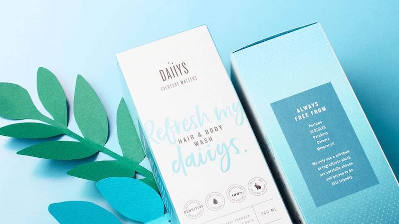
- Minimalist design can look very high-fashion and tell a story. Toiletry brand Daiiys’ simple packaging and tame color scheme showcase the simple ingredients that are used in the products themselves.
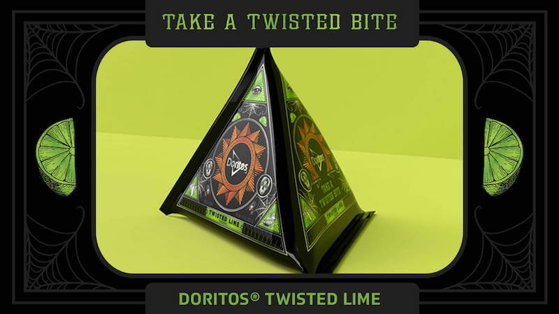
- How would a novel shape make your product stand out? The Doritos brand brought out a twisted lime flavour and emphasised the power of the taste by using packaging design inspired by powerful secret societies.
- How can you mimic sophistication? Champagne brand, Monte-Carlo, created an elegant vintage-style packaging design that was elevated by gold foil accents and fancy typography.

Leveraging product packaging design software
“Doing packaging design is about having a set of tools you can work with and applying them according to the situation” says Craig. “There may be pricing exercises you can go through to look at the best price point, and tools like Max Diff and card sorting may also be helpful.”
A key part of that toolkit is conjoint analysis. “You’re likely to end up doing a conjoint analysis at the final stages of your research. It’s often one of the last steps, after you’ve identified the features and functions that matter most out of your total scope of possibilities.”
Although there’s a lot to consider with packaging design, you can now automate important functions and use best-in-class analytics to arrive at the optimal solutions. Businesses are saving time and money by using Qualtrics XM software rather than outsourcing conjoint analysis projects.
“Conjoint analysis helps organisations understand the trade-offs involved when choosing what to include within a package,” says Craig.
“It helps them understand what’s really important to have included, what’s not as important, and subsequently things like people’s price sensitivity and the costs involved in production.”
“Other exercises help you to carry into the conjoint analysis only the attributes, features and functionalities that really matter – the things you could potentially go forward with.”
“Then within the conjoint analysis exercise, you’re testing a more finite set of attributes, interchanging those and understanding what rises to the top and what people are really adamant about in terms of inclusion.”
Qualtrics tools make it possible to bring conjoint analysis in-house so that you’re not dependent on an agency or third-party service to make changes or run tests. That’s important because you want to have the freedom to change your approach and explore new possibilities as they arise.”
Using survey software to design better product packaging
How does survey software work to help you create better packaging design? The Qualtrics Conjoint XM Solution analysis to design and launch your products includes:
- Conjoint Configurator – An intuitive and self-serve interface for rapid configuration of attributes, features, and levels and creation of both Conjoint and Maxdiff studies in a matter of a few clicks.
- Conjoint Simulator – A simulation interface that allows users to predict respondent trade-offs in order to design the most optimal package.
- Conjoint Clustering – With auto-clustering, Qualtrics users can segment populations based on their package preferences – allowing for targeted pricing, planning, and marketing.
“We have developed a do-it-yourself, easy-to-use technology that allows users to conduct this type of research on their own,” explains Craig.
“We’re empowering companies to act for themselves so they don’t have to go to outside consultants to conduct this kind of research. They’re running studies that help them understand how their products should be packaged and priced. It’s very intuitive and easy to use.”
Get started with a conjoint analysis demo