Brand identity definition
What is brand identity exactly? Well, in simple terms you can think of it as the visual building blocks of branding, and the design elements linked to your brand personality. It’s the logo, brand colours, typeface, and other visual elements of a particular brand – the things that people might look out for in a shopping mall, or amongst a list of products.
Think about McDonald’s’ golden arches; Coca-Cola’s swirling font and iconic red; Nike’s ‘Swoosh’; Google’s four distinctive colours and Apple’s… well, Apple.
Brand identity corresponds to the intent and approach behind these elements. Brand image is the actual results of these efforts- whether successful or not.
These are some of the hallmarks of great brand identity building, alongside other, less noticeable touches. For example, you might not pay attention to the particular fonts being used by Apple and Google, but they are different and ironclad for each – as part of their efforts to build a consistent brand identity.
Brand identity cornerstones:
- Logo
- Colours
- Font/typeface
- Shapes and iconography
- Tone of voice
In essence, brand identity your customers recognise you amongst a crowd, and to cultivate positive associations for your customers.
Turn your brand into an icon with Qualtrics BrandXM
Why is brand identity important?
There are a few key reasons that brand identity should be seen as a central focus of any company’s brand activity, and they have a lot to do with customer preference and customer loyalty.
First and foremost, building a strong, consistent brand identity helps lend credence and build a reputation. At its height, standalone elements of your brand identity – like your logo – could be enough to convince someone to buy your product over any other. Just think about how Gucci products command a higher value than non-brand clothing, as a simple example. Or how Adidas’ three stripes on a pair of shoes might make you feel reassured that they’ll help you run faster than a cheaper alternative.
That’s great if you’ve already achieved strong brand recognition, but what about when you’re just starting out? In that instance, making the visual elements of your brand identity appealing and memorable will help you stand out in a list of similar products. And if you can make your brand identity reassuringly consistent, you’ll appear more professional than those whose identity is harder to pin down.
Furthermore, humans are often driven by emotion – and so are our purchasing decisions. So if your brand identity is built on a bedrock of professional design that appeals to people’s tastes, you’ll stand a better chance of getting them on board than a less visually-striking competitor.
Characteristics of a strong brand identity
The tricky thing about brand identity is that – as with anything visual – there’s a lot of subjectivity. One person might love a specific design while another hates it. With that being said, though, there are a few core characteristics that every organisation should try and keep in mind when it comes to developing brand identity design:
Unique brand identity
Strong brand identity is really about standing apart from the crowd, and being instantly recognisable is the goal. If any of the various visual elements of your brand can be easily confused for another organisation, you’re in trouble. Being unique helps people remember you, and that often comes from a visually striking treatment that can’t be mistaken for anyone else.
Uniform brand identity
If your logo, colours, and fonts all look like they don’t belong together on the same page, you have a problem with cohesion. Your finished brand style guide should ideally boast complimentary colours, shapes, and typesets so that however you apply your brand’s visual elements, things have a sense of uniformity and togetherness.

Image source:Vengage
Appropriate brand identity
As well as looking like they belong together, strong brand identity design needs to be appropriate for the industry you operate in. If you’re in a corporate environment, squiggly handwriting will probably make you look unprofessional. Conversely, if your organisation works with children, you probably don’t want your brand assets to be too stuffy.
Adaptable brand identity
The different elements of your brand identity design need to be easy to apply in a multitude of settings. Designers should feel confident in using your visuals online, in print, and out-of-home, while your company colours should be flexible – allow for colour inversion, and use in various combinations
Accessible brand identity
It’s always worth giving thought to those with disabilities when designing your brand essence. Will colourblind people be able to make out your logo? Does your brand’s typeface cause problems for those with dyslexia?
Elements of brand identity design
Your brand identity will be present on everything from product packaging to email signatures, but the key building blocks of it from a design point of view are as follows:
Logo
Your company name, and/or a symbol in its place. Think: Nike as it’s written out, and the ‘Swoosh’.
Colors
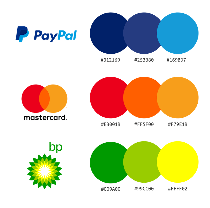
The palette that appears in and around your logo, on your website, across your packaging, etc. A great example of this is IKEA’s iconic blue and yellow.
Typography
The fonts you use and how you use them – including guidelines for things like white space around your logo, and how different fonts work together.
How to build a strong brand identity
Ok, so now you know the main components of brand identity, it’s time to create or fine-tune yours. Here are a few strategies for creating a visual brand image that people will love:

Image Source: 99Designs
Do your research
Before you fire up any graphic design software and start mocking up brand assets, you need to be confident of your positioning. So the first thing to do is market research – dive into your target market and your competitors to learn what works, what doesn’t, and what people expect from brands in your field.
Hone your personality
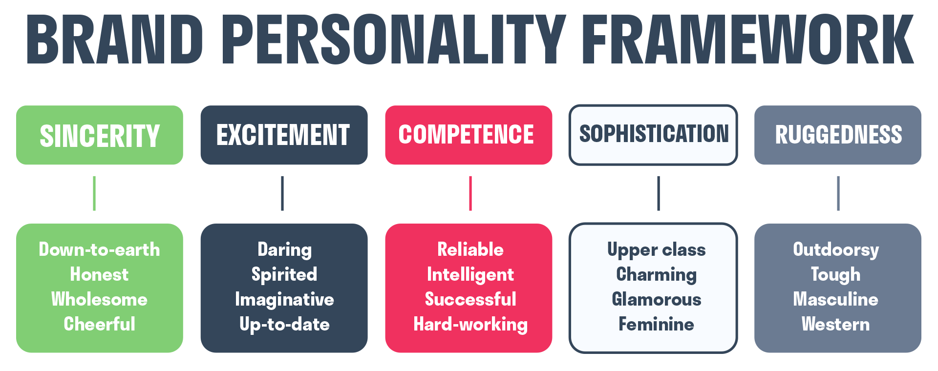
The information you’ll gather in the market research phase will help you develop your brand’s personality and a set of values – your brand’s mission statement should also feed into your visual identity.
It helps to think about how people think and present themselves as a metaphor for brand identity; someone with conservative values will dress very differently from a counter-culture punk music fan, for example. It’s the same for organizations: your values should inform your brand image.
Design and document your brand identity
Ok, now you have a vision for what your company stands for, it’s time to put pen to paper. Your design team should think in terms of usability and uniformity – it’s best practice to clearly state rules for how various parts of your brand identity can and can’t be used.
When it’s time to distribute brand assets, it’s worth taking the time to template every possible use case – from PowerPoint decks to stationary – so that people can’t accidentally veer away from design guidelines, and so that using your brand identity in practice is as easy as possible.
Think about language
Your brand identity should also shine through in the way you write. Airtight Tone of Voice documentation will help anyone representing your brand online do your brand personality and brand strategy justice – and bring consistency to your overall brand identity.

Image Source: Hurree
3 famous brands that nail brand identity
Apple
Apple’s always on these kinds of lists for good reason: if you can replace your company’s name with a symbol and still have people recognise you, you’ve won. Apple has an iron grip on its brand identity and branding across the board, with a consistently premium, minimalist, and clean look and feel permeating everything from its website to the actual design of its products.
IKEA
There’s an elegant ‘no-nonsense’ feel to just about everything IKEA does in terms of brand identity, which is completely intentional and in line with the products they make. They also score highly on brand recall tests because they’ve taken the smart step to adorn their physical stores in their striking blue and yellow.
Airbnb

Airbnb underwent a major rebrand in 2014 and has since done an excellent job of positioning its logo (and colour scheme), to the point where it’s now a widely-recognised piece of iconography. The company’s brand identity stems from a mix of premium reliability and a sense of fun, spirited humanity.
How to measure the strength of your brand identity
Building a strong brand identity doesn’t start and stop with the upfront work. Branding in general is an ongoing process – one that needs to be monitored and measured in order to prove growth.
There are a few ways you can measure brand identity as part of brand image, brand awareness, and brand perception:
Surveys
There’s a huge number of different types of surveys out there for monitoring all things branding, but perhaps the most common is the brand perception survey. This kind of survey can help you understand how your brand identity is perceived in the mind of customers, as well as prospects, employees, and other stakeholders. For many growing brands, these perceptions may change drastically over time. In fact with continued investment to amplify the brand it should! To track changes in the brand and it’s overall health, leaders commonly use brand trackers as a solution to keep a pulse on their markets.
They paint a great picture of the ‘mental real estate’ your brand owns, letting you see how that stacks up against your aims. You can then use that data to make informed decisions that impact brand identity over time.
If you’re looking for help getting started, Qualtrics has a host of tools available for running surveys for customers and prospects.
Social listening
You can get a good grasp of how customers feel about your brand identity – and how it compares to the rest of their experiences with you – by using social listening tools that include sentiment analysis.
Qualtrics enables companies to listen to all social data sources, gathering and analysing customer data from any social media source and any online review site, including Facebook, Twitter, TripAdvisor, and Booking.com, among many others. Our platform also integrates data from social CRM tools and social media monitoring software such as Sysomos, Radian6, and many more for a comprehensive view.
Always-on feedback
When you’re in a fast-moving industry, a lot of customer-focused data quickly loses its relevance. That’s why it’s also important to incorporate always-on feedback into your brand monitoring.
Qualtrics’ XMOS™ is an experience management platform that delivers real-time, AI-powered insight into everything from your brand identity to the customer experience, helping you drive a culture of action that will constantly move the needle for your brand.
Turn your brand into an icon with Qualtrics BrandXM