Step 3: Building Your Creative
Now it’s time to start thinking about what kind of visual you want to use to capture your visitors’ attention, and how you want it to behave. Do you want messages to glide over the screen, or appear suddenly? Do you want a small tab people can choose to click on or ignore, or a big image that pops up to steal their attention? These visuals you’ll be using to ‘intercept’ your visitors are called creatives.
Choosing a Creative Type
Once inside your new Website / App Insights project, you’ll want to get started making creatives. Below are some of the most popular Creative types:
- Responsive dialog: This creative is similar to pop over and slider creatives. It appears on top of your web page and automatically scales to the visitor’s device size. This creative provides accessibility features out of the box without the need for additional JavaScript-based updates that can be required in other creative types.
- Pop over: This creative type can be used to catch your visitors attention.
- Feedback button: This creative is especially useful if you want to be subtle in collecting the valuable feedback you need. The fixed design makes this creative one of the easiest to use and implement.
- Slider: This creative has a similar look as the feedback button. Once a visitor clicks on the tab section of the slider, the remaining section of the slider animates out from the webpage border.
Qtip: Both feedback buttons and sliders are subtle ways to gather feedback from your site visitors. When choosing between them, keep the following in mind:
- For sliders, only a tab is visible to the visitor at first. Once selected or on page scroll, the remaining part of the creative will animate out. An example of this behavior can be found on this support page, where you see a tab that says Feedback.
- Feedback buttons can also behave this way, but only if you created it after September 27, 2019, and you set the Web Display animation to Slider.
- Feedback buttons also have an option where clicking the feedback button opens the survey in a new window instead. This is possible if you set the Web Display animation to New Window.
Designing Your Creative
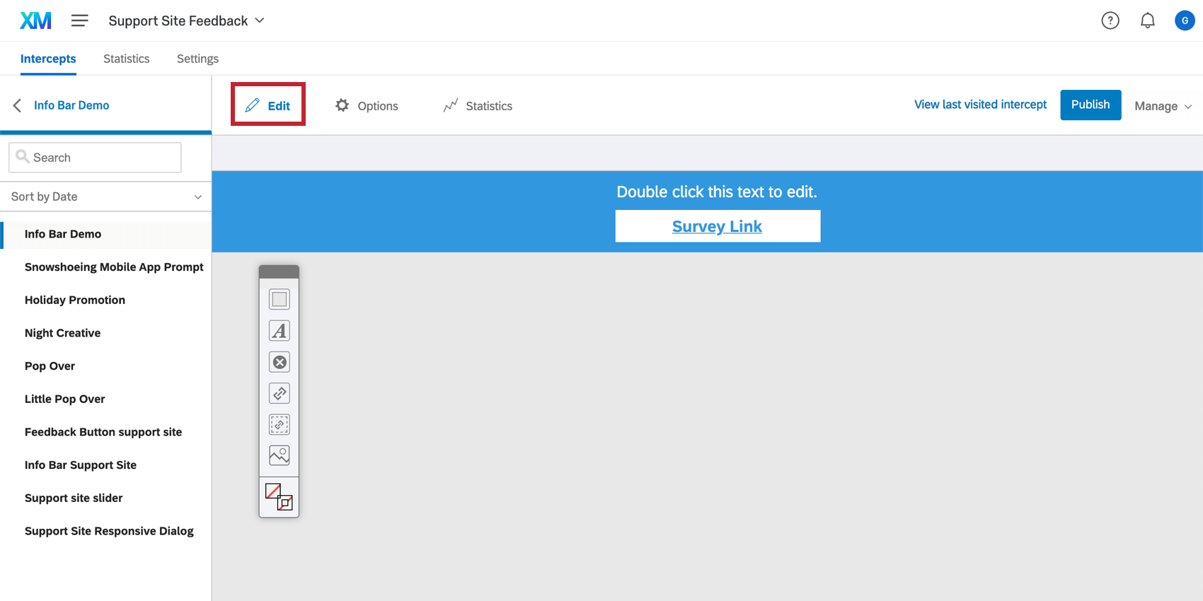
Once you choose a creative type, you can start customizing it to your needs in the Edit section. Keep your creative design clean, but don’t be afraid to make it pop. Always check with your web design team to make sure the creative follows the style guide associated with your company or website.
You can customize many things about your creative, but here are some of the main things to consider:
- Sizing: The dimensions of your creative will remain static when displayed on both a desktop or mobile view. In the case where you want your intercept to appear on 2 different device types, you’ll need to build 2 separate creatives, so one is mobile optimized. Otherwise, it is important to format your creative so it will appear nicely on both a mobile and desktop view. Adjusting the dimensions of your creative may also help with eliminating your scrollbar. If you are unsure about the appropriate dimensions for your creative, you can use the Preview mode to test the display on any given screen resolution.
- Target: Decide whether you want your target to display right on the creative (e.g., a survey that appears on a slider) or if you want to link out to it using text or a button. You’ll also want to decide where this target is positioned on the creative.
- Close Button: Decide how your users exit the creative. Qualtrics provides premade buttons, but you can also use text or an image of your own.
- Adding a Logo: There are 2 ways you may add a logo to your creative. You can insert a graphic directly into your creative using the toolbar. Alternatively, you can add a logo directly into the header of your survey within the Advanced tab of the Look and feel menu. If you are using a customized theme, the logo may already be applied to your survey.
Deciding How Your Creative Behaves
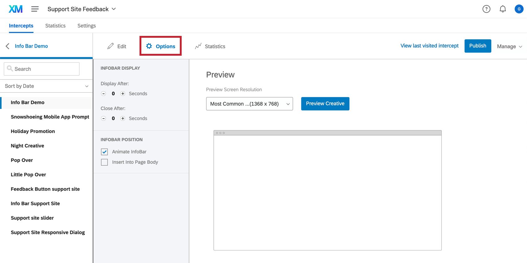
The Options section helps you decide how you want your creative to behave, such as how it glides onto the screen, where it’s positioned, the timing of its appearance, and more. Every creative is slightly different in how it behaves, so the options presented in this section vary for each creative.
Testing Your Creative
In the Options tab, you can preview your creative. Preview Creative mode is a quick and easy way to test whether your creative is formatted as you intend. The Preview window will take into account any conditions you have set in your creative options. If you do not see your creative appear in the preview window, you will want to go back and double check the formatting of your creative.
Publishing Your Creative
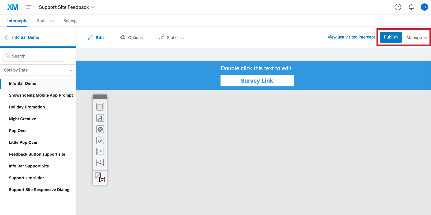
Once you’re happy with how your creative looks and behaves, make sure you Publish it! This pushes your changes live to your website, so long as you’ve deployed your code and activated your intercept.
If you are not ready for your creative to appear on your site, Qualtrics will save your changes automatically and keep them from deploying until you are ready to publish.


