
Significance Testing in Dashboard Widgets
What's on this page
About Significance Testing in Dashboard Widgets
Dashboards can help you understand whether the differences you see over time or between groups are statistically significant, and therefore worthy of driving important business decisions. For example, you may have found yourself asking the following:
- Did the NPS really go up this month, or is it a small change that’s just noise in the data?
- Does the Midwest group actually have higher satisfaction scores than the West group?
- Which of my 5 segments had higher or lower than typical scores on this metric?
With significance testing, you can discover which data changes matter most.
Available Widgets and Metrics
Significance testing is currently available in the following widgets, with the following parameters. We’ll go over these in more detail in the following sections.
Widgets
Qtip: Significance testing is also compatible with any type of dashboard that supports the widgets listed above, including CX, EX, BX, and Results Dashboards.
Metrics
- Average
- NPS
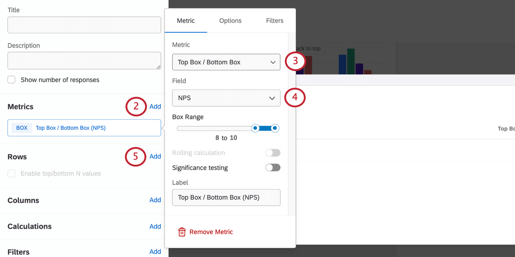
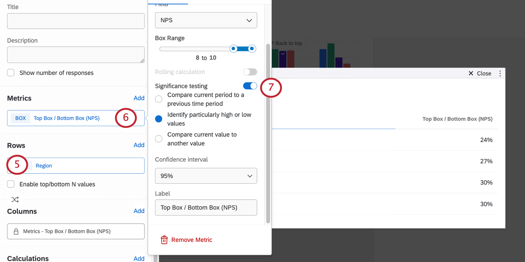
- Top / bottom boxes
- Subset Ratio Qtip: In order to conduct the significance test, the numerator must be a subset of the values selected for the denominator. Additionally, the ratio must be less than one.

- Custom metrics
Qtip: When testing significance across time periods, the x-axis/y-axis dimension should be a date field. When testing significance across values the x-axis/y-axis dimension should be a non-date field.
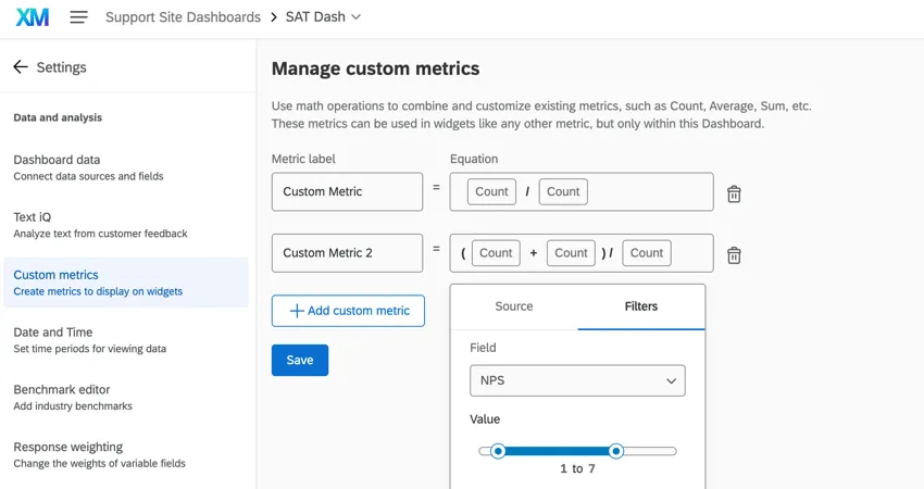
Qtip: In some legacy widgets, one type of custom metric can be used with significance testing: proportional custom metrics with a single field as the divisor. Proportional custom metrics follow the general format of (A + B) / C where A, B, and C are different data fields. A / B also works, since there is just a single field as the divisor. When creating custom metrics for this purpose, you can only use counts, as shown below. There cannot be static number in the equation; e.g., (A + 5) / B will not work.
However, custom metrics, including proportional custom metrics, are unsupported in the majority of newly created widgets.
Setting Up Line and Bar Charts
Qtip: If you want to compare 2 time periods, select a date field. If you want to compare 2 values, select a non-date field.
For details on each of these options, see Configuring Significance Testing.
Setting Up Tables
Qtip: If you want to compare 2 time periods, select a date field. If you want to compare 2 values, select a non-date field.
For details on each of these options, see Configuring Significance Testing.
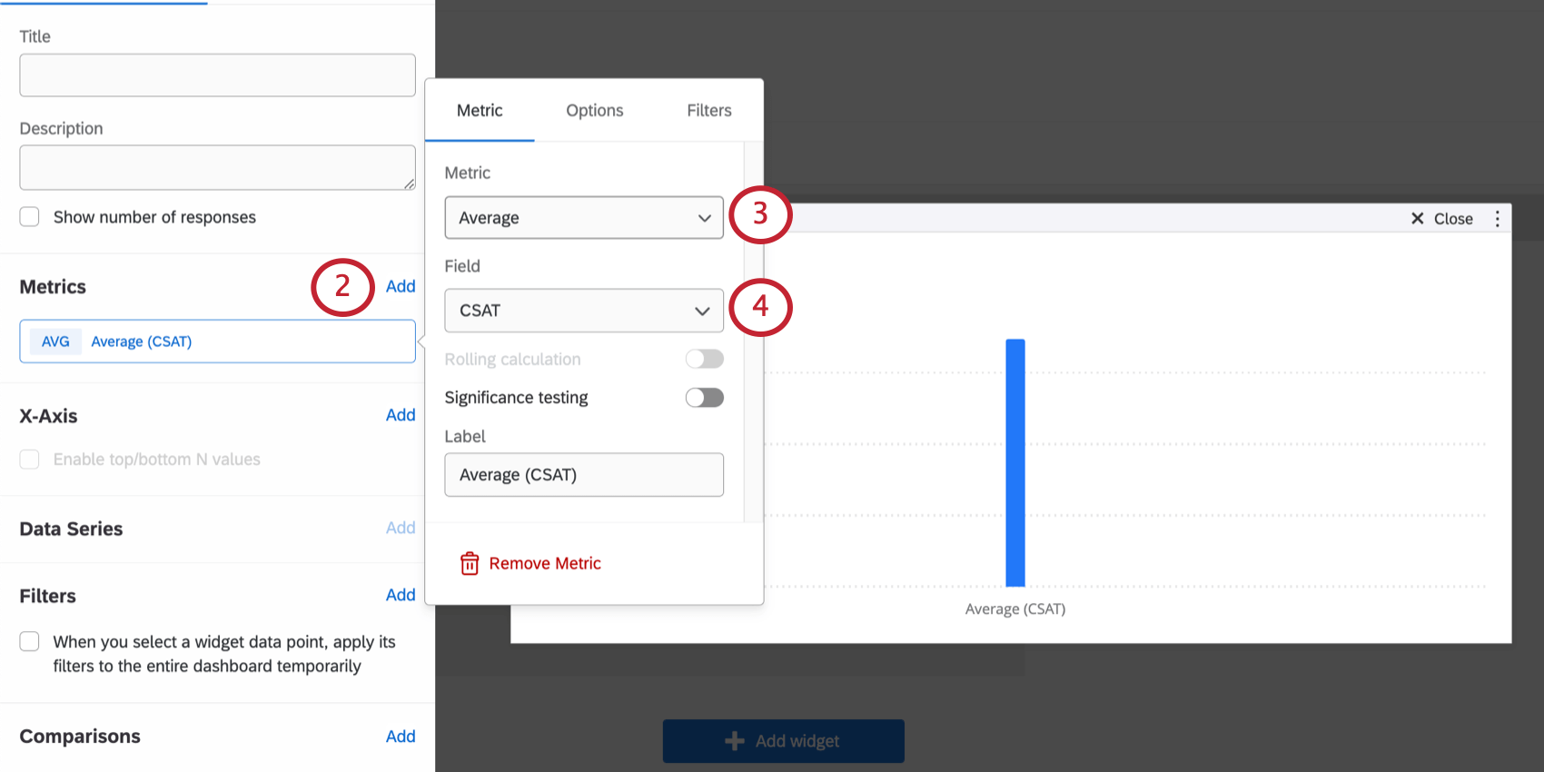
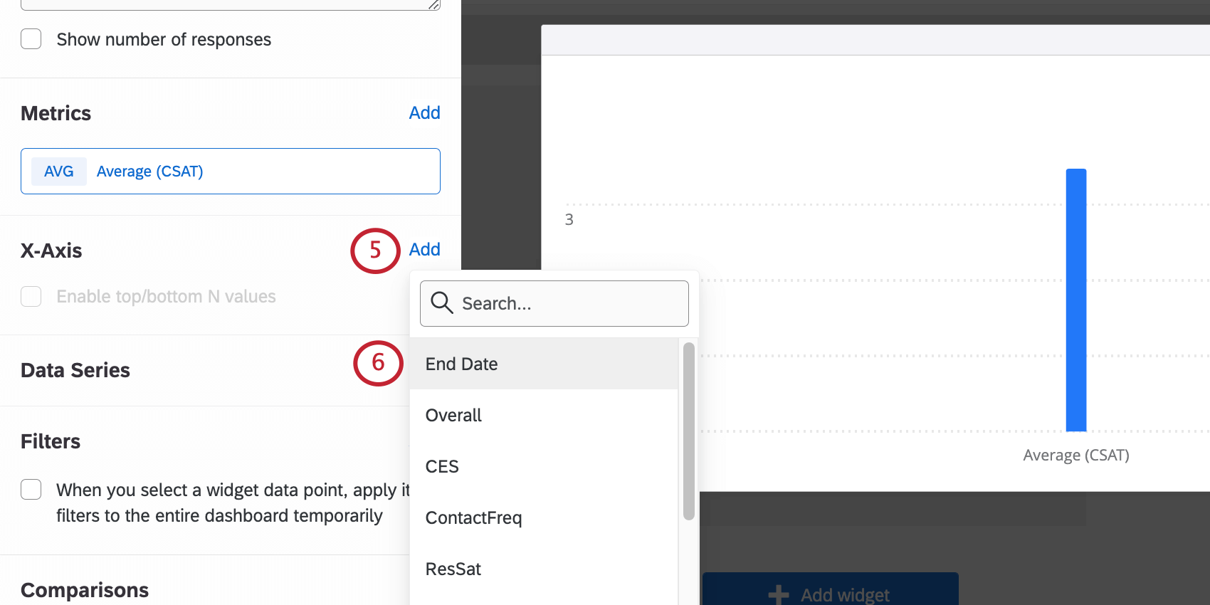
Configuring Significance Testing
Once you’d set up your line chart, bar chart, or table and turned on Significance testing, you’ll have a few options to choose from.
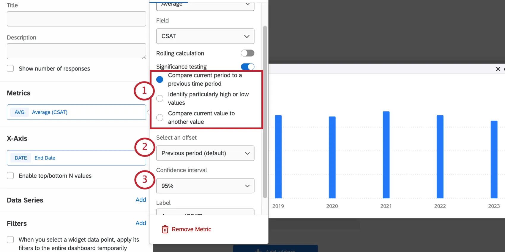
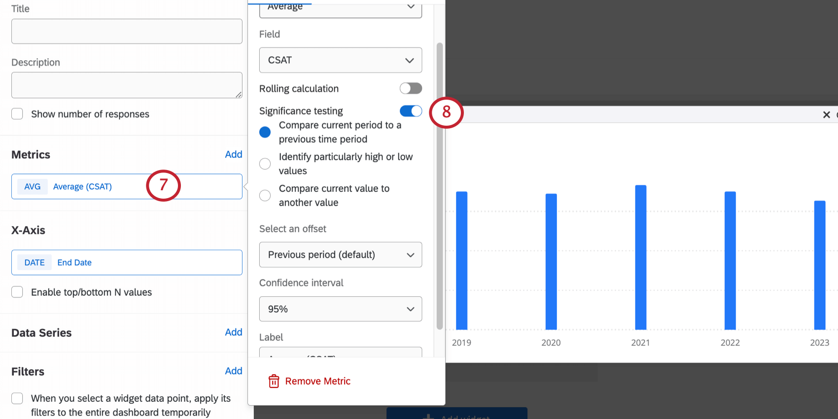
- Compare current period to a previous time period: Each time period is compared against each previous time period when determining significance of a change. To use this option, your x axis dimension or row must be a date field. Example: Is this month’s overall score higher than last month’s? Is this month’s score higher than it was this time last year?

- Identify particularly high or low values: Most common selection for data that doesn’t involve time or dates. Example: Is Brazil’s score higher than other South American countries?
- Compare current value to another value: Each value is compared against each other value when determining significance of a change. To use this option your x-axis dimension must be a non-date field. Example: Is Brazil’s score higher than Venezuela’s score? Is Brazil’s score higher than Colombia’s? Is Venezuela’s higher than Colombia’s?
- Previous period: Compares each time period to the previous time period.
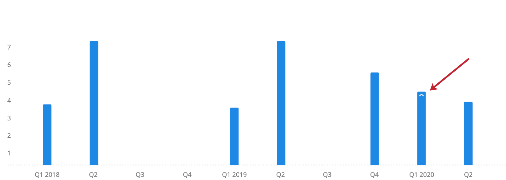
- 1 year: Compares each time period to the time period one year before.
Example: This widget displays the average CSAT grouped by quarter, with an offset of 1 year. The arrow indicates that the increase in value from Q1 2019 to Q1 2020 was statistically significant.

Comparing Significance Across Multiple Dimensions
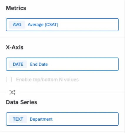
You can compare significance across multiple dimensions by adding a metric, x-axis, and data series. In order for this to work, you need to make sure that:
- The x-axis field is a date field.
- The data series field is a non-date field.
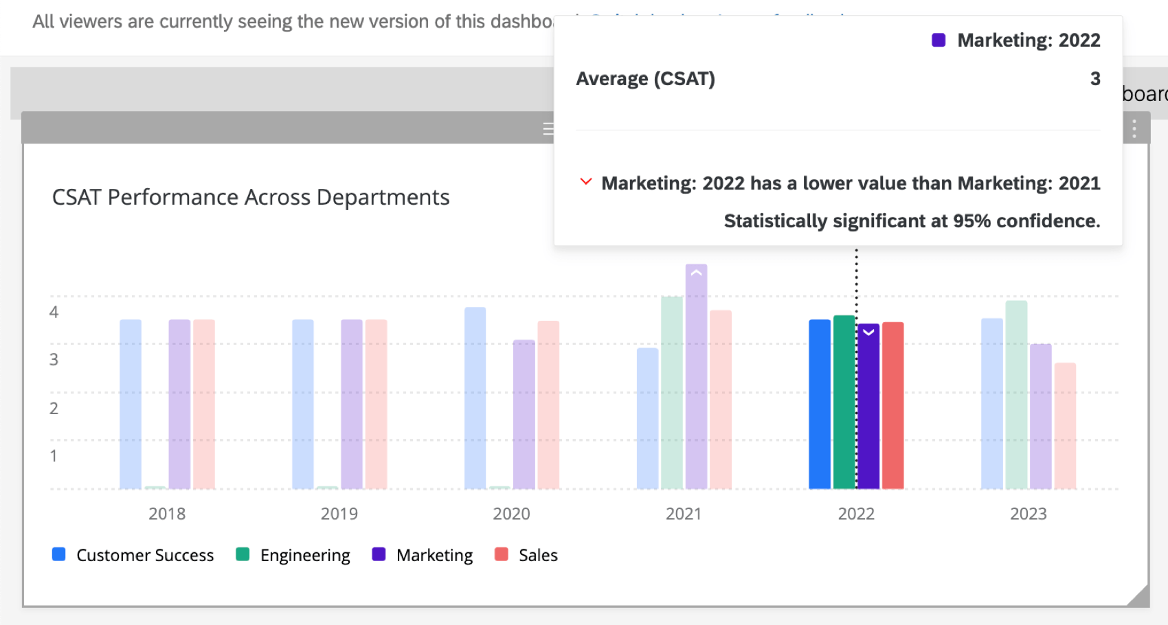
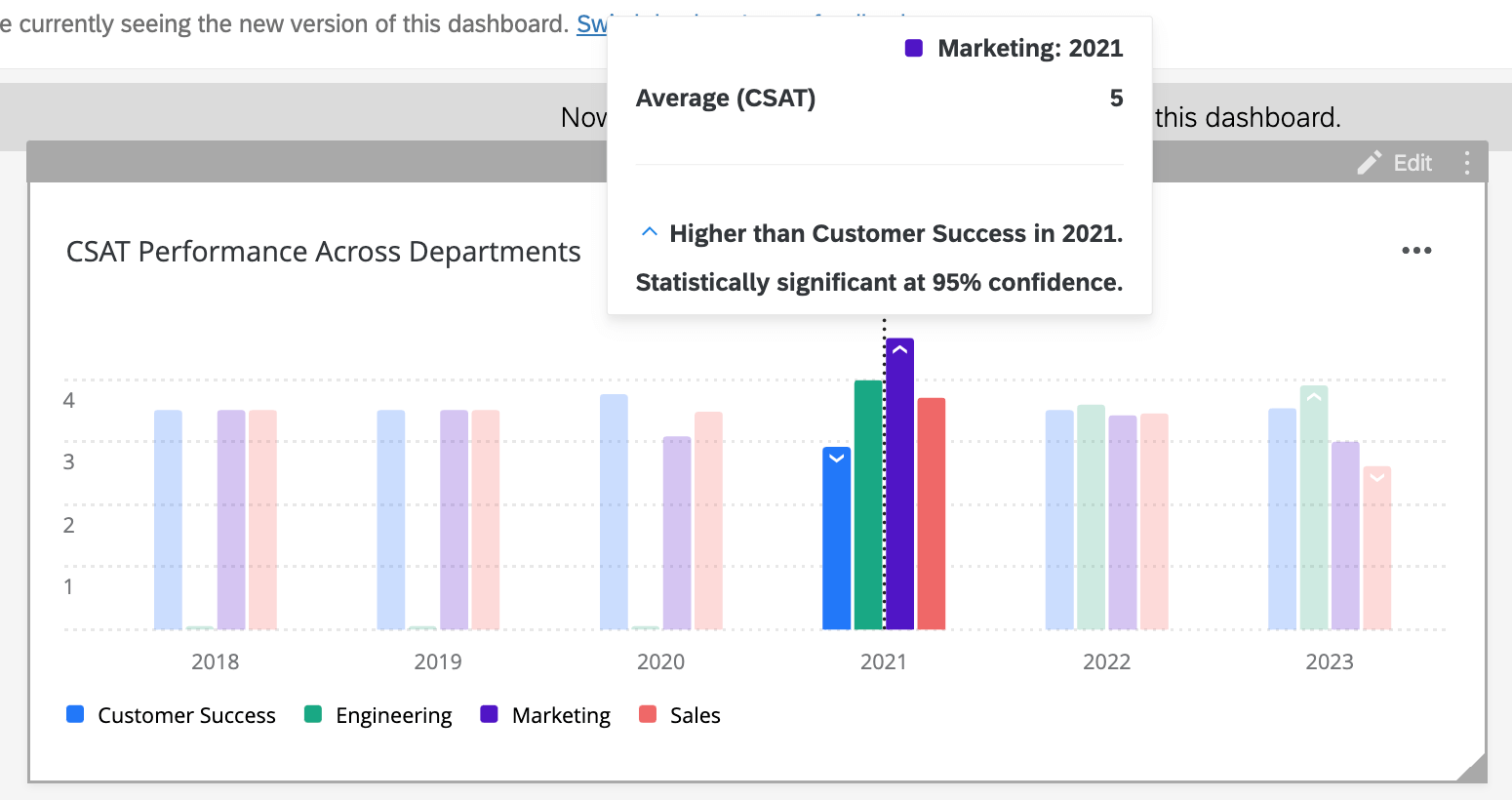
Example: This widget displays the average CSAT for different departments each year. The metric is Average CSAT, the x-axis is the date, and the data series is the department.
Selecting Compare current period to a previous time period compares significance across time periods for each distinct department.

Compare current value to another value can also be selected to compare significance across departments within each distinct time period.

Understanding Significance Testing
The Confidence Interval indicates how confident you would like to be that the results generated through the analysis match the general population. Higher confidence levels raise the threshold for a difference to be considered statistically significant, meaning only the clearest differences will be marked as such.
Once you have enabled significance testing, you might notice upwards and downwards arrows in your widget. These arrows indicate statistically significant values.
You can hover over an arrow to determine why the value is considered significant, and what the confidence interval of that test was.
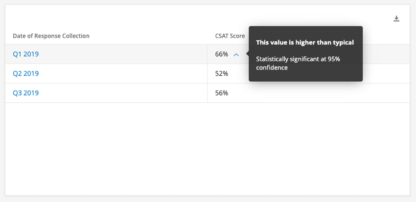
Example: Here we hover over the blue arrow next to Q1 2019’s CSAT score. The tooltip tells us this value is higher than typical, and the confidence interval for this is 95%.

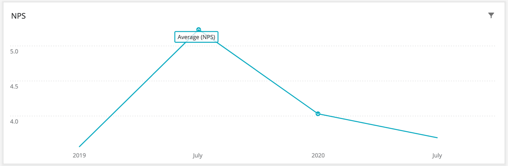
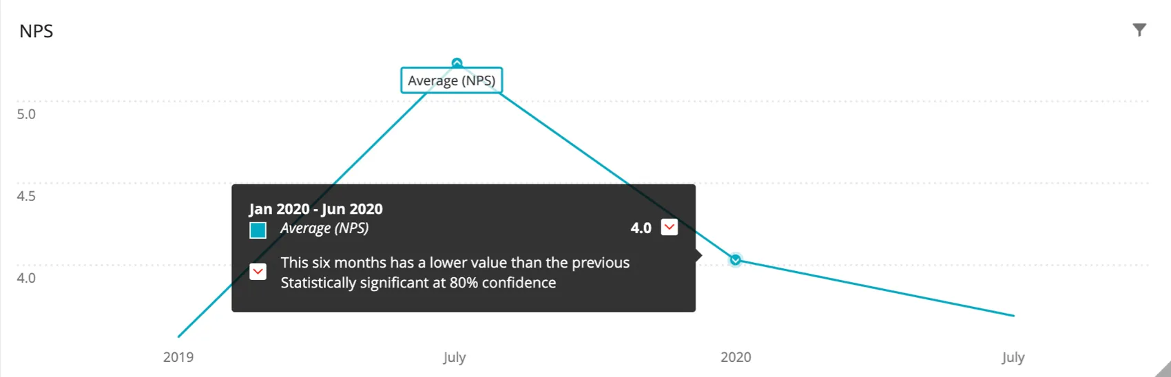
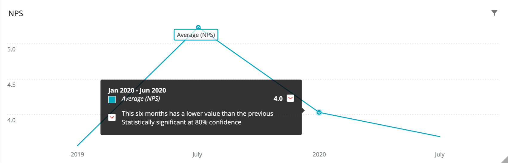
Example: Here we hover over the arrow over the January 2020 – June 2020 NPS score. The tooltip tells us this value for this six month period is lower than the previous six month period (July 2019 – December 2019), and the confidence interval for this is 80%.
Technical Notes on Significance Testing
When comparing one NPS score to another, regardless of chart type or type of comparison (e.g., over time), the following process is used:
When comparing one top box score to another, regardless of chart type or type of comparison (e.g., over time), the following process is used:
FAQs
Why are my metrics adding up to 99 or 101 instead of 100?
Why are my metrics adding up to 99 or 101 instead of 100?
33.60 + 33.60 + 32.80 = 100
Whereas if you choose to display no decimals with the same dataset:
34 + 34 + 33 = 101
Widgets can’t show infinite decimals, which means that regardless of decimal settings, some data will eventually have to be rounded up. This means that small deviations, like adding up to 99 or 101 instead of 100, work as intended.
That's great! Thank you for your feedback!
Thank you for your feedback!