Step 3: Planning Your Dashboard Design (CX)
Dashboards vs. Pages vs. Widgets
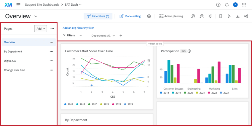
Dashboards pull data sources into charts, tables, and other visualizations called widgets (shown right). These widgets can be organized onto pages of the dashboard (shown left). From there, you can create unlimited dashboards, unlimited pages, and unlimited widgets for any CX Dashboards project.
But should you? You may be asking yourself the following:
- How many dashboards are too many for a single project?
- How many pages are too many for a single dashboard?
- Can a page get so saturated with widgets that a new page is preferable?
- How do I know if the widgets I want to add are necessary, or if there’s another way to organize my data?
For guidance, we asked an expert at Qualtrics. She has built some of the most complex CX Dashboards projects imaginable. She believes it varies based on the needs of your research program, and has given us insight into her approach.
“I start by gathering the perspectives of the stakeholders and considering the design of their dashboards based on the data sources and the drivers. To get things started, it often makes sense to create:
This brings us to five pages and gives some wiggle room for extra pages based on unique reporting objectives and key drivers. For example, it may make sense to roll up several CX Dashboards projects into a single dashboard to better represent a substantial business driver. If a widget, or a page, doesn’t represent a driver, then rethink the element. Some other common page types to consider:
Avoid widget overload so the impact isn’t reduced, particularly for your C-Suite stakeholders. You can’t be afraid to purge pages and widgets. But if you’re having trouble killing your darlings, here are some ways you can start to narrow widgets down:
|
Who is Your Dashboard For?
As we learned in the previous section, it’s important to think about the audience of your dashboard before you start building. By thinking about the personas that will be using the dashboard, you can take into account the kind of information you should try to communicate with your dashboard.
As an example, let’s go over some of the personas that are commonly found in a CX Program, and what job goals they can accomplish by using a dashboard. On the rightmost column, we speculate on the kind of widgets (charts and tables) that might benefit these users.
| Role | Dashboard Objectives | How Frequently They Will Use Dashboards | Widgets and Features They Need |
| CX Manager |
|
Once a month |
|
| Analyst |
|
Every day |
|
| Operations Manager |
|
Every day |
|
| Closed Loop Operator |
|
Every day |
|
| Executives |
|
Once a month or quarter |
|
Of course, this isn’t an exhaustive list – as you build your dashboard, you may find that your personas have needs that would be better filled by other widgets and reporting features. In the next lesson, we’ll go over how to build the widgets we list here, in addition to some other common ones.
