Survey Methodology & Compliance Best Practices
About ExpertReview
ExpertReview is a feature in the Qualtrics platform that checks the overall quality of your survey before you distribute it. It will make suggestions as to how best to improve your survey to ensure that you are collecting the highest quality data possible. Below are possible suggestions that you may receive via ExpertReview and ways that you can improve each one.
Predicted Duration
Our data indicates that surveys longer than 12 minutes (and 9 minutes on mobile) start to see substantial levels of respondent break-off. Sometimes long surveys are necessary, but in order to increase your survey completion rate, we’d suggest finding ways to make your survey shorter whenever possible.
Qtip: The metric calculated in ExpertReview takes into account both the longest and shortest paths possible in your survey (meaning that it accounts for your Survey Flow as well). It estimates the longest path based off of the following:
- Average human reading speed of 300 words/minute
- 500 milliseconds time to transition between questions on a page
- 300 milliseconds time to transition between choices in a question
- 3 seconds time to transition between pages
- 2 seconds time to select answer for a slider question
- 10 seconds to type in a text-entry response
A quick look at a survey containing page after page of boring questions produces a response of “there is no way I’m going to complete this thing.” If a questionnaire is long, the person must either be very interested in the topic, a true bleeding heart, an employee, or paid for their time. Internet surveys have some advantage because the respondent will often not see all of the survey at once. However if your survey sends them page after page of questions, your response rate will drop off dramatically.
In addition to shortening your survey’s length, we recommend keeping the following in mind when trying to increase your response rate:
- Let respondents know up front how long to expect it will take them to complete the survey.
- Using a progress bar can actually decrease completion rates.
- Instead, it’s better to use textual cues (i.e., “We have just a few questions left!”).
Not sure how to go about shortening your survey? Check out our support page on Deleting Questions.
Mobile Compatibility
Up to 53% of surveys started on Qualtrics happen on mobile devices. Unfortunately, many of these mobile respondents end up leaving before they finish the survey. Making sure your survey is “mobile-friendly” can help increase both completion rates and the representativeness of your data.
Not sure how to go about making your survey mobile compatible? Check out our support page on Mobile Survey Optimization.
Number of Text Entry Boxes
Writing text takes a comparatively large amount of mental energy for respondents. Once a survey has more than three open-text boxes, we find that, on average, completion rates begin to decline and respondents start writing a lot less text in their responses.
Before using a text entry question, there are some very clear costs that you should take into consideration:
- They take more time for respondents to answer.
- Respondents often don’t provide very valuable textual responses in web surveys.
- You will have to code or analyze the responses.
- There is a possibility for drastic variance and/or bias.
- Ultimately, this type of data collection will result in more work for you.
The reason that open-ended questions are not used more often is that respondents generally do not like them very much. However, if you use open-ended questions judiciously, it is possible to avoid both excessive cognitive demand and long completion times. Asking open-ended questions that are very specific and easy to answer will allow you to realize the benefits of this powerful question type and avoid annoying or fatiguing your respondents.
For example, in many cases, when a number is being requested, it is best to use an open-text question. Asking for a person’s age in years and letting them type the number is easier for the respondent to do than selecting from a drop-down list. It’s also more precise than selecting an age group. When using the validation options available in Qualtrics, you can also ensure that only plausible responses are given (e.g., you can set the text-box to only accept numbers between 18 and 100). In general, it is best to not use a lot of open-ended questions because they can lead to respondent fatigue faster than other types of questions and are more likely to induce your respondents to leave the survey before completing it.
Not sure how to go about removing a text entry question or “Allow Text Entry” box? Check out our support pages on Deleting Questions and Allow Text Entry.
Number of Matrix Tables
Did you know that respondents don’t like matrix tables? Research has shown that response quality and completion rates both decline when questions use the matrix format. We’ve detected that the number of matrix rows contained in your survey may negatively impact the quality of data that you collect.
We recommend simplifying possible responses (for example: Strongly Disagree, Disagree, Neutral, Agree, Strongly Agree could be simplified to Disagree, Neutral, Agree). Use separate multiple choice questions where applicable, and try to keep matrix tables to a minimum.
Accessibility: WCAG
ExpertReview will indicate if one or more questions in your survey are not WCAG AA/508 accessible. While you may ignore this if it is not a requirement for your organization for sending out surveys to your respondents, we always recommend making your surveys as accessible as possible.
Making your survey accessible ensures that many different demographics of respondents are able to access and complete your survey. Inaccessible surveys could unintentionally exclude potential respondents from your research.
Not sure how to go about ensuring that your survey is accessible? Visit our Survey Accessibility support page for a list of features we offer that are WCAG compliant.
Question Readability
The harder a question is to read, the longer it takes respondents to finish your survey, and the more likely they are to abandon the survey or provide low quality answers. Questions can be deemed hard to read based off of the complexity of the vocabulary used and the length of the question.
The following can help make a question more readable:
- Don’t use a multi-syllable word where a shorter one will do.
Example: “Was your stay satisfactory?” vs. “Did you enjoy your stay?”
- Keep questions concise and to the point. Here are some tips to help you:
- Do not add unnecessary details to the question. It doesn’t hurt to establish context, but don’t go overboard.
Example: “Some of our respondents asked us in the past to make it easier for big groups and families traveling together to get discounted offerings. Well, we are now allowing you to book two rooms for the price of one! On a scale from one to ten, how likely are you to purchase this offering?” vs “Based on customer feedback, you can now book two rooms for the price of one! On a scale from one to ten, how likely are you to purchase this offering?”
- Strike out unnecessary clauses and words where you can.
Example: “How can our staff make sure that your stay in our hotel is as enjoyable as possible?” vs. “How can we make your stay more enjoyable?”Qtip: Adverbs and filler words like “that” can almost always be eliminated without sacrificing a sentence’s meaning.
- The passive voice calls for longer clauses than the active voice. Use the active voice instead.
Example: “Which of these products were used by you?” vs “Which of these products did you use?”
- Do not add unnecessary details to the question. It doesn’t hurt to establish context, but don’t go overboard.
The Last Question in the Survey is Descriptive Text
Often times people will add a text / graphic question to the end of their survey because they think it’s the best way to thank the respondents and let them know they’re done with the survey. However, this is not the case! Because this creates one more page of the survey, the respondent who reaches this page but doesn’t click the next button technically hasn’t submitted their response. This can cause issues with your data and with your completion rates.
Adding an End of Survey Message
Instead of using text / graphic questions, Qualtrics already has a message that appears after the respondent completes the survey. Completion is indicated by clicking the very last “next” button.
If you would like to add your own message, you can do one of the following.
- If every user should get the same message when they finish, you can simply scroll to the bottom of the survey builder, select the End of Survey block, and add a custom message to it. See the Changing the End of Survey Message page for detailed steps.
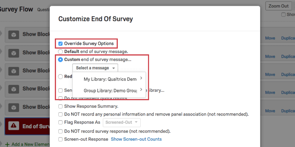
- If you are using branch logic in your survey flow to send respondents down different paths, you may want to use end of survey elements in the survey flow to add different messages to different paths. On each branch that leads to a special message, add an end of survey element and click Customize to add a new message. Select Override Survey Options and Custom end of survey message to create or select a new message.
Adding a Submit Button to the Last Page of the Survey
Sometimes you may wish to have a separate message right before the end of your survey and after your survey has concluded. Other times you may just want a button that clearly indicates the respondent is about to submit their survey, without adding additional instruction.
You can add a Submit button to the end of your survey by doing the following:
- The first step to adding a submit button is to put the last page of your survey on its own block. First, select the question or question you wish to have on the last page.
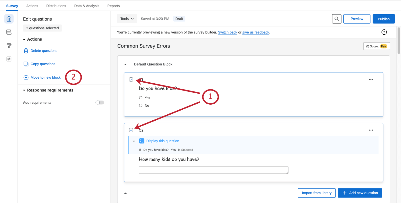
- Click Move to new block. This will move the content to a new block at the end of the survey.
- Scroll down to your new block and click on it.
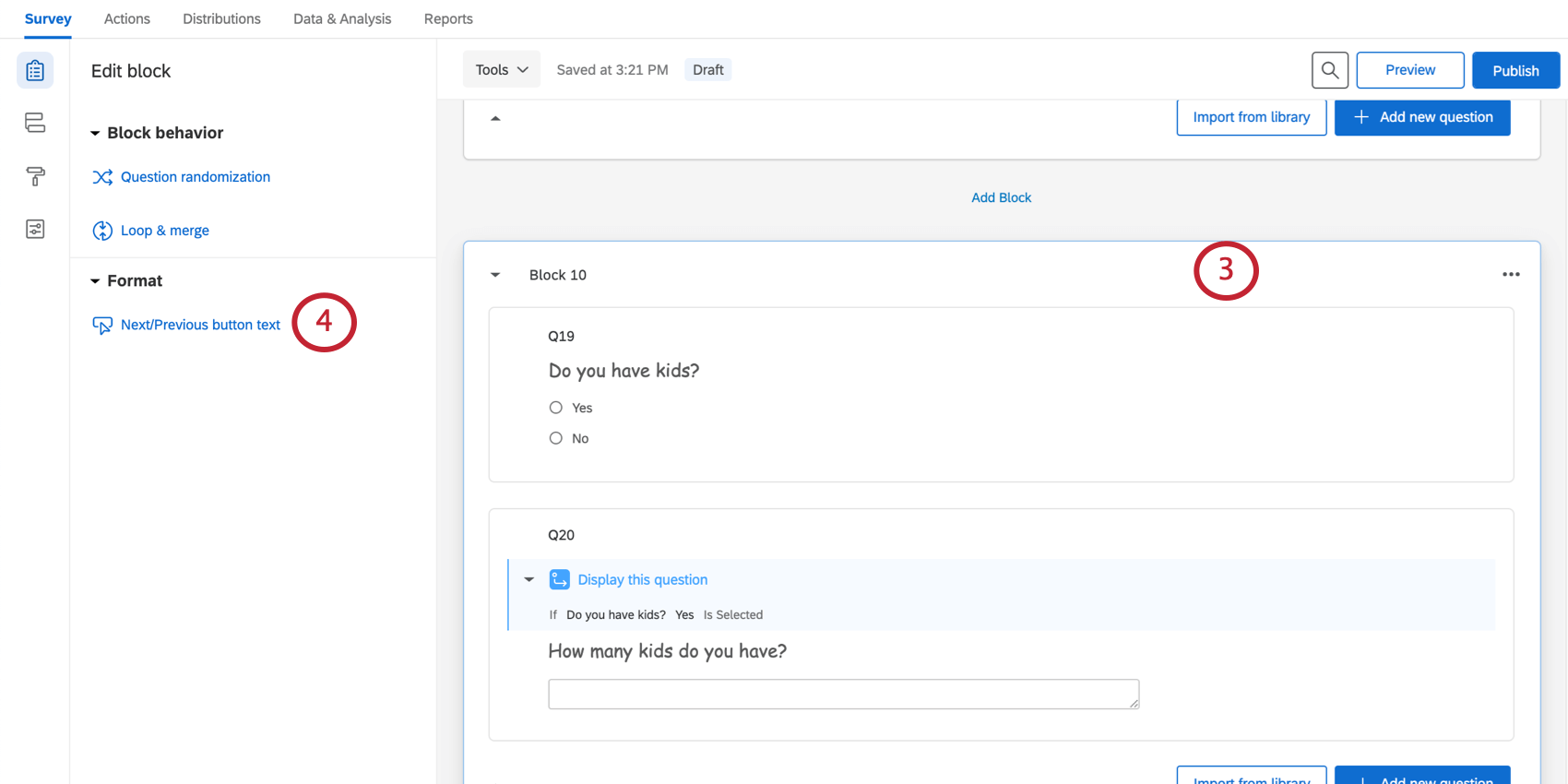
- Select Next / Previous button text.
- Under Next Button Text, type Submit, or the desired text.
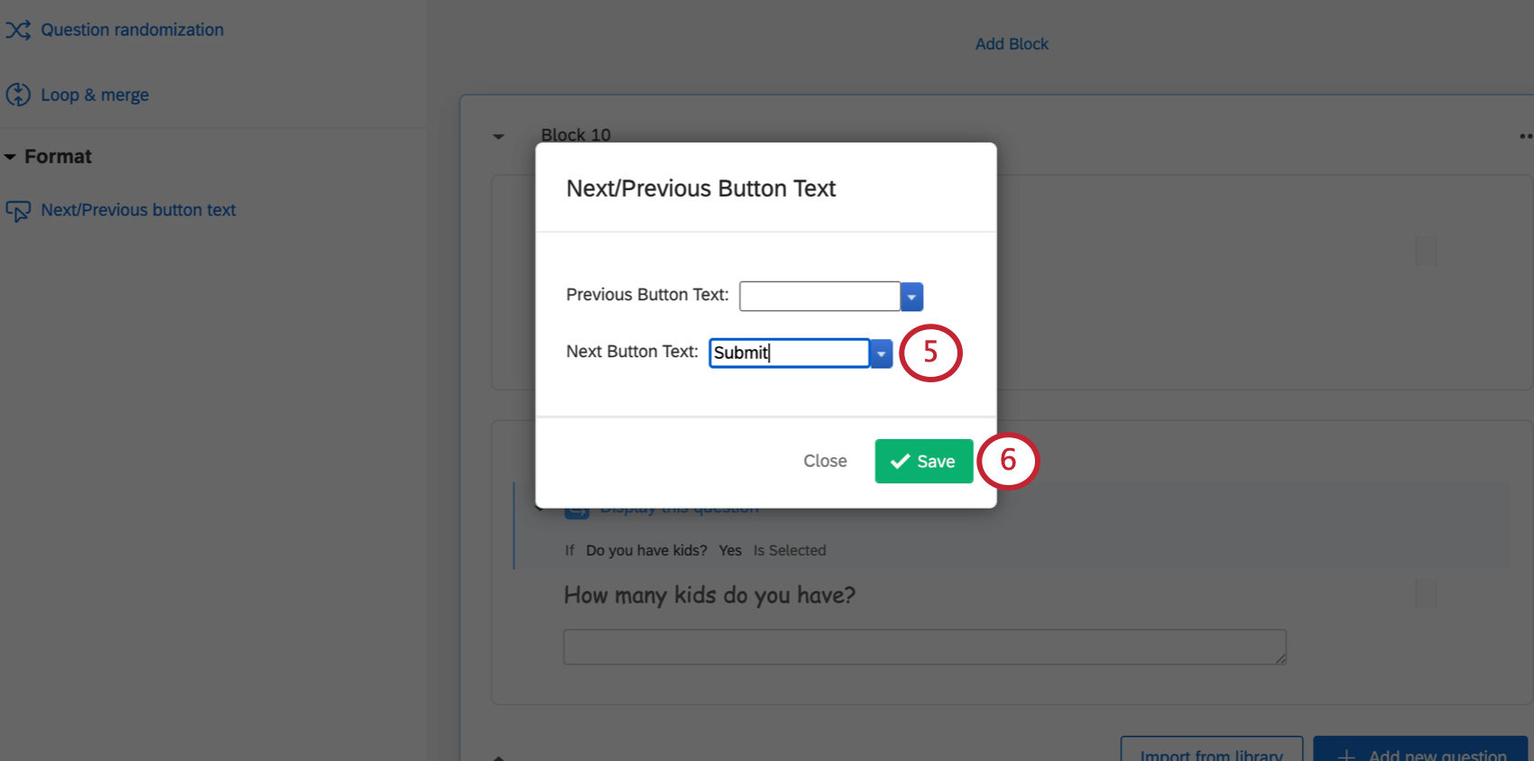
- Click Save.
Use a Qualtrics Certified Question
Certified questions leverage Qualtrics best practices to generate high-quality, standardized data to support better insights. By standardizing metrics, an entire XM workflow can be created that delivers better value in the form of unified datasets for comparative analysis, benchmarks, and continually updated and standardized profiles.
Adding Personalized ExpertReview Recommendations
Once you start adding questions to your project, ExpertReview will recommend questions developed by Qualtrics subject-matter experts that could be used instead. If you like the suggestions, you can add them to your survey and replace your previous content with just a click.
- Open ExpertReview.
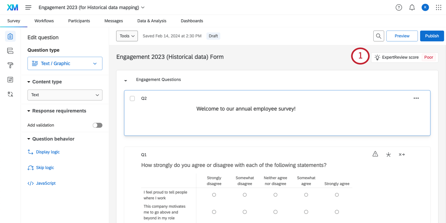
- Under Suggestions, find Use a Qualtrics certified question.
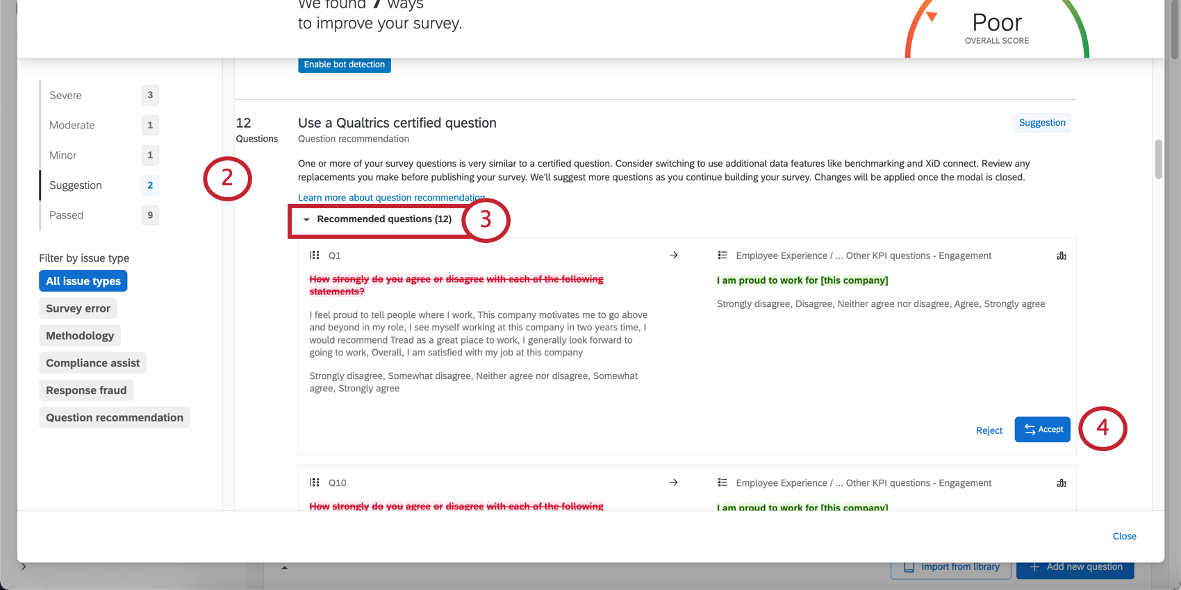
- Click Recommended questions.
- Look through the recommendations. If you like one, click Accept. You can also reject suggestions you don’t think fit your survey.
- If you decide you don’t want to make that change after all, you can hit Undo before you leave ExpertReview.
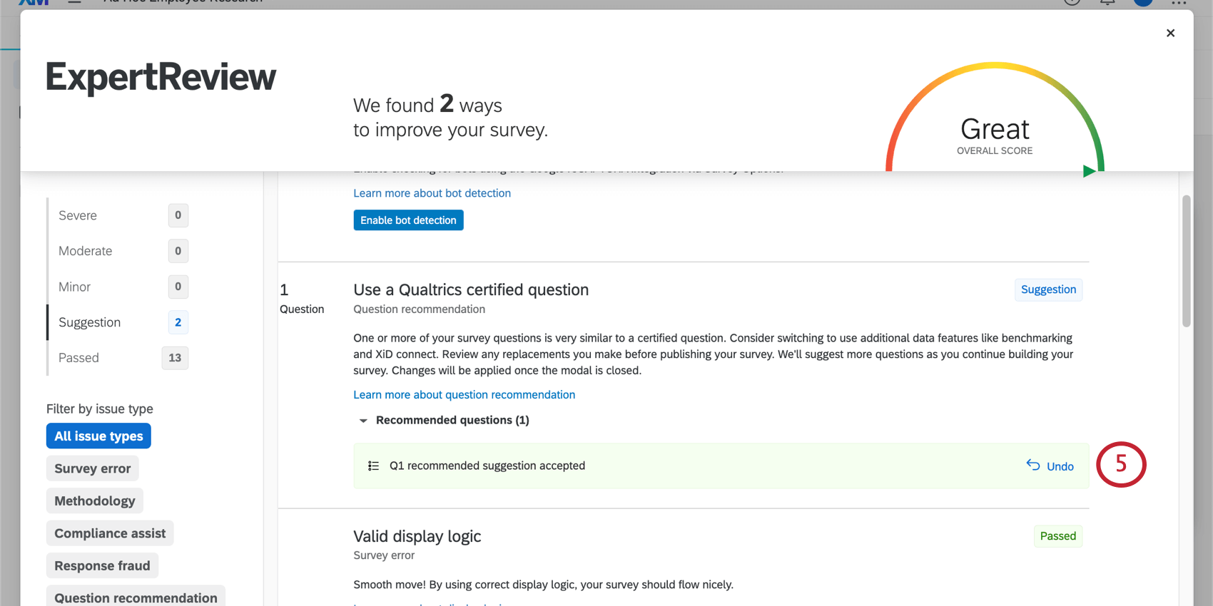
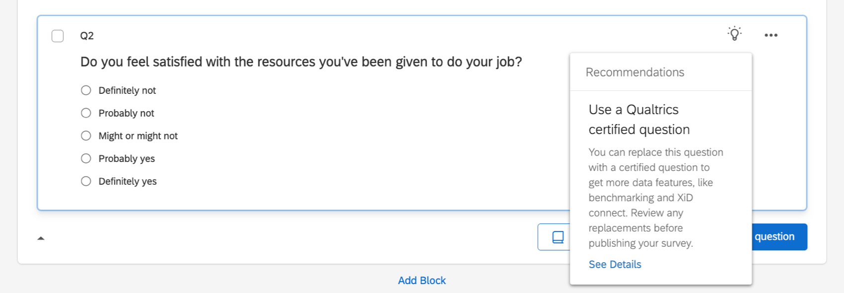
Qtip: Replacement recommendations can also appear directly on the question in the survey builder. Click See Details to open the ExpertReview menu and review suggestions.
Selecting and Editing Certified Questions
If you want to browse other certified questions, see our page on adding survey questions from the library.
If you’re interested in customizing these questions, see Certified Questions.
References
Much of the survey methodology content on this page is contributed from The Qualtrics Handbook of Question Design by David L. Vanette, Principal Research Scientist at Qualtrics. To access the entire handbook, visit this web page.
