
Statistics Table Visualization
What's on this page
About Statistics Tables
Statistics Tables help you see multiple aggregate metrics for your chosen data source. This visualization evaluates all of the responses collected for that data source and displays calculated results such as mean and standard deviation.
Qtip: Don’t like your table colors or fonts? Head over to the Global Settings to adjust them for the whole report!
Customization Options
For basic visualization instructions and customization, visit the Visualizations Overview support page. Continue reading for visualization-specific customization.
Metrics
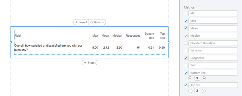
You can customize the columns you want to include in your Statistics Table. Select a checkbox next to an option to include it, and deselect the checkbox to hide it.
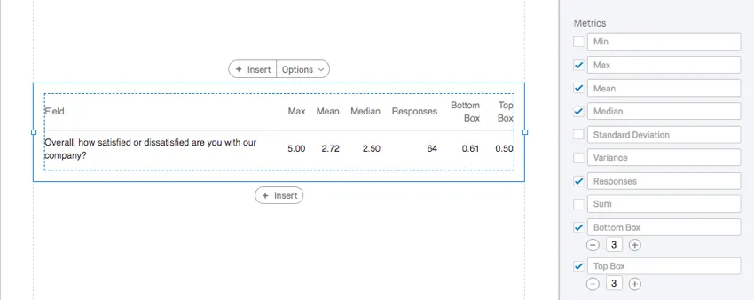
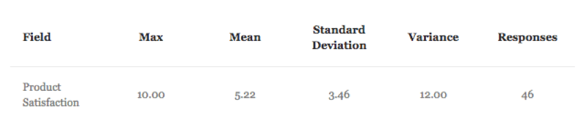
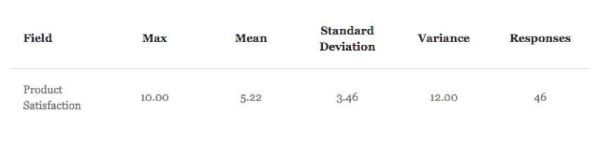
- Minimum: The lowest value collected.
- Maximum: The highest value collected.
- Mean: The average of all values collected.
- Median: The median of your dataset is the exact midpoint. When all of your collected values as organized from smallest to largest, this value is right in the middle. Qtip: Qualtrics calculates the median using a non-deterministic percentiles aggregation to approximate the desired percentage counts at scale. The median, or 50th percentile, is accurate at about 99.9% on average.

- Standard Deviation: The standard deviation across all values collected.
- Variance: The variance across all values collected.
- Responses: The total number of responses collected that contribute to the statistics.
- Sum: The values of all the responses added together.
- Top Box: Top box is the portion of respondents who fit into the highest ends of the scale. You can specify how many scale points are included in this box by typing in the field. Example: There are three NPS® groups: Promoter, Passive, and Detractor. Setting top box as 3 would make the Top Box field equal to 1, since 100% of the respondents belong to one of the three groups. But if you changed the top box to 1, it would only look at promoters, and the portion would match the portion of respondents who were promoters.

- Bottom Box: Bottom box is the portion of respondents who fit into the lowest ends of the scale. You can specify how many scale points are included in this box by typing in the field. Qtip: Top and bottom box are only options for questions with scales, such as Multiple Choice. Continuous variables, such as Sliders and Text Entry, cannot display top and bottom box.
Additional Settings
The following settings are available for the statistics table and are listed under the metrics:
- Breakout: “Break out” data by different categories. See Breakouts.
- Decimal Places: Adjust the number of decimal places that appear with each data point in the table. You can only choose from presets (0-5).
- Weighting: If you have set up response weighting, determine if you will use the weighted values in your report or if you will use the unweighted data.
- Field: Change the header that appears over your chosen question/data source. This will not change the question text itself, but what’s over it.
- Column Values: Change the text of the question/data source you’re displaying in the table. If you have multiple data sources, you can also use the checkboxes to determine what’s hidden and what’s displayed.
Qtip: You can also set global default behavior for decimal places and weighting.
Qtip: To change “Field” or “Column Values” back to the default text, erase everything you’ve written in those text boxes.
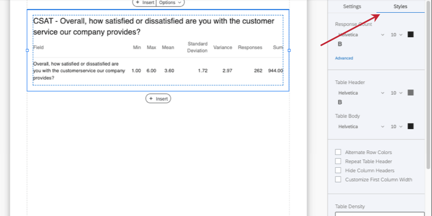
Styles
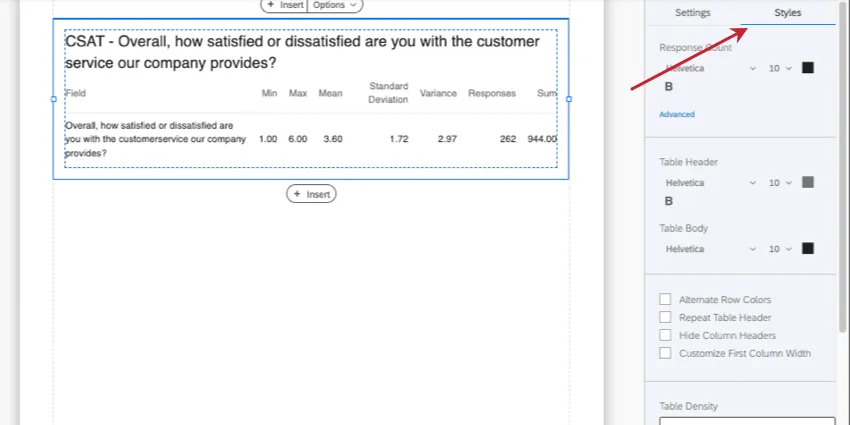
Select the Styles tab to modify response count, table header, and body fonts. In addition, you’ll have a few optional settings you can adjust:
- Alternate Row Colors: Shade every other row and make them easier to read. Statistics tables generally only have two or more rows if a Breakout is applied, or if the question loaded is multi-part, like a Matrix Table.
- Repeat Table Header: Selecting this will make sure that the header row (not the title) will repeat as the table gets much larger and has many rows.
- Hide Column Headers: Removes the entire header row.
- Customize First Column Width: For the first column that holds your question’s name, a line will appear that you can drag and drop to adjust this column’s size.
- Table Density: Adjust how close together elements of the table are. Think of this as the padding or margins between cells and the table.
- Margin: Adjust the table’s margins. Think of this as the padding or margins between the outermost border of the table and everything around it (e.g., page edges). Click Advanced to set these margins independent of each other.
Compatibility
The Statistics Table is only compatible with variables that can come in numeric formats.
- Single-Answer Multiple Choice
- Net Promoter Score
- Single-Answer Matrix Table
- Text Entry with Numeric Validation
- Form field questions with numeric validation
- Side by Side Qtip: There should be multiple-choice single-answer fields, or a text entry field with numeric validation.
- Slider
- Rank Order
- Constant Sum
- Pick, Group, and Rank
- Graphic Slider
- Drill Down
- Number and Number Set Embedded Data
- Formulas
- Numeric manual variables
Types of Reports
This visualization can be used in a few different types of report:
That's great! Thank you for your feedback!
Thank you for your feedback!