-

Qualtrics Platform -

Customer Journey Optimizer -

XM Discover -

Qualtrics Social Connect
Heat Map Question
About Heat Map Questions
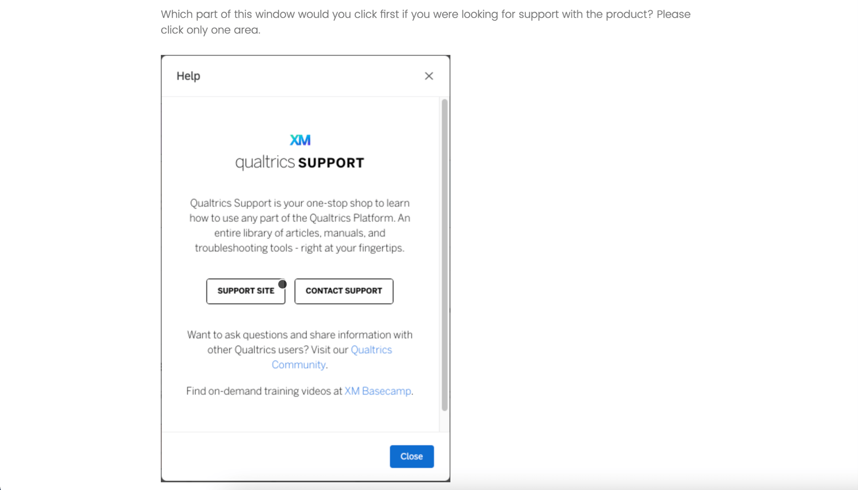
The heat map question type is used to gather feedback on images. The respondent is presented with an image and invited to click anywhere on that image. Unlike the hot spot question, respondents are not limited to selecting pre-determined regions of the image. Hidden regions may, however, be added for reporting purposes.
Setting Up a Heat Map Question
- Click Add new question.
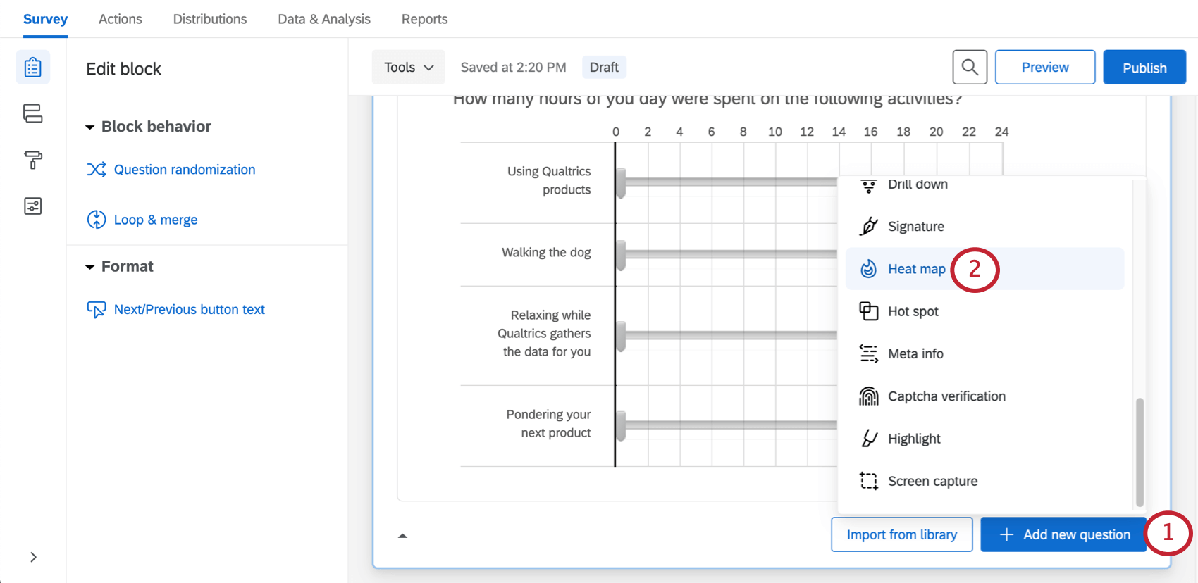
- Select Heat map.
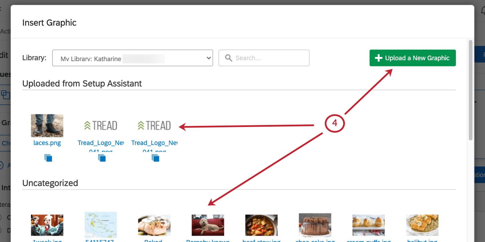
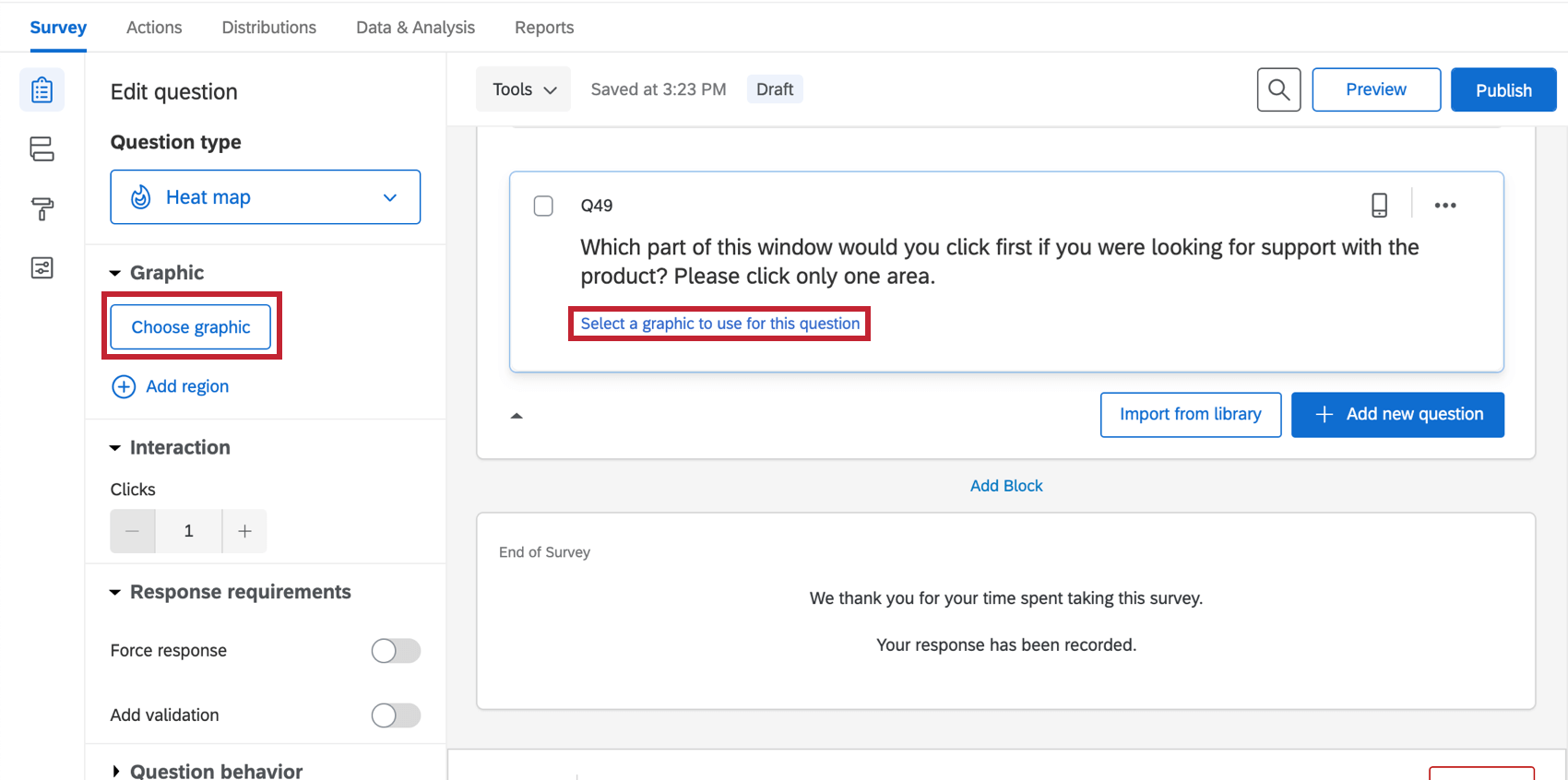
- Add a graphic, either by clicking Choose graphic in the editing pane, or clicking Select a graphic to use in this question.
- Select a graphic you’ve already uploaded to your account (or upload a new one from your computer).
- Under Interaction, set the number of clicks each respondent may make on the image (“1” is the default).
 Qtip: If the respondent clicks more than the allowed number of times, their oldest click will be replaced with the newest one.
 - If desired, click Add Region.
Qtip: Regions are not required for a heat map question, but they can make reporting easier. Rather than reporting just the coordinates of each click, Qualtrics can report the number of respondents who click in each defined region.
- Click and drag the region to move it, or click and drag the corners to resize it.
- Click the text box beneath the region to type a region name (this name will not display to respondents, but will be used in your survey results).
- Repeat steps 3–5 to add all desired regions.
Custom Region Shapes
By default, all regions are rectangles. In certain scenarios, however, you may need different region shapes. For example, on a map, you may need a freeform region shape to cover a specific city or county.
Editing region shapes is the same with a hot spot as it is with a heat map. See the instructions on the Hot Spot support page for more information.
Data Analysis
Once your responses have been collected, Qualtrics offers various ways you can analyze your response data. From the Reports tab, you can view aggregate data in pre-made reports as well as create your own reports from scratch. From the Data & Analysis tab, you can view and manage individual respondents’ data.
Visualizations
In the Results section of the Reports tab, there is 1 visualization type available for heat map questions: the heat map plot. For more information on this visualization please visit the linked visualization support page.
If you have added regions to your heat map question, then the number of clicks for each region can be viewed in a simple table, bar chart, line chart, pie chart, or breakdown bar visualization type.
In the Reports section of the Reports tab, the visualizations available for the heat map are similar. The heat map visualization will display the most to least clicked areas. If you added regions, you can use the data table, results table, bar chart, line chart, pie chart, or breakdown bar visualization type.
Downloaded Data Format
In the exported dataset, 2 columns will be provided for each click participants were allowed to make on the image. 1 column will include the x-coordinates of each click (from the top-left of the image), and the other will include the y-coordinates of each click (from the top-left of the image), both measured in pixels.
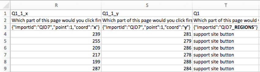
If regions were added on the heat map question, an additional column will be included to indicate the chosen region.
Viewing Individual Response
You can view an individual response in the Data & Analysis tab and export the response to PDF. When viewing a heat map question for an individual response, you can see exactly where your respondent clicked on the image. A small white dot will be added to the image where the respondent clicked.