Displaying Data in Insights
About Displaying Data in Insights
Every Insights page contains a toolbar allowing you to specifically select what data you would like to visualize and analyze.
Topic Selection
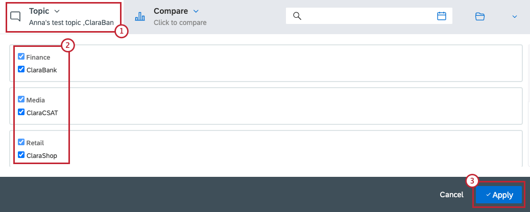
- Click the Topic dropdown menu.
- Choose what topics you want to include in your analysis. Check the box next to any topics you want to include. You can select up to 20 topics.
- Click Apply to confirm.
Compare Mode
The Compare option allows you to compare the data in your dataset based on one of the available criteria. An example could be comparing your dataset by topic, language or sentiment.
- Click the Compare button
- Use the Compare data by dropdown to select a comparison.
- Choose the categories you want to include into the visualization.
- Click Apply to confirm.
With a comparison active, you will see the same data set, but broken out by the attribute you selected.
Filtering Insights
Drill down into your dataset by applying a custom filter.
- Click the filter bar to open the filter view.
- Create the filter you want to add to your data. See Filtering in Qualtrics Social Connect for more information on building filters.
- Click Filter.
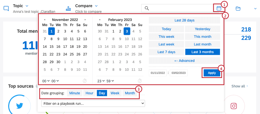
You can change the date range and date grouping of your dataset by following these steps:
- Click the calendar icon.
- Select a predetermined time period, or use the calendars to choose a custom date range.
- Choose your Date grouping option, which determines how data is grouped together by date.
- Click Apply.
Folder Selection
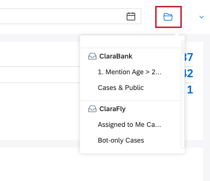
You can filter data to display one of your existing folders. Click on the folder logo and select the mailbox or smart folder you want to see data from. This will automatically select any connected topics and apply a filter for this mailbox or folder.


