Loading...
Skip to article
  • Qualtrics Platform
    Qualtrics Platform
  • Customer Journey Optimizer
    Customer Journey Optimizer
  • XM Discover
    XM Discover
  • Qualtrics Social Connect
    Qualtrics Social Connect

Using a Guided Flow & Preconfigured Dashboard (EX)


Was this helpful?


This site is protected by reCAPTCHA and the Google Privacy Policy and Terms of Service apply.

The feedback you submit here is used only to help improve this page.

That’s great! Thank you for your feedback!

Thank you for your feedback!


Attention: Projects created before November 6, 2024 use the old data model and have been placed in an Archived state. You cannot edit, publish, or refresh the data model in archived projects. Previously published data, dashboards, participants, and Stats iQ will continue to be available and operational, however dashboard creation and copying is disabled in archived projects. Archived projects cannot be copied; create a new project instead.the archived banner at the top of an old EJA or Cross XM project

About Using a Guided Flow & Preconfigured Dashboard

When you use a guided flow to create an Employee Journey Analytics project, you will be walked through the steps to combine the relevant datasets needed for the analysis. A data model and dashboard will be created automatically, which you can then use to analyze your dataset. Unlike with a custom project, you do not need to manually create a data model.

To create a project using a guided flow, select 1 of the following when creating your project:

choosing one of the prebuilt journeys

Analyzing Onboarding’s Impact on Engagement

The Analyze onboarding’s impact on engagement prebuilt journey helps you analyze how your onboarding program affects your overall employee engagement.

To use this journey, you must already have the following projects built in your account:

  1. A Lifecycle project that is used to collect onboarding feedback.
  2. An Engagement project containing the demographics and questions you’d like to analyze.
    • This project must also have a dashboard already built.

Combining Data Sources

Follow these steps to combine your data sources after choosing Analyze onboarding’s impact on engagement when creating your project.

  1. Select a survey from one of your engagement projects.
    selecting surveys to analyze

    Qtip: Only Employee Engagement projects will show up in this dropdown.
  2. Select an onboarding survey.
    Qtip: Only Employee Lifecycle projects will show up in this dropdown.
  3. Select the time frame for onboarding feedback you want to include. This date will adjust based on the date of the most recent response to the engagement survey you selected.
  4. Select an identifying field from your engagement survey to join your datasets.
    Qtip: The guided workflow joins projects with an outer join.
  5. Select an identifying field from your onboarding survey to join your datasets.
  6. Click Next.
    Qtip: Click Continue later to return to the Projects page.

Identifying Key Metrics

After deciding how to combine your data sources, select key metrics you want to analyze in your dashboard.

  1. Select the primary metric used for reporting engagement. This will either be a dashboard category or a survey question.
    selecting key metrics
  2. Select the primary metric used for reporting onboarding. This will either be a dashboard category or a survey question.
  3. Select the onboarding questions that may drive engagement. The questions from your onboarding survey will be automatically selected.
  4. Select demographic fields for filters and deeper analysis. You can select fields from both surveys here.
  5. Click Next.

Generating Your Dataset

After combining data sources and selecting outcome metrics, follow these steps to generate your output dataset.

  1. Review the information you selected in the previous steps.
    reviewing information before generating the dataset
  2. If everything looks correct, click Finish.
  3. When your dataset is generated you can then view your prebuilt dashboard.

Reduce Employee Attrition

The Reduce employee attrition preconfigured journey helps you track which employee segments experience high attrition rates and why, and quantify the impact on your organization.

To use this journey, you must already have the following projects built in your account:

  1. One of the following that contains employee exit data:
  2. An Engagement project containing the demographics and questions you’d like to analyze.
    • This project must also have a dashboard already built.

Follow these steps to use this journey:

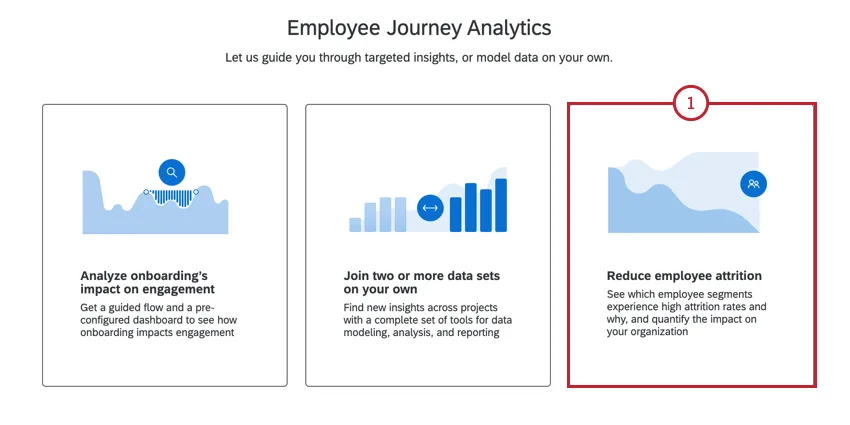
  1. Select Reduce employee attrition as your journey.choosing the "reduce employee attrition" journey
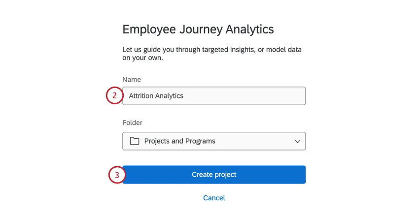
  2. Give your project a name and if desired, add it to a folder.naming the project and saving
  3. Click Create project.
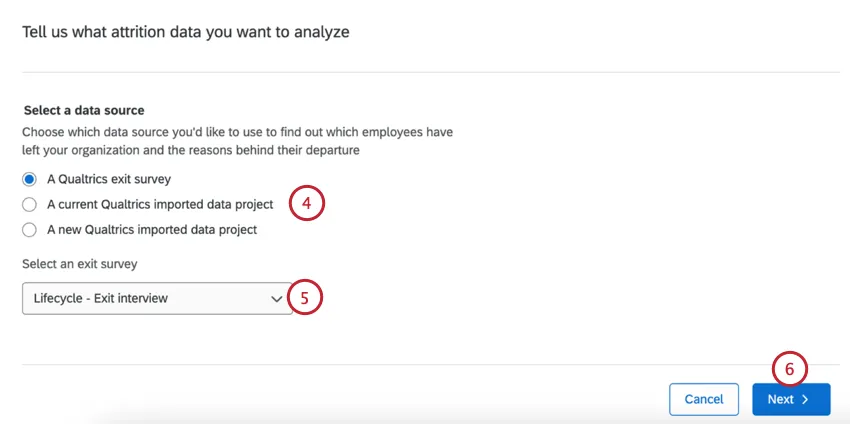
  4. Choose the project that contains the data about why employees left the company:choosing a project that contains attrition data
    • A Qualtrics exit survey. Only Lifecycle projects will appear here.
      Qtip: We strongly recommend using this option since the data field mapping is automatic.
    • A current Qualtrics imported data project.
    • A new Qualtrics imported data project.
  5. If choosing an exit survey or existing imported data project, use the dropdown menu to select the project.
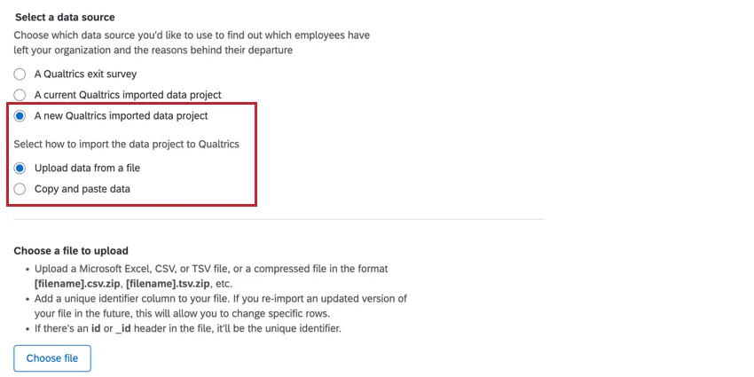
    Qtip: If creating a new imported data project, you can either paste in the data or upload a file with the data. See this support page for more information on uploading data. You’ll also need to manually map your attrition fields if using an imported data project. See Mapping Attrition Fields below for more information.the window to upload a CSV or paste data for a new imported data project
  6. Click Next.
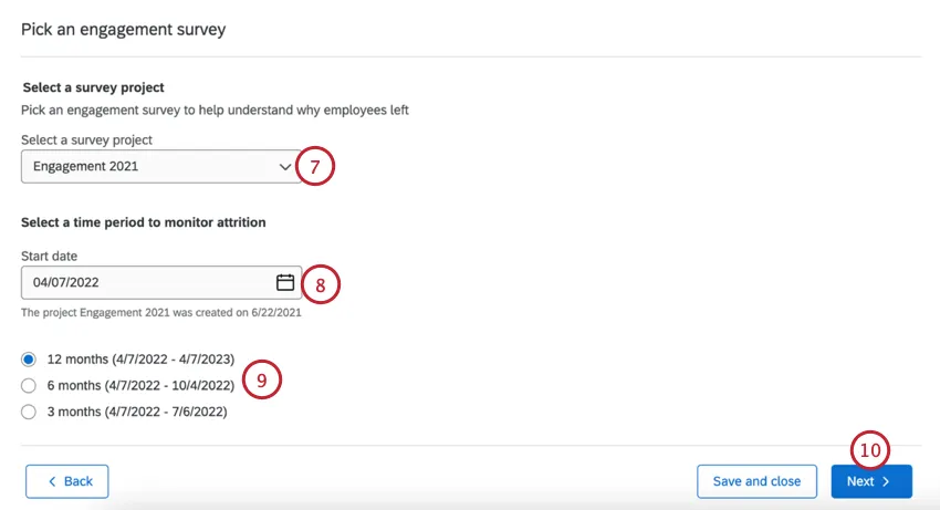
  7. Choose the Engagement survey that contains the demographics and survey questions you’d like to use for the analysis.selecting an engagement survey and time period to monitor
  8. Choose a Start date for the time period you’d like to monitor for attrition.
  9. Select the time period you’d like to monitor for. Your options include 3 months, 6 months, and 12 months.
  10. Click Next.
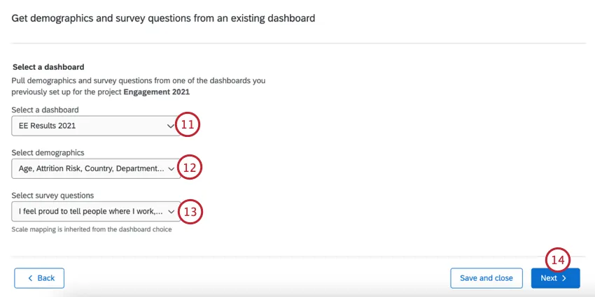
  11. From your Engagement project, choose the existing dashboard that contains the demographics and survey questions you’d like to use for analysis.selecting a dashboard, the questions, and employee demographics to use for analysis
  12. Choose the demographics fields you’d like to analyze for.
  13. Select the survey questions you’d like to use in the analysis.
  14. Click Next.
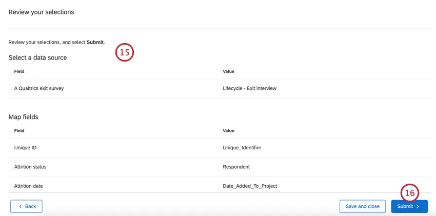
  15. Review your selections. If you need to change any of these, click the Back button and make any changes.reviewing selections and creating the project
  16. Once finished, click Submit. The analysis will take some time to complete. You’re free to navigate to other areas in your account, and you can find your journey on the Projects page.
  17. When your dataset is generated you can then view your prebuilt dashboard.

Mapping Attrition Fields

If your attrition data is in an imported data project, you’ll need to manually map your fields after uploading your data:

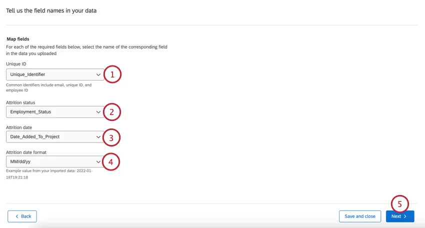
  1. Unique ID: The field used to identify participants, typically this is uniqueID, employeeID, or employee email.
    mapping attrition fields
  2. Attrition status: Select the field that contains the attrition status data.
  3. Attrition date: Select the field that contains the attrition date.
  4. Attrition date format: Select the attrition date format.
  5. Click Next.
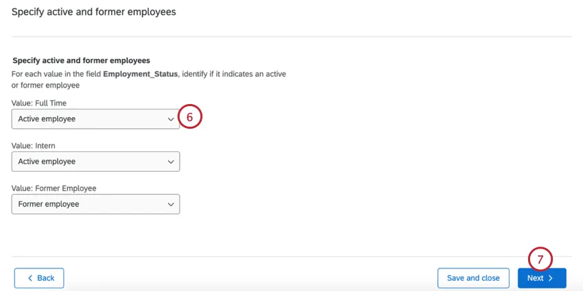
  6. Next you’ll see each possible value for your selected attrition status field. For each value, select if it indicates an active or inactive employee.
    mapping individual attrition values
  7. Click Next.
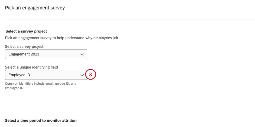
  8. When adding your Engagement project, you’ll need to select the Unique ID field that shares the same values as the UniqueID you selected in step 1.choosing the unique ID field for engagement

Viewing and Sharing the Prebuilt Dashboard

In addition to the prebuilt widgets, you can edit your dashboard and add additional widgets. For more information on editing the dashboard, see Dashboard Basic Overview (EX).

To return to your project, click Go to your project. Within your project you can refresh the data model to add new responses to your dashboard, or share the dashboard with other users. You can also edit your data model. For more information about editing the data model, see Creating A Data Model.

Attention: You cannot edit your dashboard’s dataset from the dashboard itself. Make changes to your dataset in the Data Model tab instead.

Onboarding Dashboard

This section covers widgets present in the prebuilt onboarding and engagement  dashboard. When your dashboard is created it will contain 4 widgets. These widgets visualize the impact of onboarding on engagement, based on the outcome and key driver metrics you previously selected.

Key Performance Indicators

onboarding and engagement KPIs in the dashboard

The first two widgets give a sense of the overall onboarding and employee experiences. They display the percentage of favorable responses to the items you selected as your onboarding and engagement Key Performance Indicators (KPIs).

Relationship Between Onboarding & Engagement

widget displaying onboarding items linked to engagement

The third widget looks at which onboarding items are most closely linked to engagement. This widget displays the favorability of each onboarding item, as well as the correlation of each item with the engagement outcome metric. By default, the items are ranked by impact, and the top 5 most correlated items are shown.

Onboarding & Engagement Outcomes

widget displaying onboarding and engagement across different segments

The fourth widget looks at how onboarding perception compares to engagement across different segments. The widget displays onboarding and engagement outcomes and can be broken out by the key performance indicators.

Attrition Dashboard

This section covers widgets present in the prebuilt Drivers of Attrition dashboard.

Attrition Insights

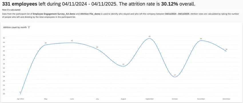
The attrition insights widget shows how many employees left your organization per month. You will also see an overall attrition rate for your organization based on the attrition window you selected during setup.
the attrition insights widget

Attrition rate is calculated with the following formula:
Attrition Rate = [Number of terminated employees] / ([Number of terminated employees] + [Number of active employees])

Stayers vs Leavers

The stayers versus leavers widget shows the survey questions with the largest gaps in favorability between employees who are active vs. terminated. These questions are directly taken from the questions you selected during the guided setup. By default, this widget is sorted by the favorability gap in ascending order, showing you survey items where the favorability for former employees is worse than active employees.the stayers versus leavers widget

You can edit this widget to customize the following:

  • Change the survey questions displayed in the widget.
  • Add a widget-level filter to filter by participant metadata.

Drivers of Attrition

The drivers of attrition widget shows you different key drivers and how important those drivers are at affecting employee attrition.

This widget is powered by Stats iQ and uses logistic regression and relative importance calculations.

Logistic regression is used to identify a list of statistically significant drivers to generate odds that show how different categories within a driver can lead to an increase or decrease in attrition. Relative importance is used to explain the variation in why people are active or terminated.

By hovering over a purple bar you can see the odds of attrition for that specific key driver.

Qtip: This widget uses all of the survey items and demographic fields selected during the guided setup as the starting data for the regression algorithm. This widget cannot be filtered by  page-level filters.

Attrition Simulation

The attrition simulation widget shows you how changes to responses for a key driver can impact your estimated attrition rate.

Qtip: This widget uses the fields generated by the drivers of attrition widget. You cannot add or remove fields from this widget. This widget cannot be filtered by page-level filters.

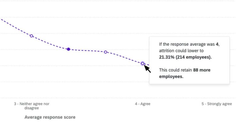
When you first visit this widget, you will see the survey item from the driver model with the highest relative importance preselected. You can click on this item at the top of the widget to change the item that is displayed.

The dotted line shows you the simulated attrition rate for different scores to this item. The solid dot is your actual score and rate of attrition. You can click the empty dots along the line to simulate how changes to the response score could impact attrition rates.clicking a dotted line to see the estimated impact on attrition rates

You can edit this widget to customize the following:

  • Select demographic segments to use as filters on the widget.
  • Input an estimated cost of attrition per employee. This allows the widget to show you how the cost of attrition can change based upon the estimated attrition rate associated with different survey item response averages.

Attrition Demographic Breakouts

The attrition demographic breakouts show how groups of people in your organization experience attrition, which helps you understand potential hotspots within your organization.  These widgets show both the size of the breakout groups (green bar) and the attrition rate (red line).the attrition demographic breakouts widget

These widgets are broken out into 2 different sections:

  • Demographic drivers of attrition: This section shows the breakout of fields that are in the driver model (i.e. statistically significant).
  • All other demographics: This section shows all other demographics included in the analysis but not in the driver model.
Qtip: The demographics used in this section are selected during the guided setup.