
Widgets Basic Overview (EX)
What's on this page
Qtip: This page describes functionality available to Engagement, Lifecycle, Ad Hoc Employee Research, Pulse, and 360 projects. For more details on each, see Types of Employee Experience Projects.
About Widgets
Widgets dynamically present data in graphs, charts, and tables. Qualtrics has many different widgets that can help you view your data by survey response, key drivers, action planning, and more.
There are many different types of widgets. To learn more about each one and where they’re available, see our Widget Types section.
Adding Widgets
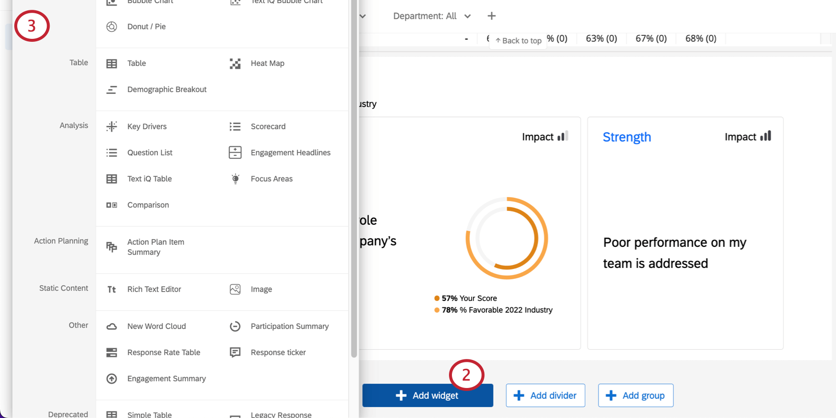
Qtip: You may notice a section of the add widgets menu called “Deprecated Widgets.” To learn more about what this means and alternative widgets you can use, see Deprecated Widgets. Note that there are both CX and EX Dashboards widgets on this list.
Qtip: Some older dashboards may contain legacy version of widgets that are not compatible with all features (like Qualtrics Assist). When editing a legacy widget, it will have a “Source” dropdown menu for you to choose a data source. This menu is replaced with a Filter field in the newer version of the widget that allows you to filter by data source. Please see this resource for more information about legacy and updated widgets for EX dashboards.
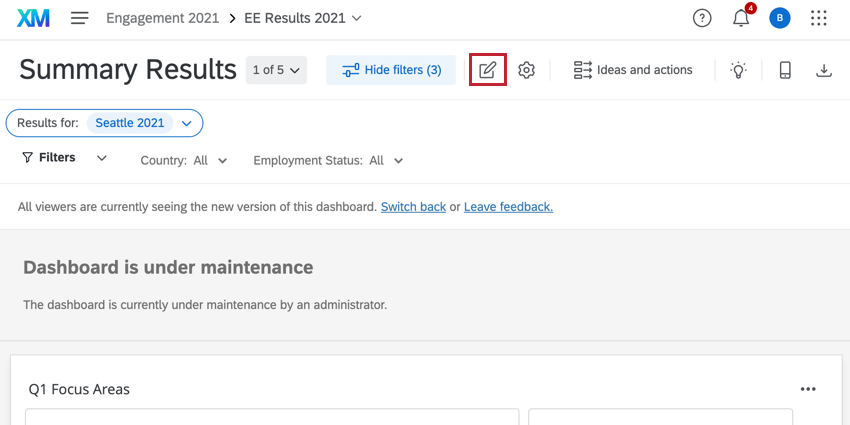
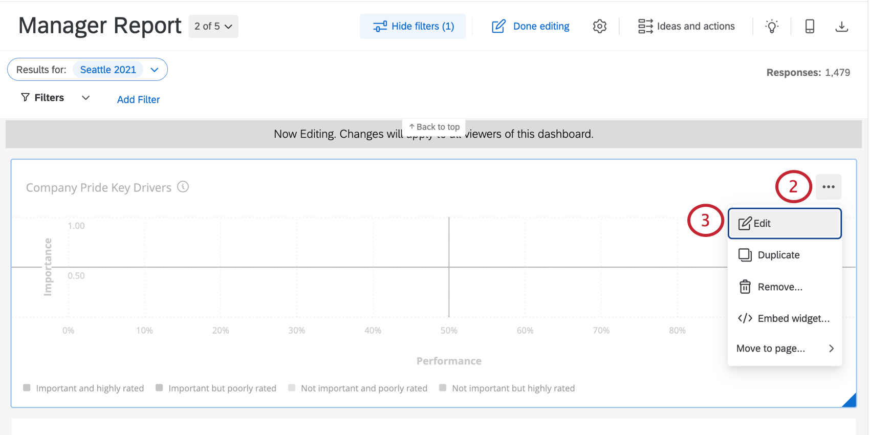
Editing Widgets
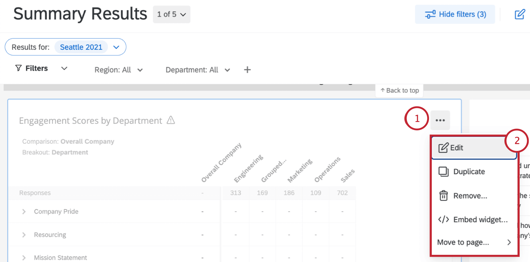
- Edit: Add titles, descriptions, colorful styling, and more to your widget. For more on the general details you can edit in each widget, see Editing Widgets. In addition, each widget may be set up a little differently, which you’ll find described on each widget’s support page. For a full list of widgets and links to pages, see Widget Types.
- Duplicate: Make an exact copy of a widget. You can choose to create the copy directly below the original widget, or at the bottom of the dashboard page.
- Remove: Delete the widget permanently from the dashboard.
- Move to page: Move the widget to another page of the dashboard.
In addition to these options, there are other ways you can customize your widgets to create great dashboards. To learn more, see the resources below:
- Basics of Editing Widgets: Instructions on how to adjust common settings, such as title, description, styles (like container and header), labels, and colors.
- Widget Metrics: Many dashboard widgets require you to pick a metric to set them up, such as line charts and both horizontal and vertical bar charts. Learn more about the many ways you can customize widget metrics.
- Resizing and Positioning Widgets: If you don’t like the size or location of your widgets on a page, they can be rearranged and resized.
- Grouping Widgets: Combine multiple widgets into a single group. This allows you to apply widget display options to all widgets in the group.
- Widget Dividers: Divid your dashboard pages into clear sections.
- View Widget Data: View data in a table format. Only available in certain widget types.
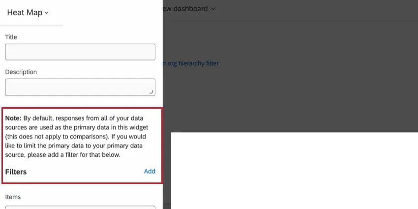
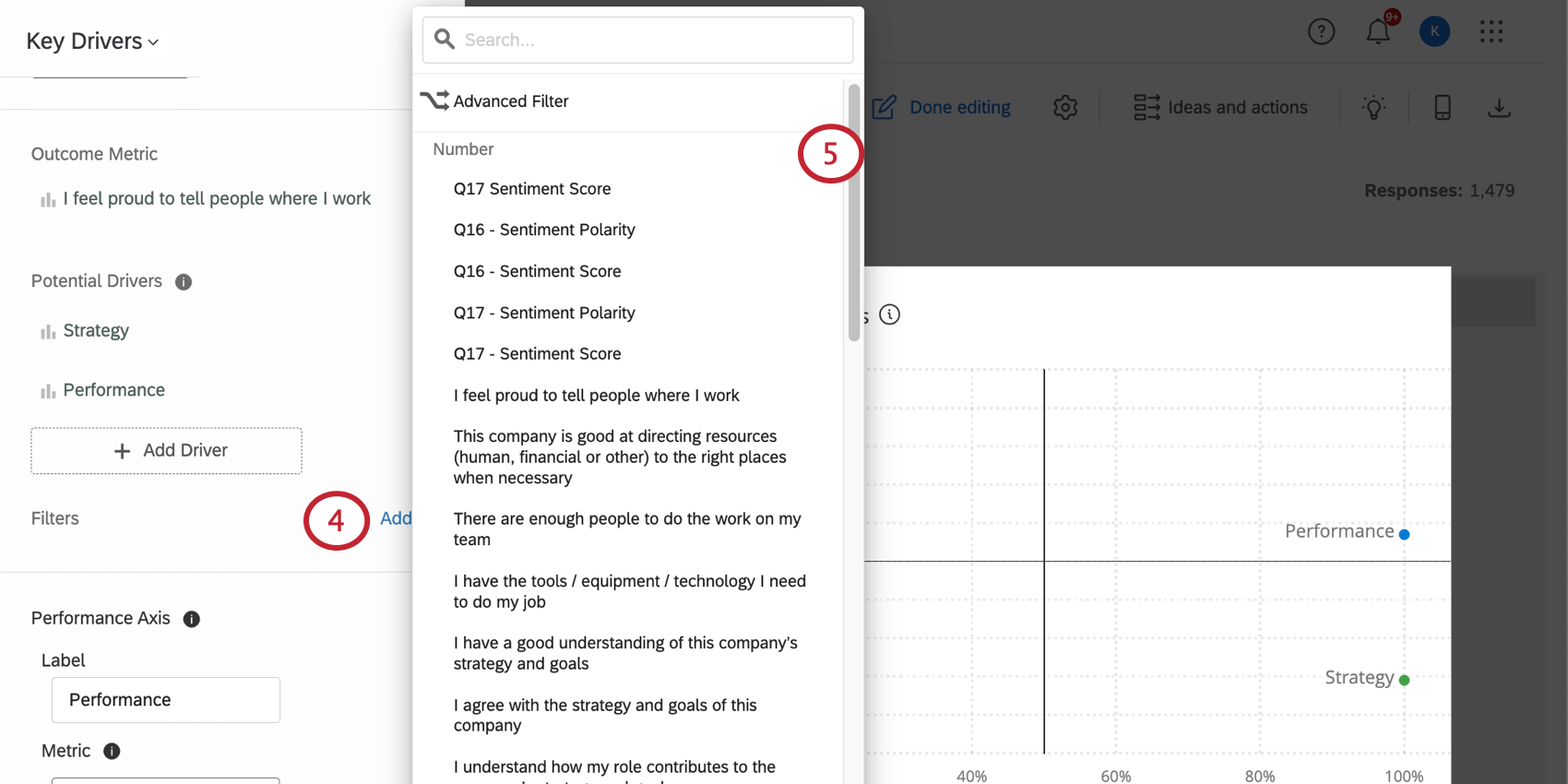
Adding Widget-Level Filters
You will only be able to apply widget-level filters to the word cloud, response ticker, gauge chart, number chart, simple chart, pie chart, simple table, key drivers, and heat map widgets. Follow the below steps to add a widget-level filter:
Qtip: Filters set on individual widgets will not apply to anything else on the page.
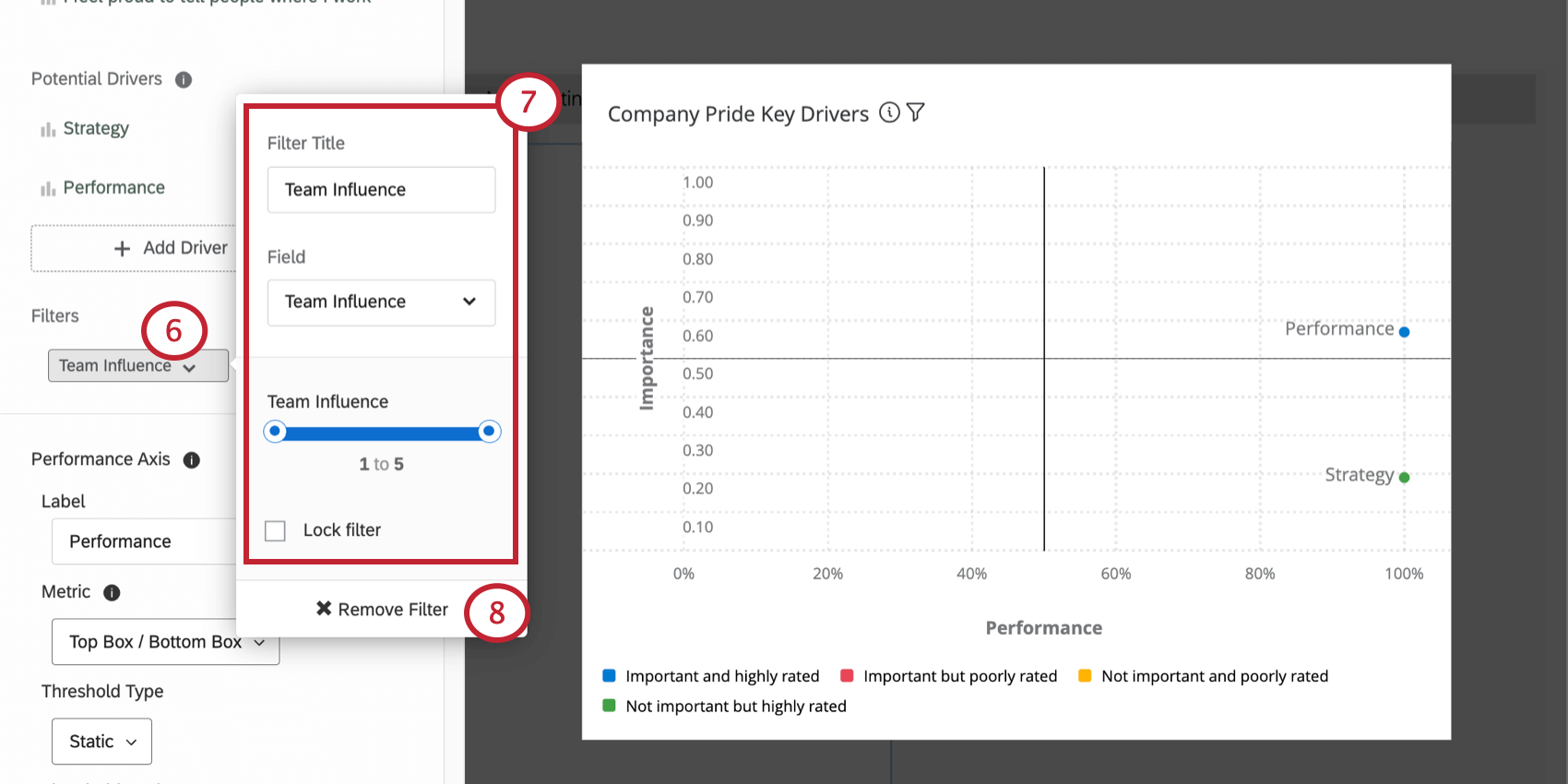
Qtip: Different data types will result in different kinds of filter options. For example, Text Sets will give you a dropdown list of options, while Numbers will give you a slider scale from which to select a number range (the number range corresponds to the answer choices’ recode values). You can change the data types of your questions and metadata inside the Dashboard Data.
Qtip: Adding widget-level filters this way only makes the filter available for dashboard users to use; it does not change what data is displayed on the widget. After you have added the filter, dashboard users will be able to select and adjust this filter, at which point the data displayed on the widget will change.
Filter Interactions
Generally speaking, page filters will apply to widgets that also have a widget-level filter applied. However, in circumstances where the widget-level filter and page filter conflict, the widget-level filter will override the page filter.
Example: If a page filter is set to show only responses from male respondents and a specific widget has a filter to show only responses from female respondents, the page filter will be ignored and the widget will only show female responses.
However, in a situation where a page filter doesn’t completely contradict a widget-level filter, both filters will be applied.
Example: If a page filter is set to only show responses from male respondents and the widget level filter is set to show only responses from participants ages 18-24, then the widget will show responses for males who are 18-24 years of age.
Export Widget
Qtip: Allow Widget Export must be enabled for these export options to appear.
You and your users can export a widget’s data. The data is available in CSV, TSV, PDF, JPG or XLSX . For CSV, TSV, and XLSX exports, the widget’s data is organized in a table, instead of the exact widget being exported.
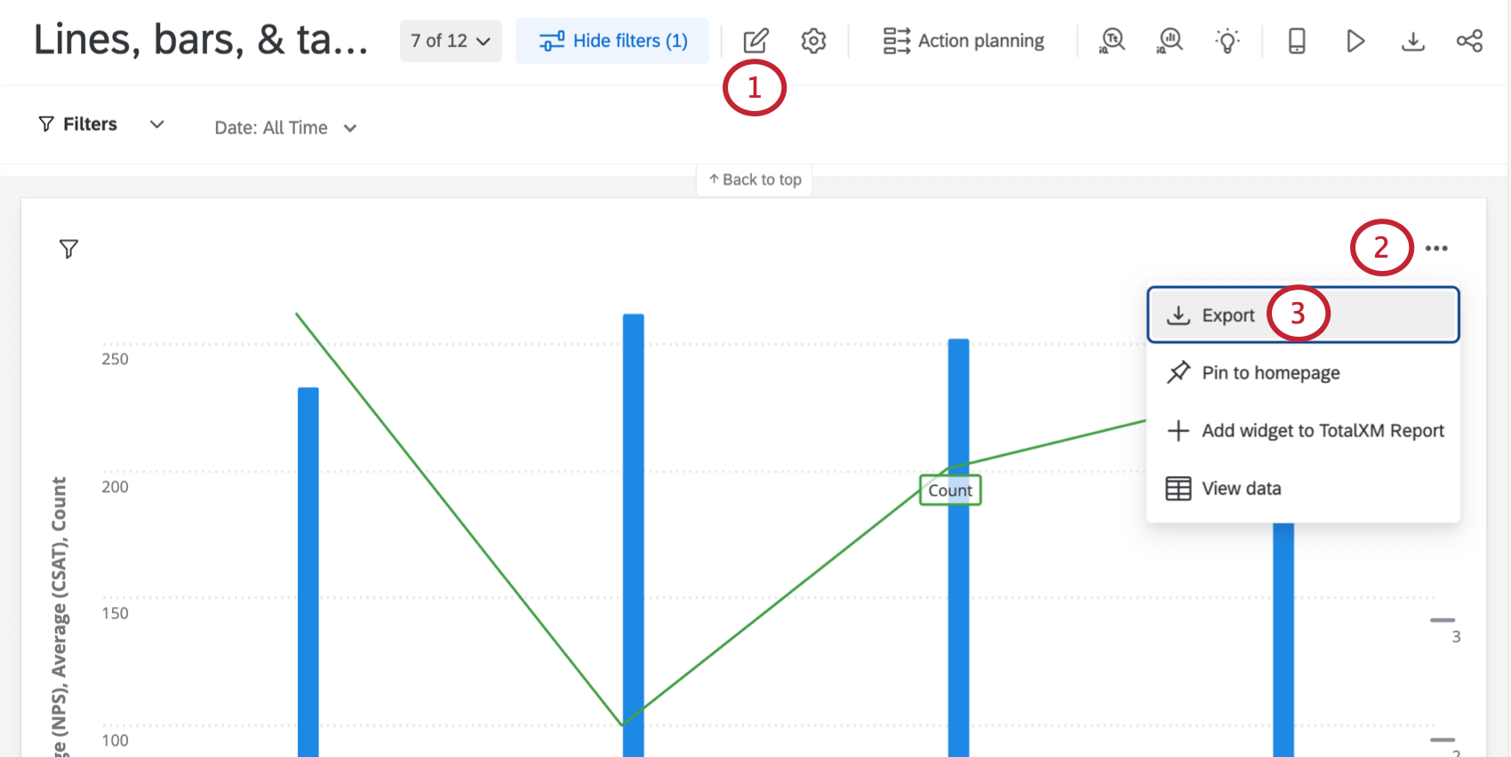
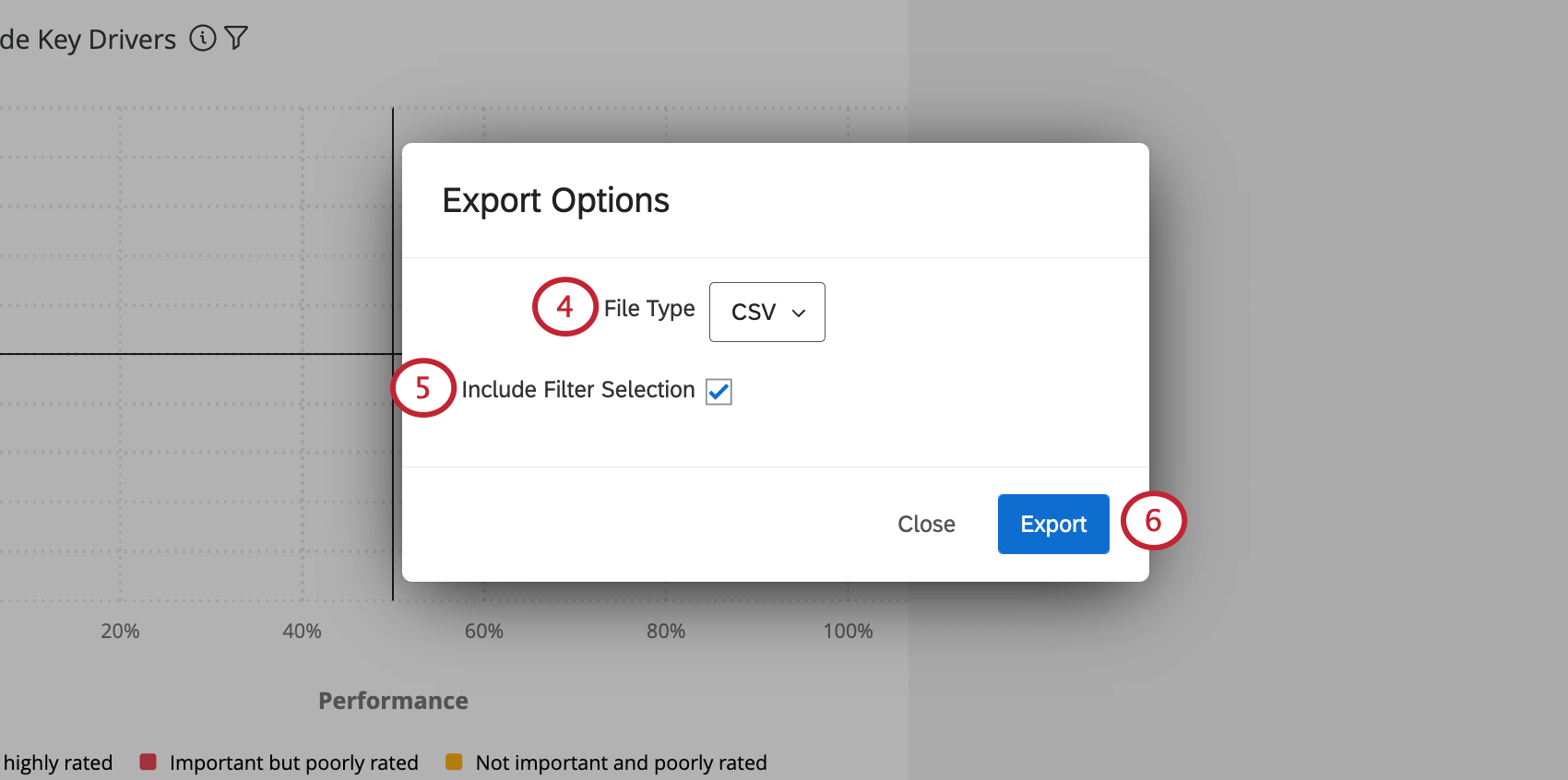
Qtip: Only Bubble Charts, Participation widgets, Gauge Charts, and Engagement Summaries cannot be exported to a CSV or TSV. Gauge Charts also cannot be exported as a PNG or JPG.
Widget Types and Project Compatibility
There are many different types of widget, all with their unique strengths and uses. To learn about about a specific widget, visit its support page, linked in the table below.
In addition to many widgets, there are many project types to consider. This table can also help you find out which widgets are available in which project types.
FAQs
Why is there only one source listed on my widget in my EX dashboard?
Why is there only one source listed on my widget in my EX dashboard?
How is Distribution calculated on my Question List / Comparison / Engagement Summary widget in my EX dashboard?
How is Distribution calculated on my Question List / Comparison / Engagement Summary widget in my EX dashboard?
Once you've decided which parts of each scale indicate high favorability, neutrality, and low favorability, the widget calculates the percentage of respondents who indicated each.
Why didn't my Participation Summary widget in my EX dashboard change when I updated my participants?
Why didn't my Participation Summary widget in my EX dashboard change when I updated my participants?
Why is my Participation Summary widget in my EX dashboard showing a different percentage than what I calculated? I already updated my invited counts.
Why is my Participation Summary widget in my EX dashboard showing a different percentage than what I calculated? I already updated my invited counts.
Now that I have my key drivers, how should I act on the results in my EX dashboard?
Now that I have my key drivers, how should I act on the results in my EX dashboard?
Why are some of my survey questions missing from the list of Eligible Drivers for the Key Drivers widget in my EX dashboard?
Why are some of my survey questions missing from the list of Eligible Drivers for the Key Drivers widget in my EX dashboard?
Why are some of the fields in my Breakout Table or Scorecard widget in my EX dashboard displaying dashes and no data?
Why are some of the fields in my Breakout Table or Scorecard widget in my EX dashboard displaying dashes and no data?
Can I bring more than one open-ended text question into a single Word Cloud widget in my EX dashboard?
Can I bring more than one open-ended text question into a single Word Cloud widget in my EX dashboard?
Can I create my own color palette for the Bubble Chart widget in my EX dashboard?
Can I create my own color palette for the Bubble Chart widget in my EX dashboard?
If I have two sources mapped in my Dashboard Data, how can I make it so this widget only displays data from a single source in my EX dashboard?
If I have two sources mapped in my Dashboard Data, how can I make it so this widget only displays data from a single source in my EX dashboard?
The count in my Number Chart widget does not match the count for the same value that I see in other widgets in my EX dashboard. Why is this?
The count in my Number Chart widget does not match the count for the same value that I see in other widgets in my EX dashboard. Why is this?
Why do I not have any data options in the Scorecard widget in my EX dashboard even though I’ve mapped over everything for my project?
Why do I not have any data options in the Scorecard widget in my EX dashboard even though I’ve mapped over everything for my project?
How do I set my Gauge Chart widget to display my Engagement Score in my EX dashboard?
How do I set my Gauge Chart widget to display my Engagement Score in my EX dashboard?
Can I insert HTML or other coding languages in the Rich Text Editor widget in my EX dashboard?
Can I insert HTML or other coding languages in the Rich Text Editor widget in my EX dashboard?
The count of responses on the Response Rates widget and/or Participant Summary widget doesn’t match the expected response count in my EX dashboard. How can I fix this?
The count of responses on the Response Rates widget and/or Participant Summary widget doesn’t match the expected response count in my EX dashboard. How can I fix this?
Why are my metrics adding up to 99 or 101 instead of 100?
Why are my metrics adding up to 99 or 101 instead of 100?
33.60 + 33.60 + 32.80 = 100
Whereas if you choose to display no decimals with the same dataset:
34 + 34 + 33 = 101
Widgets can’t show infinite decimals, which means that regardless of decimal settings, some data will eventually have to be rounded up. This means that small deviations, like adding up to 99 or 101 instead of 100, work as intended.
That's great! Thank you for your feedback!
Thank you for your feedback!