
Engagement Summary Widget (EX)
What's on this page
About Engagement Summary Widgets
Qtip: This widget is WCAG 2.1 AA compliant.
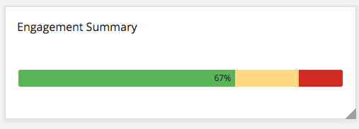
The Engagement Summary widget shows the distribution of a single category or several items in a single bar. Instead of being based off an average or an overall score, the Distribution column is calculated based off of the Scale settings. Each color of the scale indicates a different level of favorability. In addition to overall engagement with a given item, you can also add comparisons to historical data or benchmark standards.
Qtip: When multiple Items are selected for this widget, the overall engagement score is calculated by averaging the responses from each Item. Note that each question and category will not be weighted equally if they have a different number of responses.
Qtip: Unsure which Employee Experience projects have this widget? See our Widget Types and Project Compatibility table.
Field Type Compatibility
The Engagement Summary widget is only compatible with the Number Set field type.
Widget Customization
For basic widget instructions and customization, visit the Widgets Overview support page. Continue reading for widget-specific customization.
Basic Set-Up
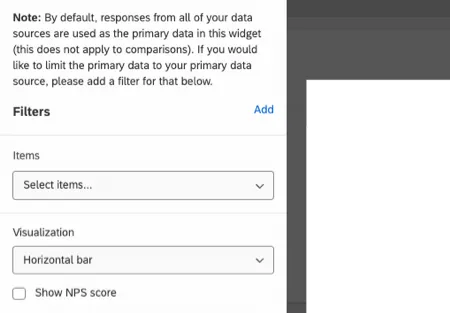
By default, responses from all your data sources are used as the primary data in this widget, except for comparisons. If you want to only pull data from a single data source, select Add to add a filter.
In the Items field, select the metadata, questions, or categories you wish to pull into the widget.
You can pull in as many items as you want, and instead of breaking into separate rows, the items will aggregate, resulting in a combined engagement score. Because of this, be careful which items you select so that they are items that make sense to combine. Organizing your survey items into categories can make it easier to group items together.
Qtip: The Scorecard widget will show the distribution of categories on separate rows. The Question List widget also separates items by row and can pull in questions and metadata in addition to categories.
Visualizations
There are 2 visualization types to choose from.
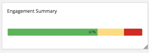
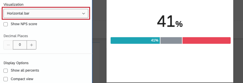
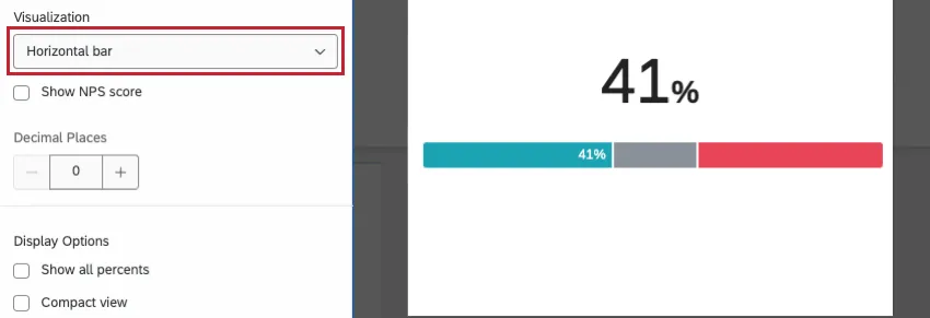
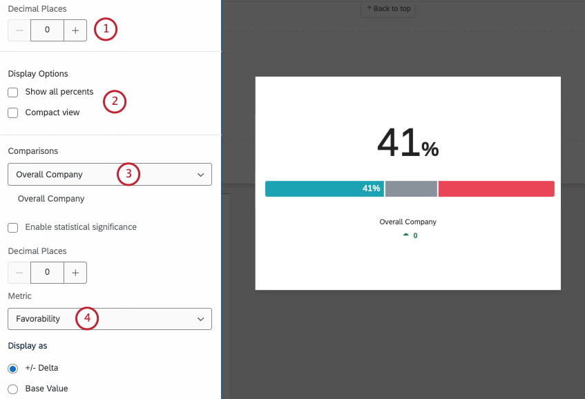
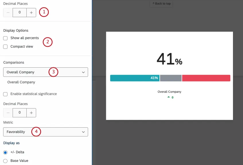
Horizontal Bar: This is the default option. Engagement scores will be displayed as a horizontally stacked bar with the engagement score as a large number on top.
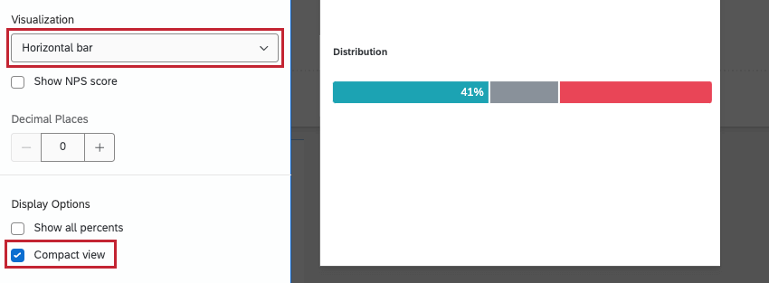
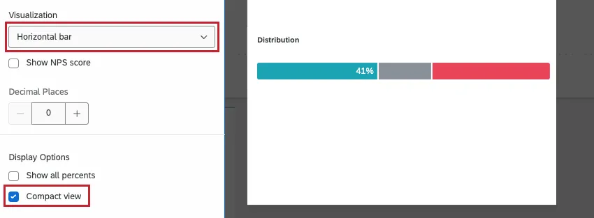
When Compact View is selected, the visualization will hide the large number on top as well as any comparisons added.
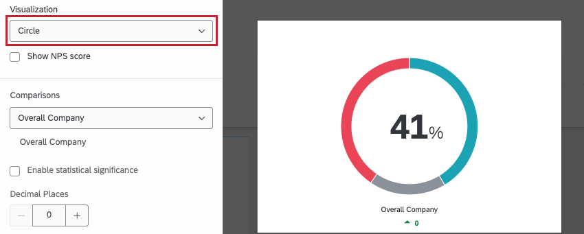
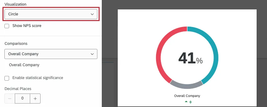
Circle Visualization: This view displays the engagement score as a pie-chart style circle with the engagement score in the center. Comparisons are displayed below the circle. Compact view is not available for this visualization type.
Additional Options
FAQs
How is Distribution calculated on my Question List / Comparison / Engagement Summary widget in my EX dashboard?
How is Distribution calculated on my Question List / Comparison / Engagement Summary widget in my EX dashboard?
Once you've decided which parts of each scale indicate high favorability, neutrality, and low favorability, the widget calculates the percentage of respondents who indicated each.
That's great! Thank you for your feedback!
Thank you for your feedback!