
Radar Chart Widget (BX)
What's on this page
About the Radar Chart
A radar chart (also often called a “spider chart”) is a two-dimensional chart designed to plot one or more series of quantitative values. The chart provides an axis for each value present in the survey, arranged radially as equi-angular spokes around a central point.
Interpretation
Radar charts are best for showing how different subjects rate on the same scale.
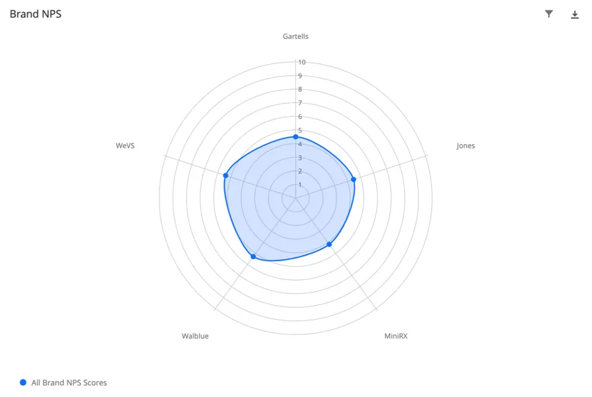
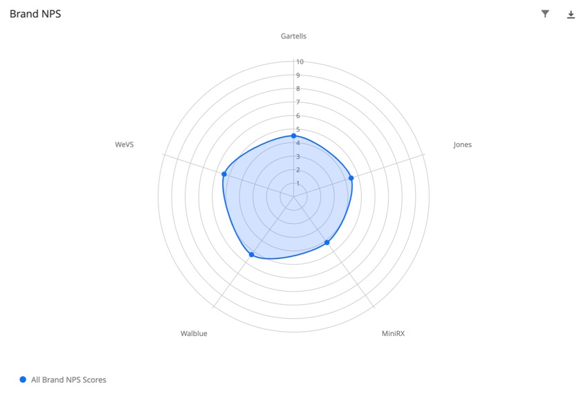
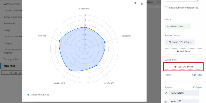
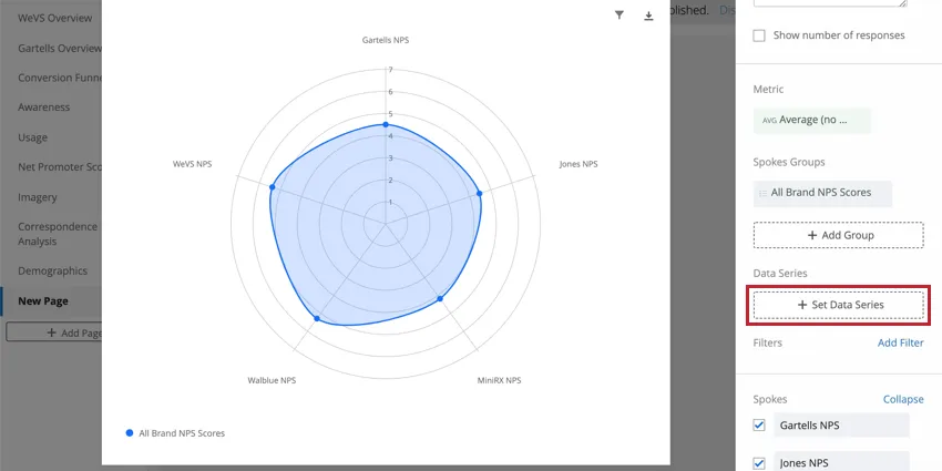
Example: See how 5 brands’ average NPS scores compare.
Because of this, radar charts are best for plotting finite numeric data, such as a scale from 1-10, rather than numeric fields with structureless or infinite values, like age or number of responses. Negative values also do not work well with radar charts.
The center of the circle represents zero, and the radius of the circle (the size it stretches in any direction from the center) generally represents the highest end of the scale. Although it’s more subjective, you can also set the radius to a value closer to the highest gathered data point so far.
Each spoke on the circle represents a different data point. In the example below, the spokes are the fictional brands WeVS, Gartells, Jones, Wallblue, and MiniRX.
Data Requirements
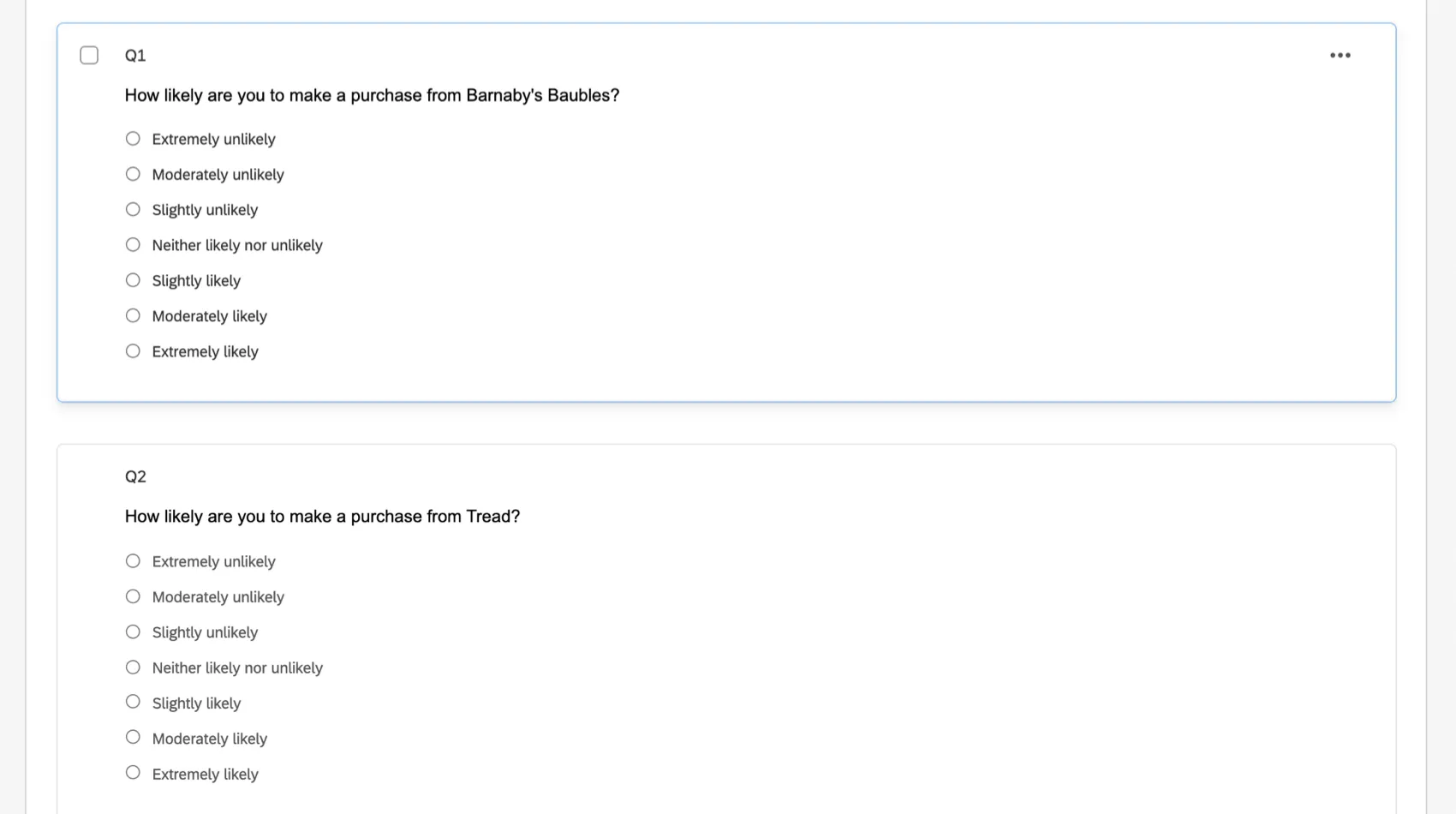
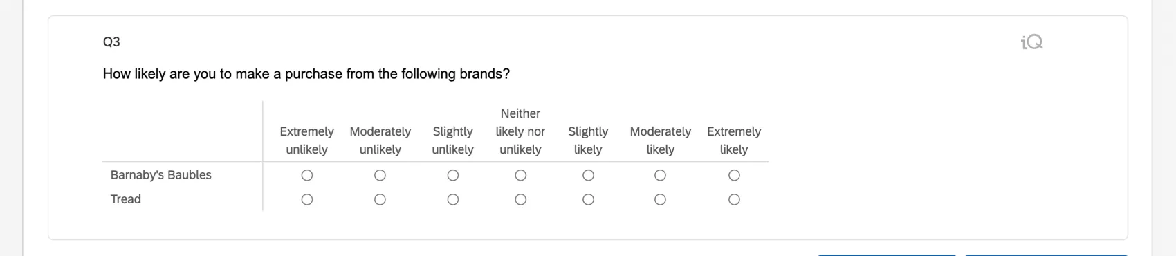
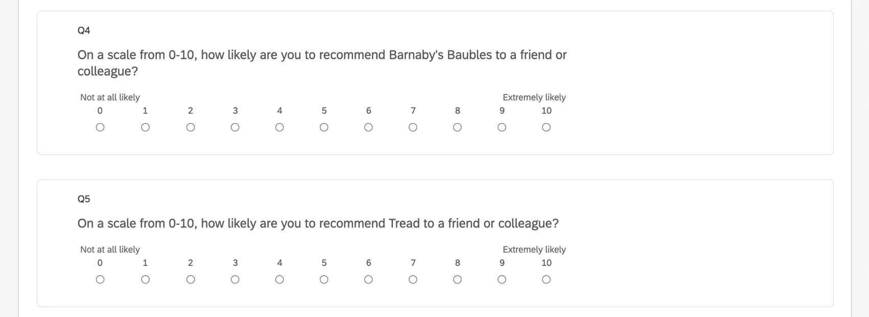
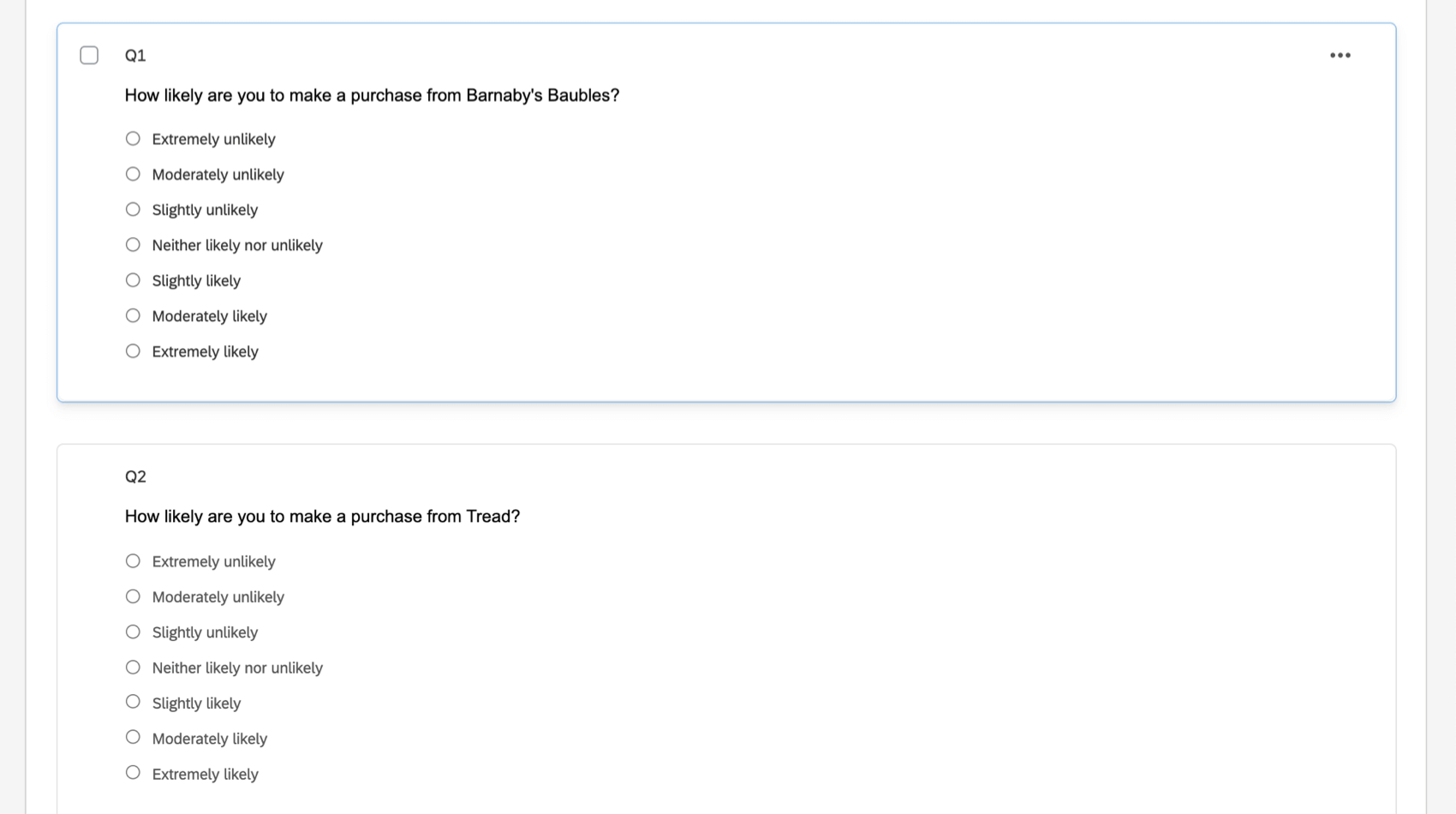
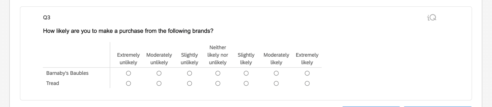
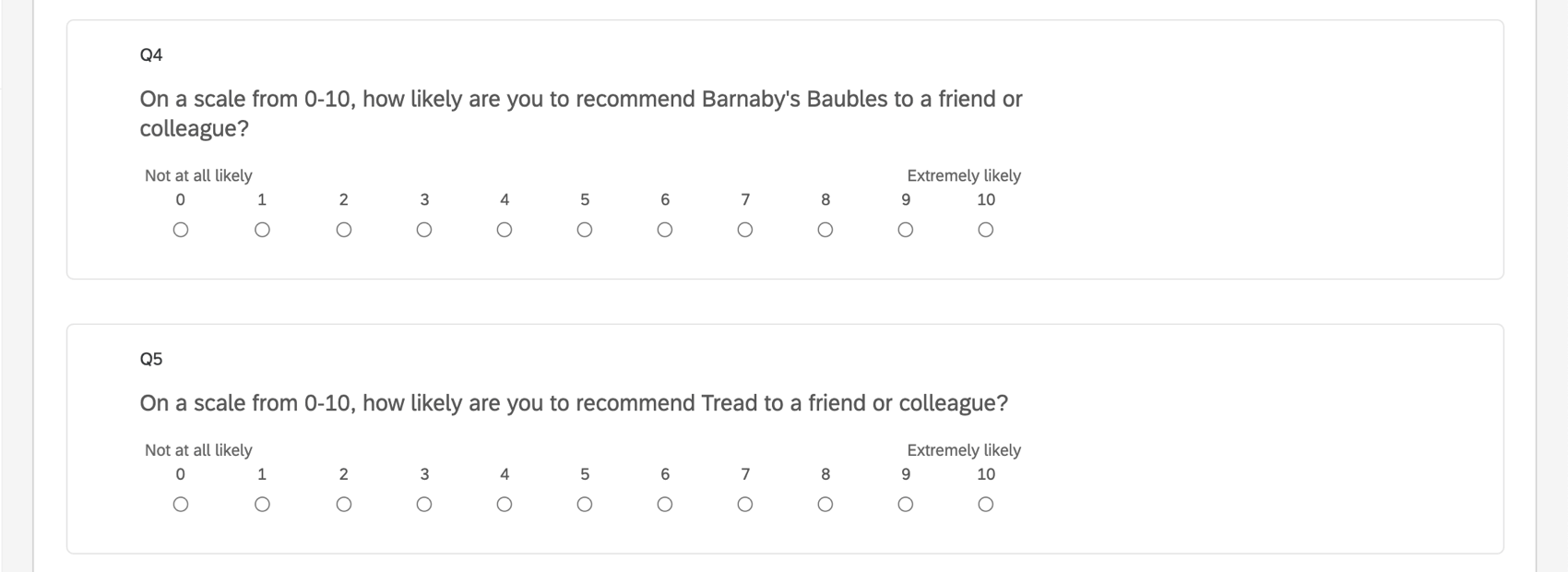
The radar chart works well when you have multiple sets of the same question with the same numeric scale. For example, you may ask “How likely are you to make a purchase from _?” separately about each brand you are researching, and ask respondents to rate their answer a seven point scale from “Extremely likely” to “Extremely unlikely.”
This means your survey needs one of the following:
- Several multiple choice questions with the same answers in scale format
- A matrix table in a Likert format
- Several Net Promoter® Score questions
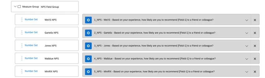
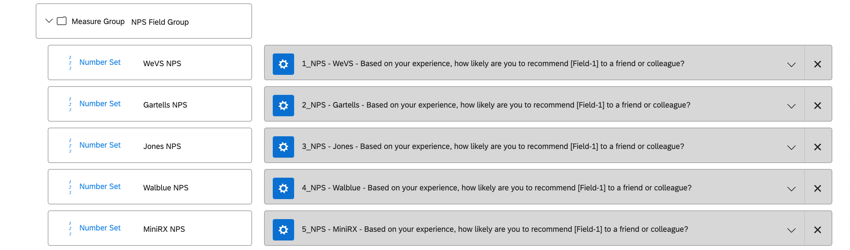
Example: Based on how you completed your Brand Tracker setup, you are likely to have a separate NPS question for each brand you are researching, bundled together in a Measure Group. This is perfect for the radar chart.
Qtip: Technically, you can add many other kinds of data to a radar widget, including Numeric and Count-based fields. But radar charts are best for displaying data from sets of identical questions set on finite number scales.
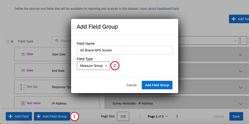
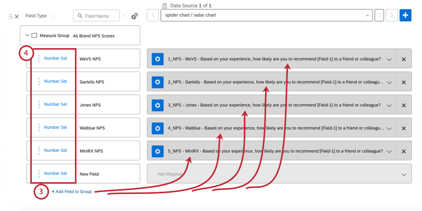
Mapping Data for a Radar Chart
If you don’t want to use the NPS field included by default, these instructions can help you map your custom survey questions.
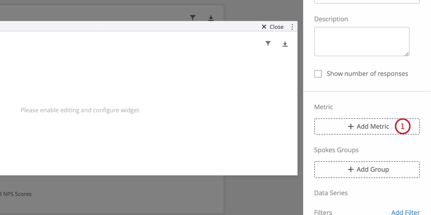
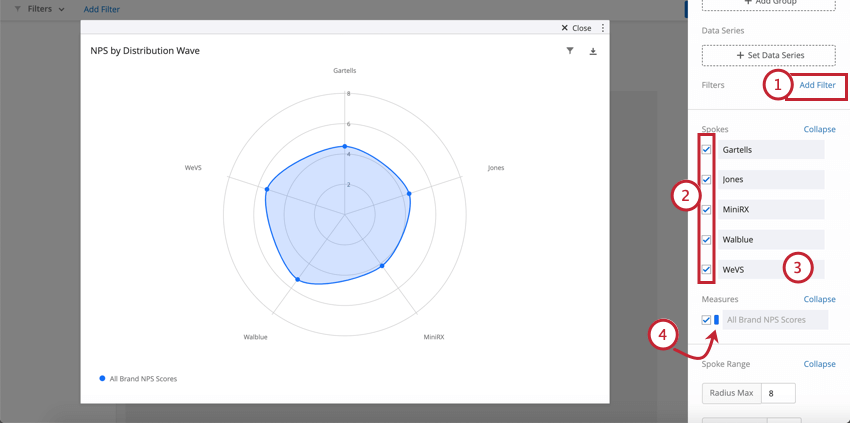
Setting Up your Radar Chart
Once you have the right data mapped, adding data to your widget is easy.
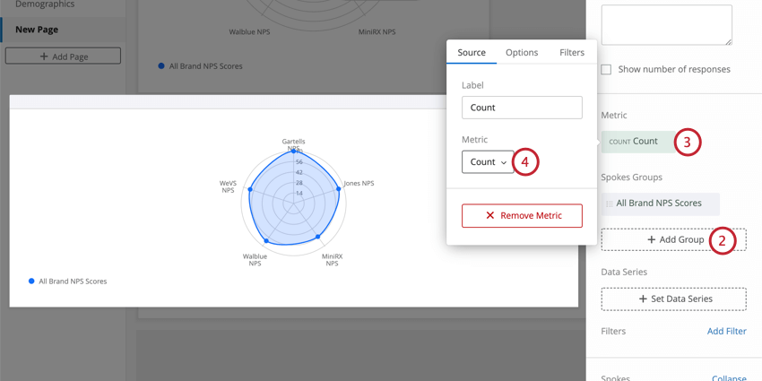
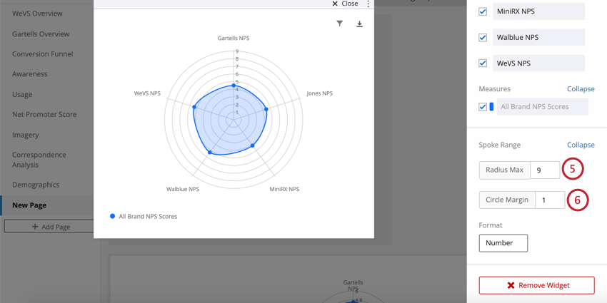
Qtip: NPS is scored from 0 to 10, so 10 can be a great value for this maximum. However, you may also make adjustments based on what makes the widget easier to read. It looks like the average NPS isn’t a perfect 10 in our example study, so we lowered the maximum to make the differences between brands more readable.
Qtip: For smaller scales, you may want to see a ring for every value, hence we set ours to 1. For larger scales, this number should be higher to make the graph easier to read. For example, if the maximum value was 100, your circle margin might be 5 or 10.
Charts with Multiple Spokes Groups
If you would like to display multiple groups on your radar chart, you’ll need to format your data a little differently.
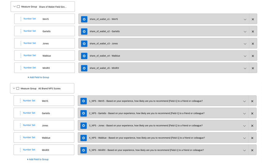
We still advise that you set up each the data you want to display in the radar chart as Measure Groups of Number Sets. But each group of fields needs to have the same brands or attributes with the same naming. In the following screenshot, you see that both the NPS and Share of Wallet groups have the same brands inside: WeVS, Gartells, Jones, Walblue, and MiniRX.
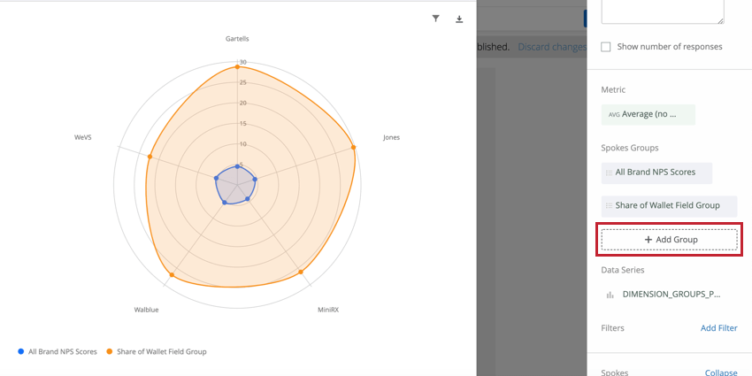
Once you’re ready, you can add another measure to your radar chart by clicking Add Group.

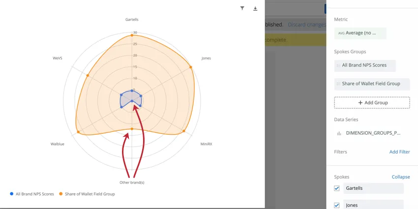
Qtip: The radar chart will still generate data if one measure group has an extra field that the other doesn’t, but because there’s no data to populate, the chart will look uneven. Look at the screenshot below to see how a radar chart with NPS (which didn’t collect data for “Other brands”) and Share of Wallet (which did collect data on “Other brands) will display data.
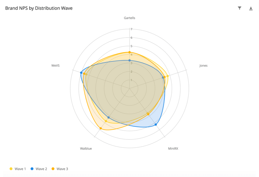
Breaking Out Radar Charts with Data Series
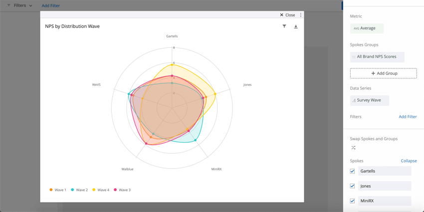
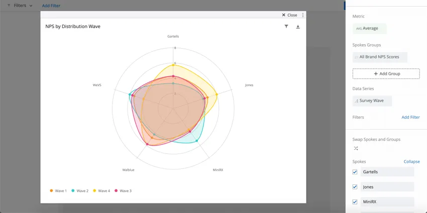
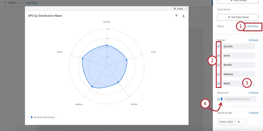
You may want to break out your radar chart by additional information, such as Embedded Data, survey metadata, or demographic data you’ve collected on recipients. For example, you may want to see how NPS ratings for each brand differed by the respondents’ industry, by the wave of the survey distribution, or by the date the survey was sent.
You can do this by clicking Set Data Series and selecting a Text Set or Multi-Answer Text Set field.
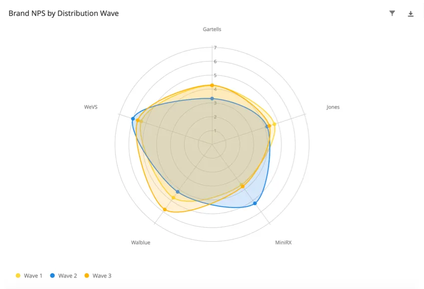
Here is what that radar chart looks like broken out by wave:
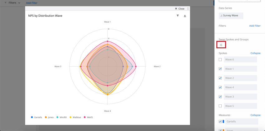
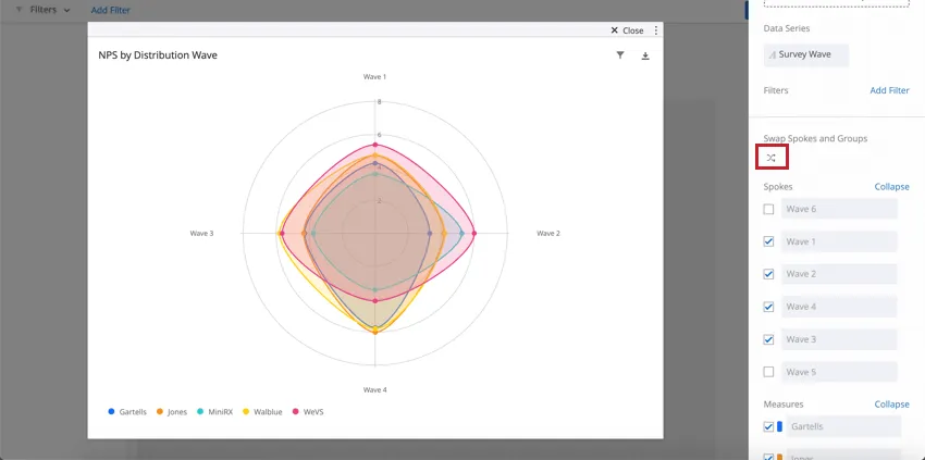
To switch the spokes (fields listed around the edges) and the groups (colorful maps), you can click the icon beneath Swap Spokes and Groups.
Qtip: Survey wave is not a default field. If you want to identify waves of distribution, you need to make sure you’ve added Embedded Data to your survey flow and included a query string on the end of your survey link each time you distribute the survey.
Qtip: We do not recommend adding a data series if your chart already has multiple groups loaded into it.
Widget Customization Options
The order of fields cannot be adjusted.
FAQs
How do custom metric filters interact with page filters in BX dashboards?
How do custom metric filters interact with page filters in BX dashboards?
That's great! Thank you for your feedback!
Thank you for your feedback!