What is user experience?
User experience definition: User experience is the relationship between users and the things they interact with, starting from a human-first point of view.
As a school of study and practice, UX is concerned with making things intuitive, easy, relevant and enjoyable to use. It also seeks to understand the psychological, cognitive and contextual factors that influence that outcome. UX designers work to help the things we use make sense to us and maximise their usefulness and usability in our lives.
The Interaction Design Foundation describes user experience design in terms of the What Why and How of product use.
Why? What does the user want from the product? What are their motivations for engaging with it? What tasks do they want to accomplish, and what outcomes are they working towards?
What? What should the functionality of the product be? What features will it include?
How? How will the product’s features and functions be designed so that it’s aesthetically pleasing and accessible to its user?
Deepen your UX knowledge with the Digital Experience Playbook
Where did UX come from?
The term ‘user experience design’ was coined in the 1990s by cognitive scientist Don Norman, then an employee at Apple. When Norman began to explore the idea of user-centred design, the idea of placing end users at the heart of design thinking – something we now see as intuitive and logical – was a new and challenging concept.
Despite historical precedents like the philosophy of ergonomics and the tendency of ancient humans to design tools around themselves, UX didn’t truly enter public consciousness as a design requirement until relatively recently.
So how did UX gain traction and become widespread?
One factor is the mushrooming growth of the internet and with it the ability of technology companies to shape our world through their ideas and innovations. Like Don Norman, Apple’s Steve Jobs was an advocate of user-centred design and made a point of building it into highly influential technologies such as the iPhone.
User experience design and technological development are deeply intertwined, both in terms of methodology and culture. UX designers naturally work digital-first, and UX methods have been shaped around software development workflows like waterfall and agile.
Humans are biologically evolved – we’re made a certain way and there’s no quick way to change this. Technology on the other hand is fast-evolving, mutable and easy to revise and change in a short space of time.
As we become increasingly dependent on and connected with digital forms of communication and learning that are man-made and complex, we have more and more need for those interfaces and systems to be shaped around our biological nature.
It makes sense to mould technology around the humans rather than vice versa. UX helps us to make those changes so that we can best use the technologies we create and design meaningful and relevant experiences.
What’s the difference between UI and UX?
Though they sound similar, user experience and user interface (UI) aren’t the same thing.
User experience covers users’ entire interactions with a brand, as well as its products and services. UI encompasses how a user might specifically interact with software, computer systems or apps through buttons, screens, and other visual elements.
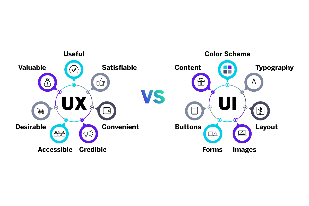
The two concepts are linked – implementing changes to user interface design might have an impact on user experience, for example. User research can help to inform what changes should be made to UI to help improve a user’s experience.
What is digital UX?
While UX isn’t exclusively concerned with technology, digital UX is a huge part of the field and also the arena in which UX design has, for the most part, been developed and pioneered. UX can be considered a truly digital-first industry, since it has developed in tandem with the internet and the digital landscape where we now live and work.
Digital UX is UX design and research that’s concerned with optimising online experiences and the human interfaces of digital technologies – the places where humans and machines meet. Because of the investment in and focus on UX work in digital fields, it’s a job that’s often broken down into a number of roles and responsibilities within a team.
- UX researchers are experts in defining user needs and carrying out user research
- UX designers define requirements, create personas, and develop wireframes and prototypes
- UX writers focus on using language to
- UI designers create the look and feel of websites and apps using visual design
- Interaction designers help businesses create user-focused experiences on a product or service level
- Service designers carry out high-level analysis and planning of end-to-end user journeys, taking into account people, technologies, processes, and business strategies
Why is UX important?
As UX design has become better known, end-user expectations have evolved. Rather than expecting to just cope with using something difficult or unintuitive, more people have become aware that complex or confusing designs are a decision rather than a fact of life, and we now expect and demand ease and logic from our experiences.
In recent years, businesses delivering great user experiences have been able to stand out from their competitors and pull ahead financially.
Today, UX has moved from an advantage to imperative.
As consumers began exercising informed choices and rejecting poor UX, competing businesses began differentiating themselves on their ability to provide good experiences. Those failing to meet the standards of user experience design have found themselves suffering in terms of sales and reputation.
Meanwhile, good UX has been recognised as a powerful way to create good customer experiences, building positive emotion and loyalty through consistently smooth and intuitive interactions. Good UX means happier customers, fewer drop-outs and pain points during interactions, and ultimately a healthier and stronger business with positive revenue impact Forrester has found, a user-centred design can have up to a 200% higher visit-to-order conversion rate than a site with a bad UX design.
How to improve UX
If you’re interested in improving the user experience of your website, app, product or service, you’ll need a deep understanding of the principles of UX design, and understand the needs and motivations of your users.
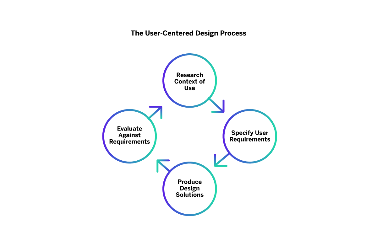
Embark on user research and user testing
Before you begin to put any ideas and UX design principles into practice, it’s a good idea to commit to a programme of user research and testing to create a strong foundation for your work.
User research helps you gain a deep understanding of your customers, what they want and need and how they relate to your products and services. UX research can help you identify where your UX is currently at and which areas you should prioritise for improvements.
User research at its core is about uncovering the reasons behind your customers’ behaviours, determining what actions would better serve their needs and the user experience as a whole. By understanding your customers in-depth with intent, emotion, and sentiment metrics and more, so you make effective decisions based on real data.
Interaction design is best based on the results of user testing, which can involve surveys, observations, user interviews, focus groups and more. User testing helps guide your product development and marketing planning by observing your end user’s interaction with your products and services. Rather than relying on creating personas without testing, you gather solid market research for the actions you take.
Through informed observation, testing and collecting feedback, you can see and evaluate your UX performance in real time. You can map out the user flow and conduct usability testing to see if your design serves users correctly during all the moments that matter.
Things to consider include:
- What’s driving your users? Ask your user base about their current user experience, and what they want from future interactions. Examine what they tell you directly and what they’re saying indirectly with conversational analytics.
- Where are the pain points? At what point in the human-system interaction is there a breakdown, and why? Aim to fix these issues and anticipate future friction.
- Test, test and test again. User-centred design needs to evolve with your target audience, as their needs and preferences are not static. Test your users over time and improve incrementally with multiple versions and new design elements as needed.
Consider user experience vs usability
If you’ve read anything about user experience, you’ll have seen the term ‘usability’ surface.. User experience and usability are closely related, but they’re not quite the same thing.
Usability is an important characteristic of things that have good UX. It’s the property of being easy to use and intuitive. If something makes sense, operates smoothly in the way you expect it to, and doesn’t confuse you or complicate your task, it has good usability.
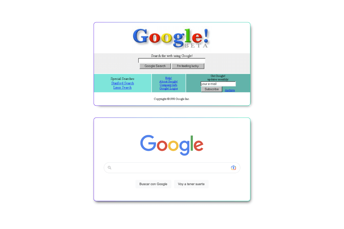
User experience is a broader term. User experience encompasses user goals and expectations, their prior knowledge, and the context in which they’re using the system in question. A UX designer looks at whether a product or service is credible, findable, accessible, valuable, desirable and useful, and makes changes if not. Sometimes, this is a big change, and sometimes it’s relatively small. Just take Google’s UX redesign, for instance – a few changes, but a big difference in usability.
Remember to ask:
- How do your users interact with you? It’s no good optimising the human-computer interaction if your users prefer their mobile devices. Your UX research should highlight the context in which your users encounter your brand, helping you to generate an accurately responsive design.
- Does it work for everyone? A good user experience designer knows that the best experiences cater to all needs, whether that’s optimising for colour blindness or creating a different accessible design.
Optimise the user interface
Once you’ve gathered all of the data on what your users are looking for, you can start on the UX design process. Ideally, your understanding of user data and usability should directly influence your UX design.
UI design smooths the process of a user’s interaction, providing just what they need and want at every step of their journey with your brand. Often, UI design is completed with input from UX designers and SEO professionals, ensuring that users can discover your brand, interact productively and complete desired actions in a smooth way.
Aspects to consider include:
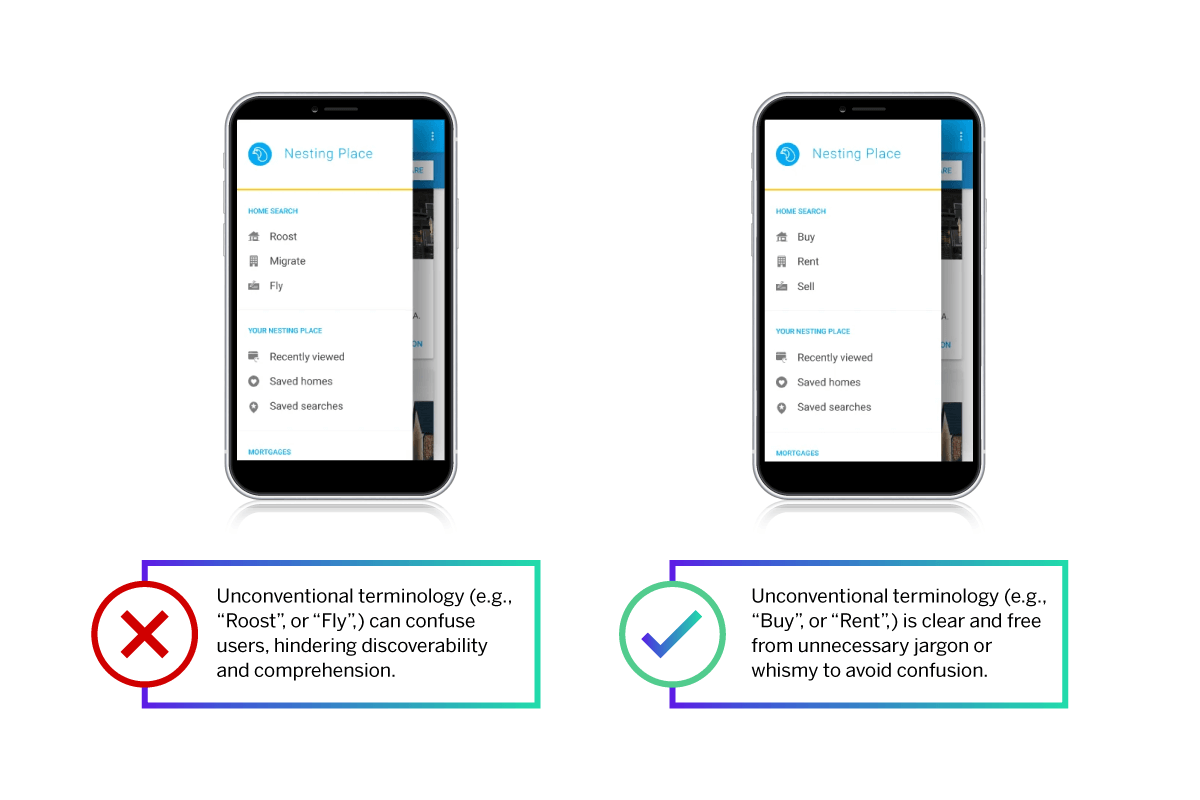
- Does your UI design feel intrusive or confusing? The best UI designs are almost imperceptible, with users able to find what they need and flow onto the next step of their journey without interruption. That even extends to the wording on the design.
- Do your UI elements feel cohesive? Individual interaction design is helpful, but your overall user experience should feel as if it’s interconnected. Interaction designers should be able to create a sense of familiarity and a common brand design language that’s easy for users to connect with.
Think of UX as part of CX
We’re often asked where user experience fits into customer experience, and whether there’s a meaningful difference between UX and CX. In fact, the two things are different in scope and form but share some core characteristics.
- User experience is often short-term and practical, generally concerned with ‘rubber meets the road’ interactions like website navigation and ensuring the accessibility of digital resources
- Customer experience tends to be longer-term and much broader in scope, with an emphasis on business culture and values and big-picture goals like brand loyalty and differentiation. Nielsen Norman Group has described CX as “UX over long periods of time”.
What the two fields have in common is a desire to be user-first and user-focused, and to develop a deep understanding of users and their goals through research and feedback.
Core principles of UX
Whatever the focus of a UX project, there are certain foundational principles that UX practitioners bring into play in order to assess needs, design solutions and refine and develop towards a final outcome.
Garrett’s elements of user experience
Some of the most enduring concepts in user experience are outlined in Jesse James Garrett’s “Elements of User Experience”. Despite being published in 2000 and mostly concerned with websites, Garrett’s basic principles remain a solid reference point for those wanting to get to grips with the core concepts in UX. They include:
- Visual design: The look and feel of a product or service, including colour, shape, sound and image quality.
- Information design: How informational content is presented in order to support user understanding (for example, the fact that this list is presented in bullet points). Garrett also mentions Information Architecture – the way content on a website or similar environment is hierarchically structured to make it easy to find what you’re looking for.
- Interaction design: The logic and sequence of interactive applications or environments, and how well they support a user’s ability to meet goals and complete tasks.
- User needs: The external requirements and expectations an end-user brings with them. These must be understood through user research, market research, psychology and other kinds of background knowledge.
- Navigation design: The design of a navigation system, such as website or app menus, buttons, link text etc. to support a user’s movement through an interactive environment.
Norman’s 6 design principles
Another great resource for foundational user experience design knowledge is Don Norman’s 6 design principles. Through these, Norman wanted to help designers minimise the gulfs of execution and evaluation.
Gulf of Execution: Differences between a task as a user imagined doing it, and the reality of actually working with a system. (“Why do I have to update the software before I can play a game?”)
Gulf of Evaluation: A gap between the user’s understanding of a system and what it is doing, and the reality of how the system works and its current state. (“Is this thing on? Is it recording?”)
His six design principles were:
- Visibility: When the function of something is visually obvious, users will find it easier to know what to do. Functions that are visually hidden (for example small print, low-contrast colours or a cluttered layout).
- Feedback: When a user takes an action, there should be feedback from the interface or environment to confirm that the action has taken place. A classic example is the convention for link text on websites to change colour once they have been clicked. Confirmation messages or ‘on’ lights that glow when a device is powered up are also examples of feedback.
- Constraints: Limits or restrictions on what a user can do. By reducing the possibilities available to only what’s relevant to them, you reduce the cognitive load and the risk of overwhelm or confusion for your user.
- Mapping: Design that shows the relationship between controls and their effects. With a good design, the controls will signal to the user what their effects will be. For example, the arrow buttons on a lift door show whether they will call a lift going up or one going down. The word “stop” on a bus bell button shows what will happen to the bus when you press it.
- Consistency: A design with consistency uses a set of rules to make things predictable and logical for a user. Elements with similar operations look and feel similar, and follow similar processes wherever they appear. For example, on a web browser, the “back” button always takes you to the previous page you were on. Conventions like these can be internal, i.e consistent design within a single interface, or more universal. Some consistency conventions are extended across a whole class of systems, such as web browsers.
- Affordance: Where the appearance or form of a system gives the user an idea of how to use it. With a physical object, this might be something like the placement of a handle or the look and feel of a touchpad. In web or interface design, it might be the shape, prominence or wording on a call to action button.
Examples of great UX design
Here are a few examples of great user experiences and UX design that put the customer base at the heart of the design thinking process.
Airbnb
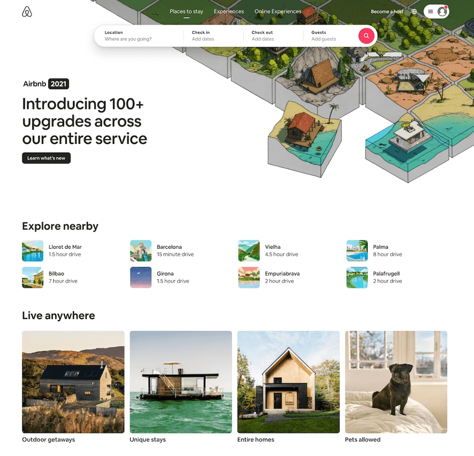
Here, Airbnb has taken a user pain point – finding somewhere to stay that allows pets – and presented the solution right on the homepage. The user flows directly to the listings they’d prefer with clear signposting.
MailChimp
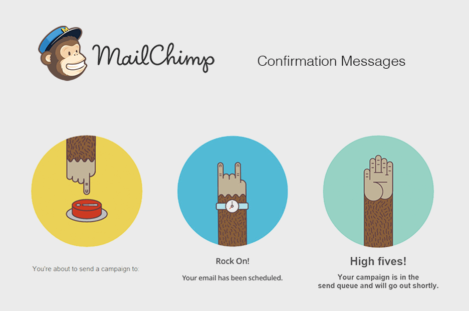
Rather than leaving users questioning about their campaigns, MailChimp provides simple confirmation messages that are visually engaging at the same time. Easing the potential query of “Did that send?” helps to improve the user experience.
Disney+
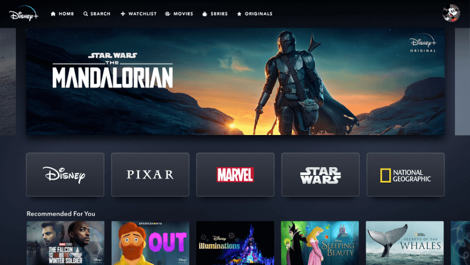
Rather than making users hunt through a large directory of films and TV shows, Disney+ brings all of its five brands to the fore of its home page, making it easier for users to find exactly what they’re looking for from their most popular franchises.
ASOS
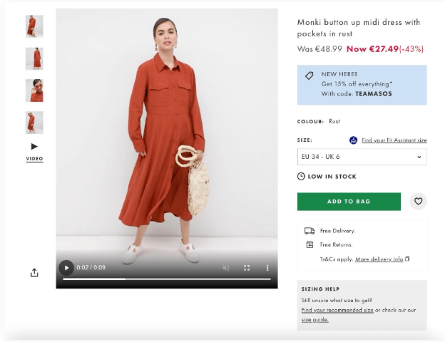
ASOS offers both images and a catwalk video to its users to help give them a better understanding of each product. Additionally, they inform the user of the stock for each item right on the product page and tag in a discount code to help convince users to make a purchase.
Improve your UX with Qualtrics
Qualtrics’s research solutions provide you a significant competitive advantage over other brands in your market.
Improving your user experience by informing the design process with better research not only creates better customer outcomes like increased loyalty, but also leads to an overall stronger business.
Learn more in our detailed eBook and start improving your user experience today.
Deepen your customer knowledge with the Digital Experience Playbook